One weekend redesign turned into a new company-wide initiative.
How consolidating our “Aha!” moments into one screen became our most popular page, plus the story of a dramatic redesign that kicked off a larger company initiative.

Our best moments were buried in the wrong places
Moz Pro is Moz’s flagship SEO suite. At the time, our North Star was user lifecycle and journey, so we tracked “Aha!” moments. These were moments when a user stops, looks at what’s in front of them, and thinks “okay, this is extremely helpful!”
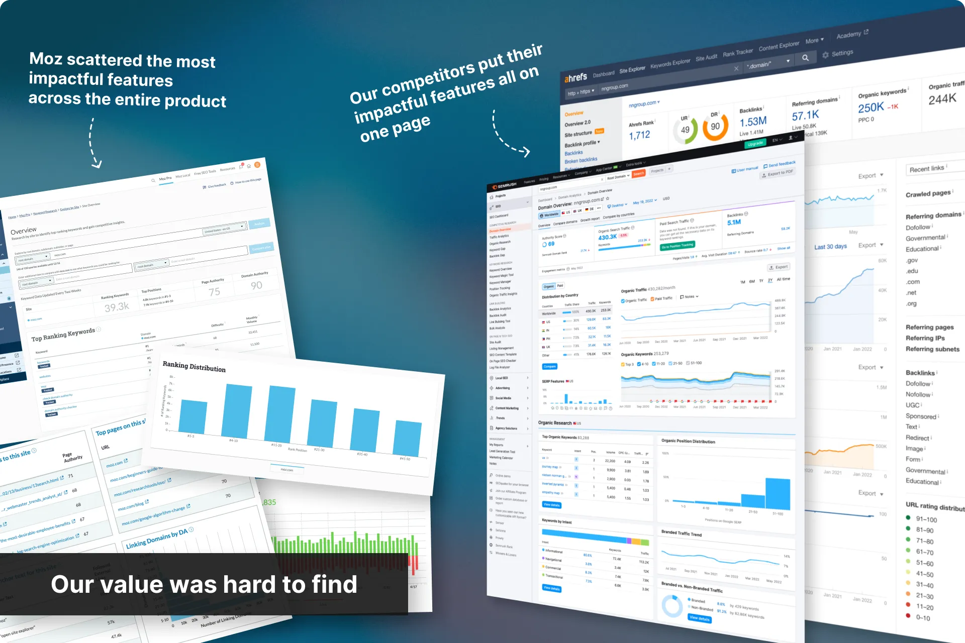
We knew what a lot of our “Aha!” moments were, but they were scattered across six different tools and buried a few clicks deep, and a free trial is a short window to stumble into them by accident.
Domain Overview pulled them into one page, early in the journey. It also closed a competitor-parity gap that Ahrefs and SEMrush had already filled.
Problems
Moz Pro didn’t guide users to its full value. Our most convincing features already existed, users just never found them. “Data or insights not useful” was a top ten cancellation reason, often when the useful thing was there and buried.
Many research-first users were leaving us for our competitors because they did a better job at surfacing research value quickly.
Goals
Pull the scattered "Aha!" moments into one page, and shown early in a user's journey. This should:
Improve discoverability of Moz Pro’s features and data
Show the value Moz Pro provides quickly, and all in one place
Demonstrate how features work together for a fuller picture of a site’s performance
Close the competitor-parity gap on quick-start overview pages
Constraints
Build in Material UI but keep designs as close to our legacy tool as possible to avoid jarring our users.
No time to rethink the IA. This needed to ship, and a full information-architecture rethink was off the tab
No new data. Everything on the page had to come from data and features that already existed in-app.
How to measure success
Increase Free Trial vesting by 20% (Company initiative)
Cut churn in half (Company initiative)
Increase visits to our core research tools (Keyword Explorer, Link Explorer, Competitive Research)
Built the case with our research lead
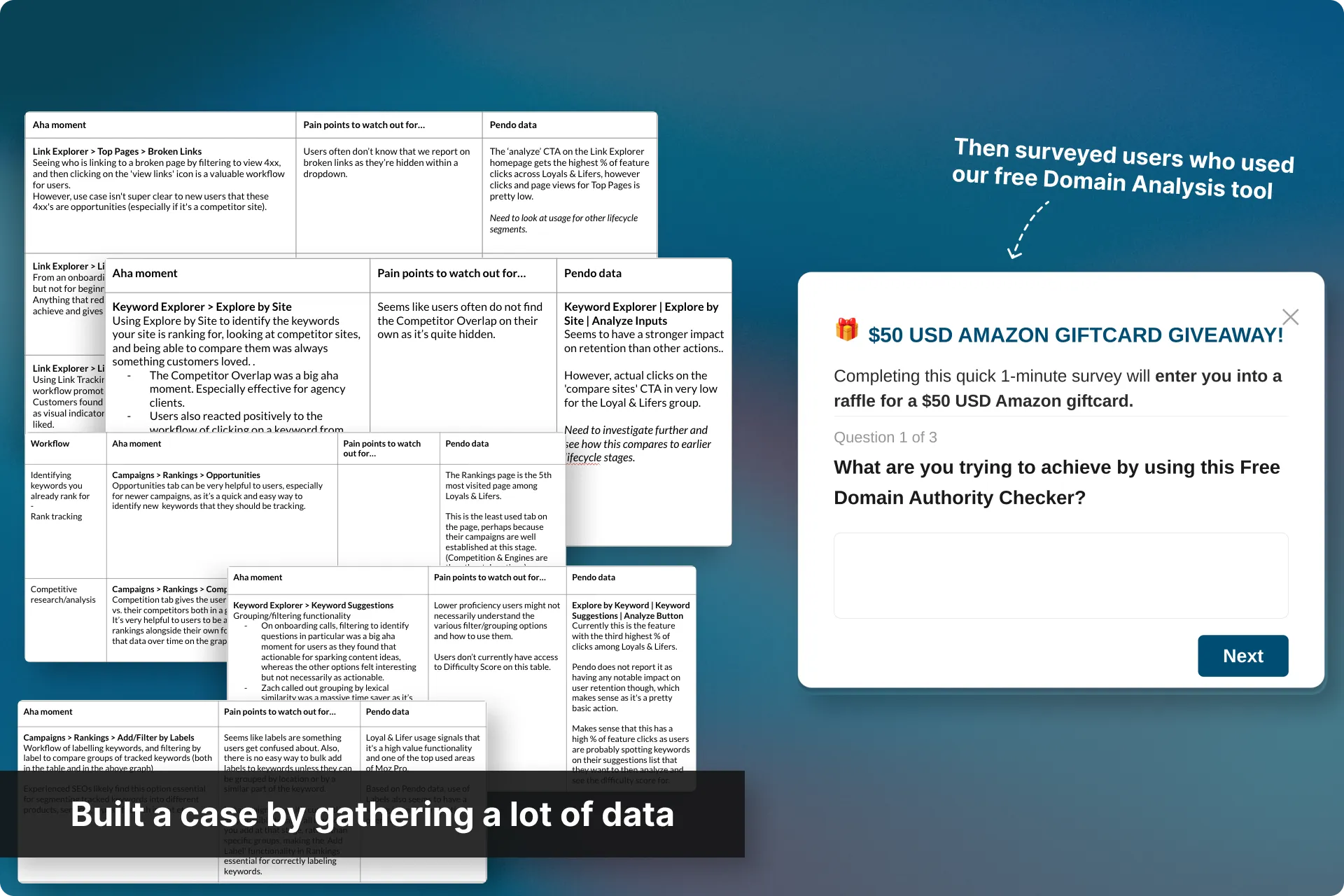
Partnering with Rebecca, our UX Research & Strategy Lead, we laid out how we’d actually prove this page was worth building, in three layers.
- Layer 1: get the full list of “Aha!” moments, map which ones Domain Overview would trigger, and tie that to projected vesting.
- Layer 2: find how many users used the free Domain Analysis tool and how often, to project in-app engagement.
- Layer 3: survey paying users who were still using our free tool, to understand why they weren’t just using Moz Pro, and pair that with interview data on what they’d want on the page.
The demand already existed, we could measure it, and every data point on the page was something we already had. This gave us a low-risk, high-impact case.
Ran a discovery session with Product
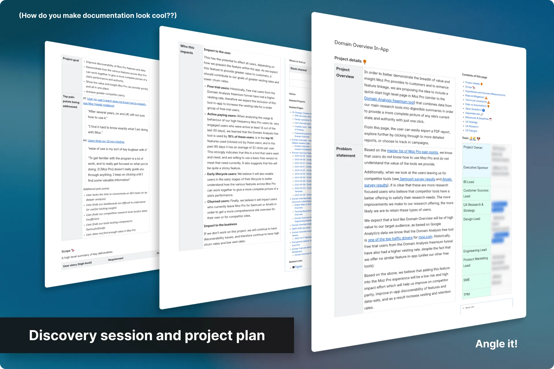
With proof of a business case, we sat down with our PdM to nail down the fundamentals:
- Project and business goals
- Hypotheses
- The problem statement
- How we’d measure success
- What was data versus assumption
- Risks and constraints
- And more…
This turned into a formal project plan and was sent out to UX, Product, SMEs and Customer Success for additional input.
Created a UX game plan
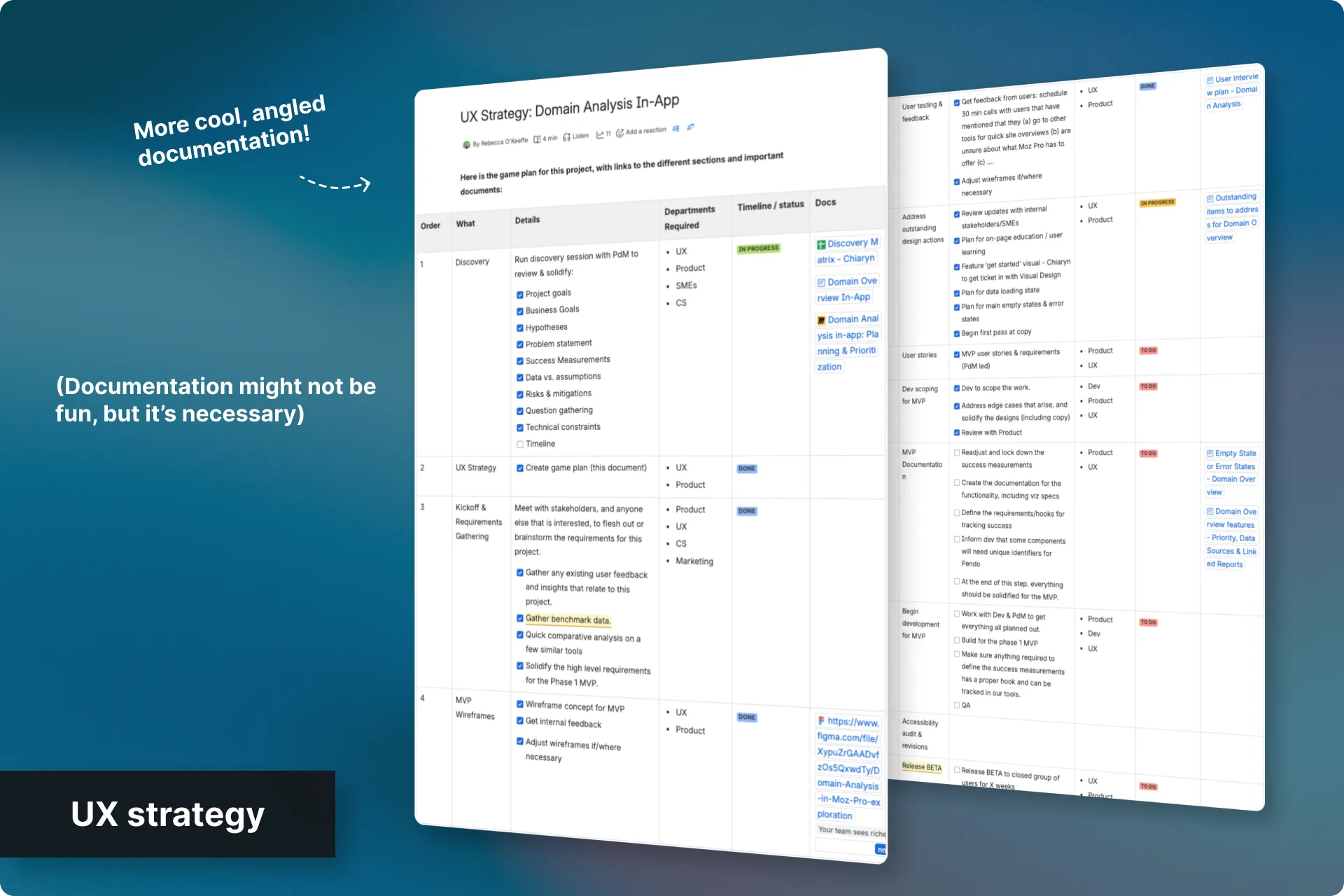
Documenting a proper game plan is standard practice for me as it outlines the steps that will be taken and timeframes for those steps. Once approved, it becomes a working agreement and, if kept up to date, it also allows everyone to know where one is at with their project, and makes a handoff much easier when necessary.
My plan was to transition the design work to our Senior Designer, so I knew this would come in handy.
Kickoff and requirements gathering
Rebecca and I met with stakeholders (and anyone else interested) to gather existing feedback, run a comparative analysis against similar tools, and pull benchmark data so we’d have something to measure against later.
We solidified the requirements for our Phase 1 MVP, which included surfacing “Aha!” moments from four other pages:
- Explore by Site: Competitor Overlap
- Explore by Site: SERP Analysis
- Link Explorer: Top Pages, Broken Links
- Link Explorer: Link Intersect
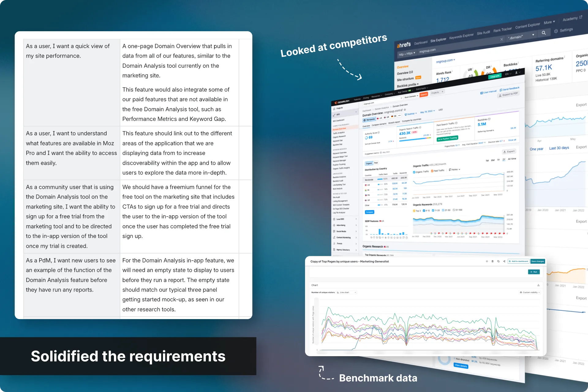
I then assigned one of our Senior Designers to start putting pen to paper.
My plan now was to focus on other projects and let my team take care of this one. But then…
I saw the proposed design (and rebuilt it over a weekend)
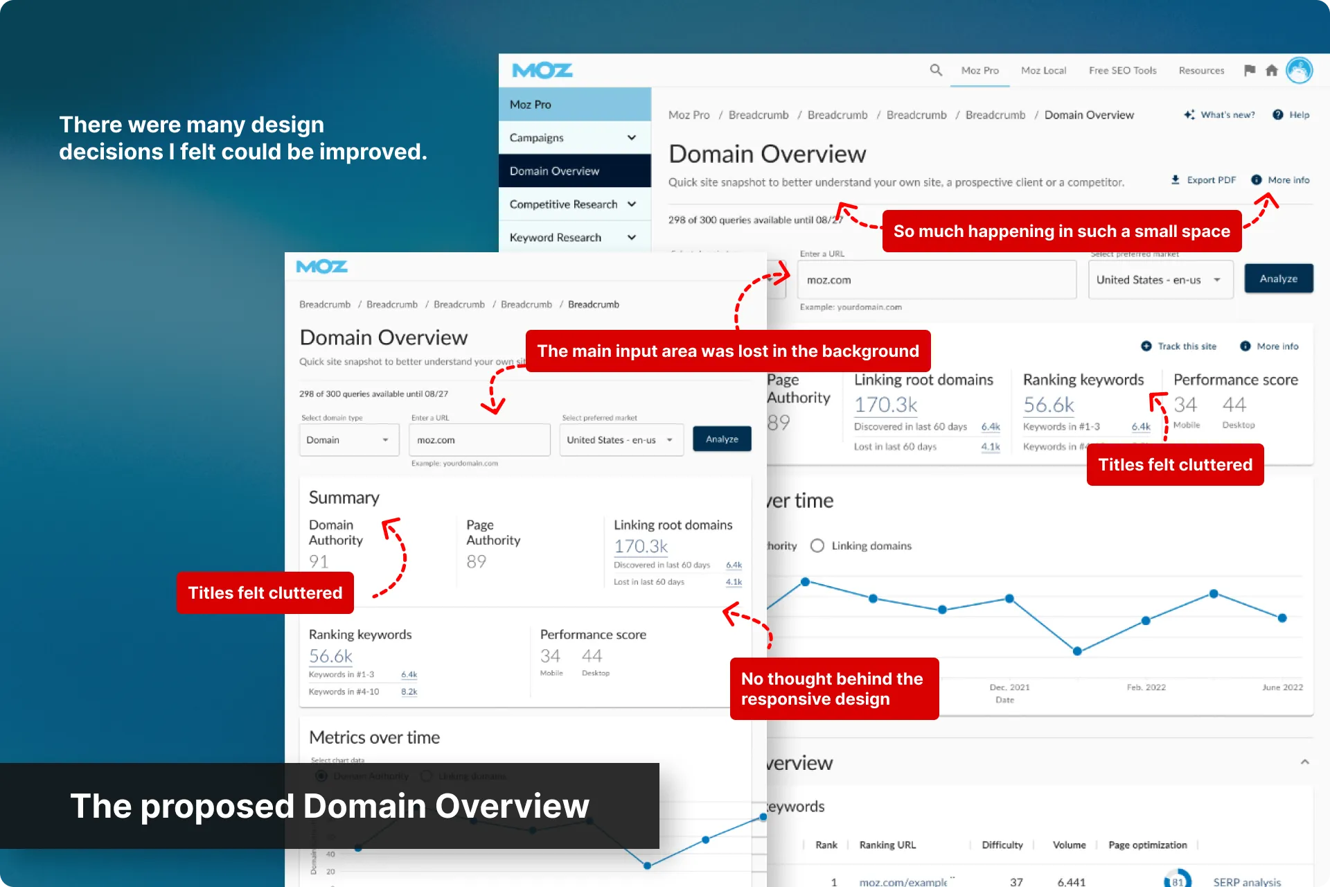
This was the first project with me as Moz’s new UX Manager, and I was now responsible for the outcome of all of our designs. So when our Senior Designer presented their proposal (our old, outdated components stretched into a new full-width layout they were never built for), it was clear that our old Manager’s interim strategy of keeping new pages visually close to legacy had expired.
This new design looked like it was going to make the experience worse, and since my Senior Designer was already behind schedule, I took the weekend and changed what wasn’t working for me.
What I had after that was a better concept, but it broke our constraints. I still wanted to push this forward, but it first had to survive stakeholders.
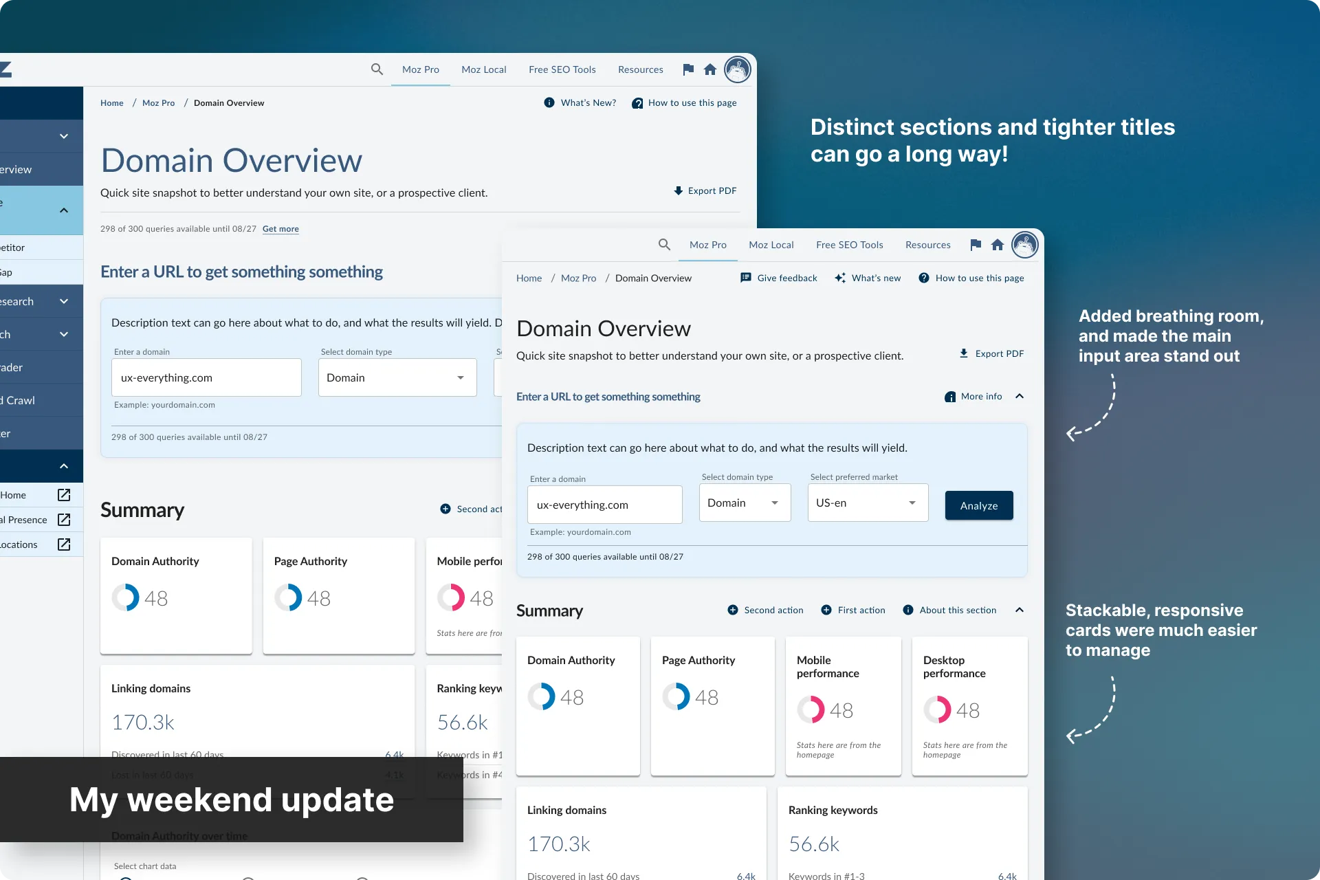
It landed well, but created a wonderful, new problem
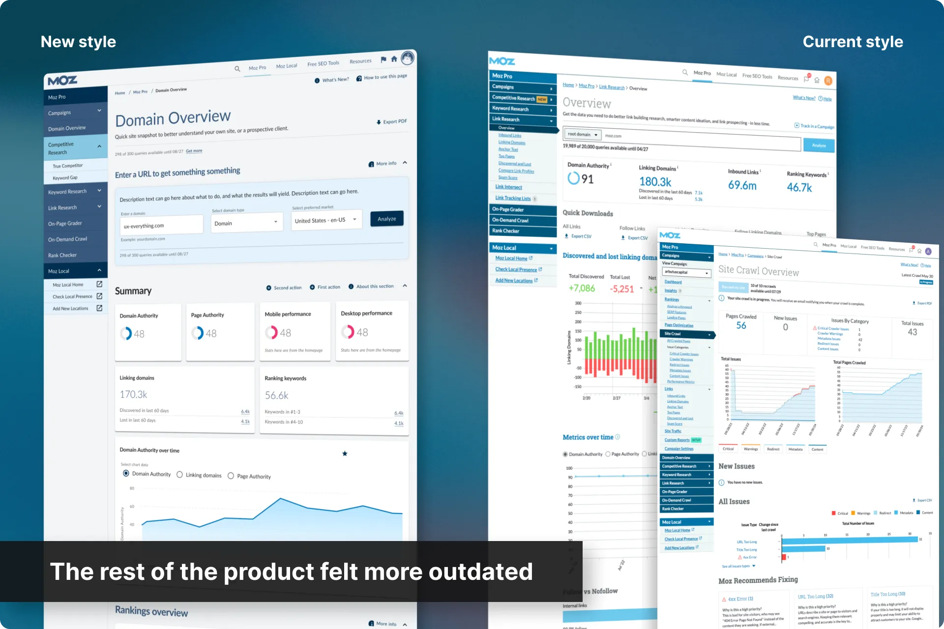
The concept was well received internally, but now we had one genuinely modern, well-organized screen, sitting inside a product where every other screen still looked 10 years old.
Instead of feeling like progress, it made the rest of Moz Pro look broken by comparison, and we had no plans on fixing that.
Nobody had disagreed that our patterns were dated, but an argument about design debt stays abstract until it’s two screens side by side. This gave me the fuel for my argument that a patch-it-as-we-go strategy had an expiration date, and needed to change.
So I went on a side quest….
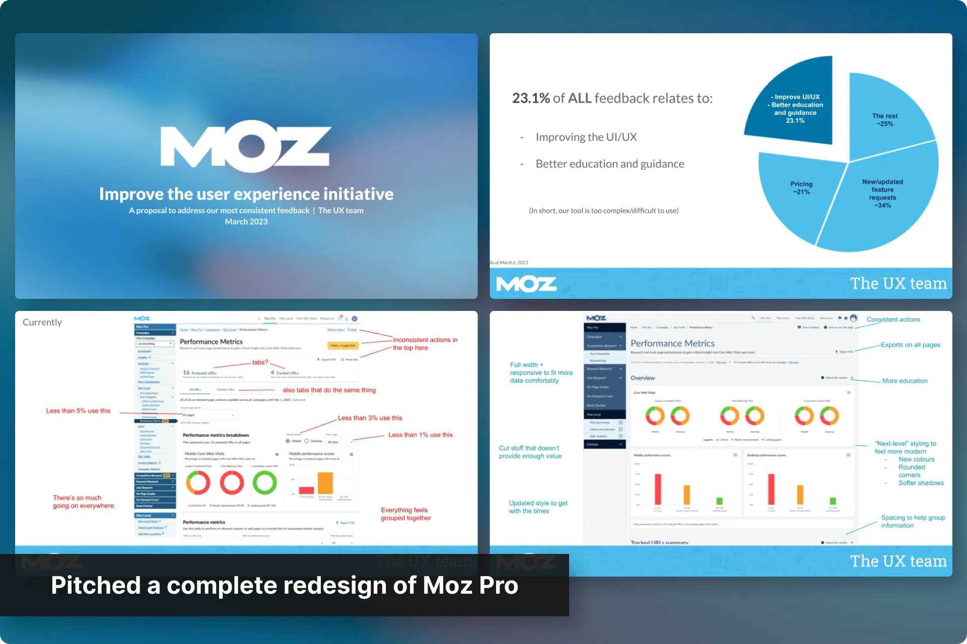
I pitched a formal redesign for the entire Moz Pro suite
This was not a small ask. In fact, it was such a big ask (and process) that it warranted its own entire case study. I highly recommend checking it out.
Spoiler alert — I put together a pitch and we got the approval for a complete UI/UX overhaul, then scheduled Domain Overview to be the first release with this new style.
Now back to the main quest (Domain Overview)
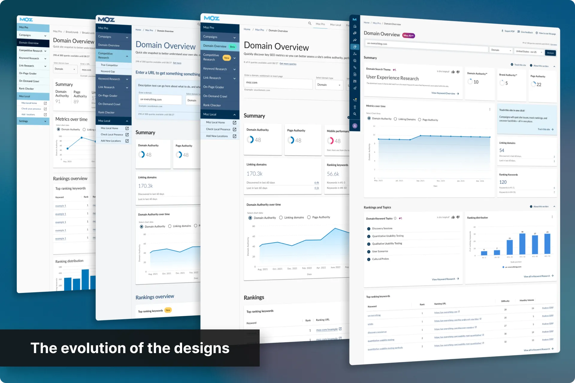
Fleshed out the mockups from my weekend concept
Rather than starting from scratch, the team and I used my concept as the starting point and built out final mockups from there.
I remained more hands-on with the design side of things here while my team gathered internal feedback and adjusted.
Tested it with users
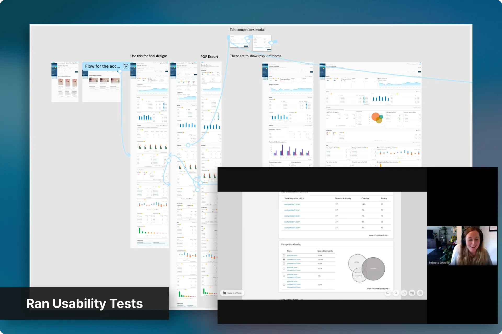
Rebecca, our UX Research & Strategy Lead, scheduled 30-minute Usability Tests with users who’d told us they went elsewhere for a quick site overview, or who weren’t sure what Moz Pro actually offered.
The feedback we received was encouraging, and I adjusted the designs where needed.
Locked down the remaining decisions
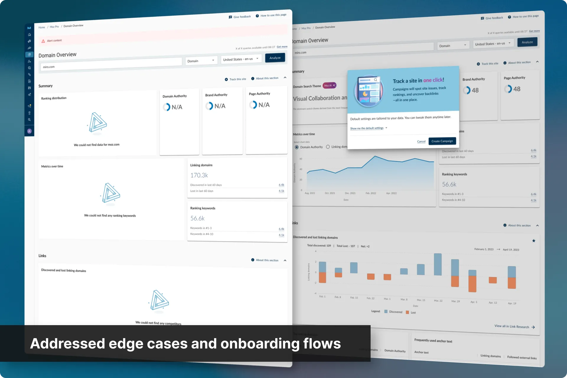
Rebecca reviewed open questions with internal stakeholders and SMEs, planned the on-page education for first-time users, scoped a “get started” visual with our Visual Design partner, worked out the loading, empty and error states, and wrote the first pass of copy.
From there Product led the MVP user stories, and Dev scoped the build, surfacing edge cases and locking the designs down with us before a full group review.
Supported the build, then audited it for accessibility
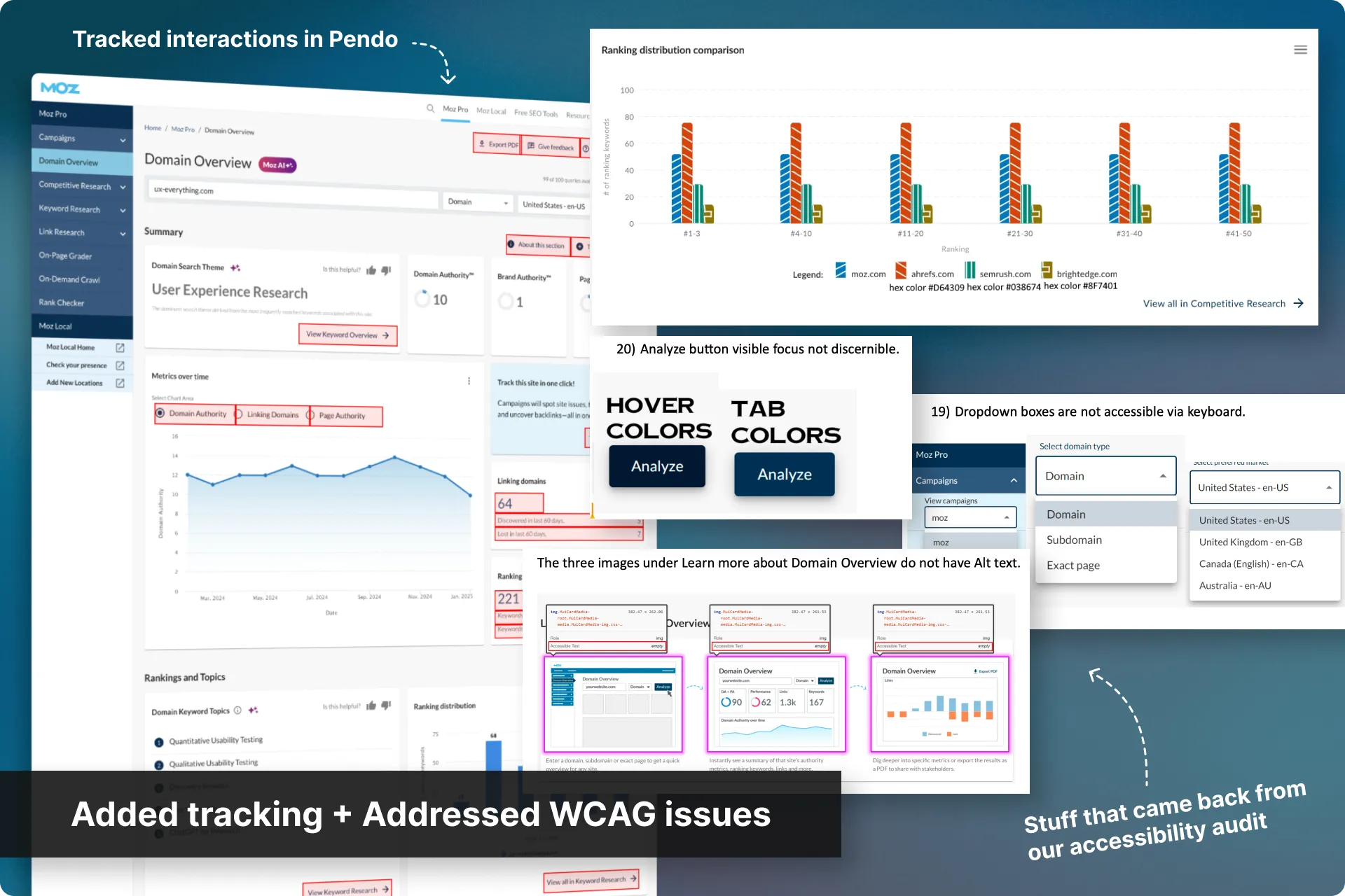
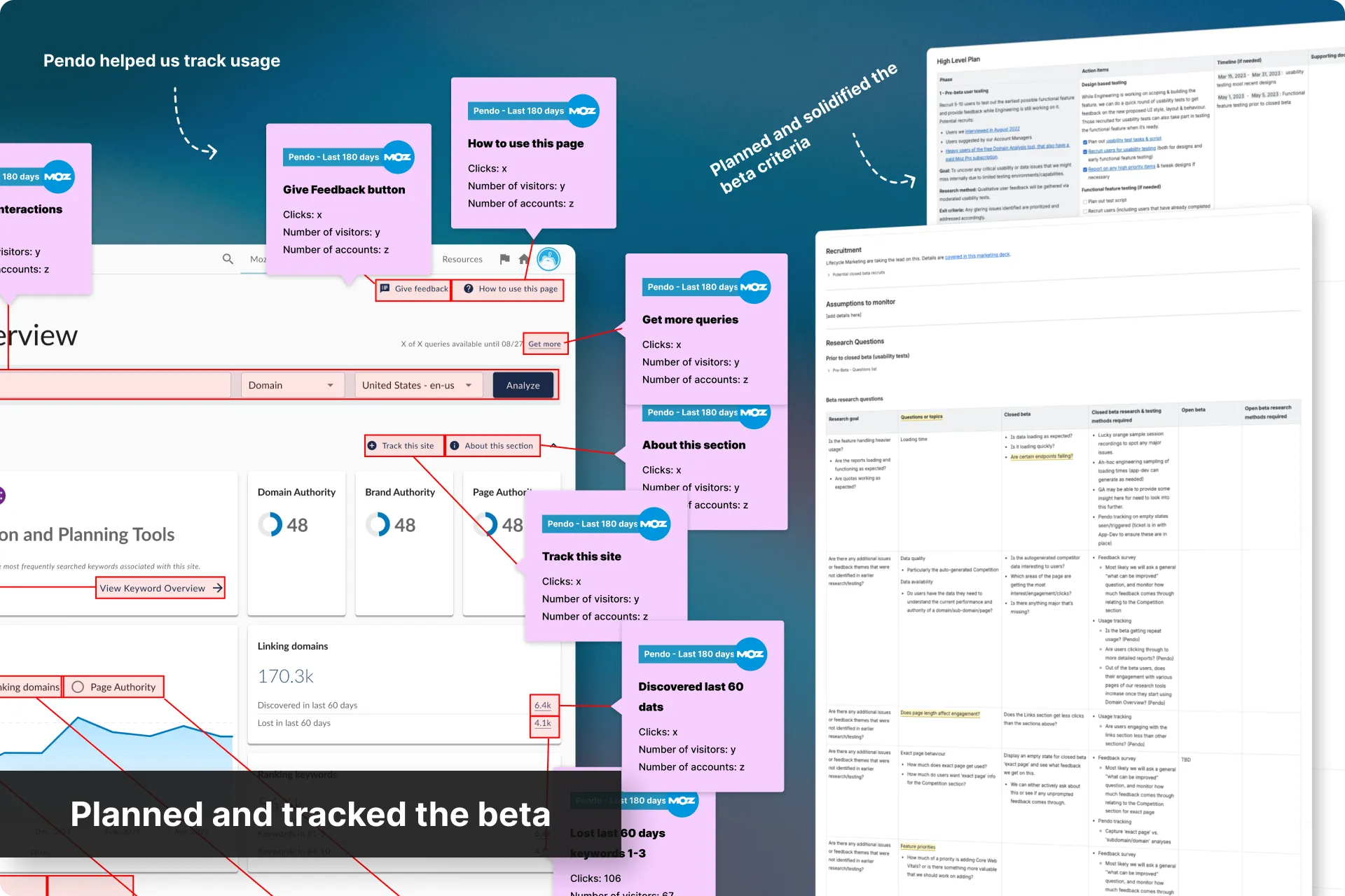
Rebecca worked with Dev and our PdM through the build, reviewing and testing along the way, defining the hooks we’d need to track usage, and giving Dev the unique identifiers Pendo would need.
I helped set up the hooks in our tracking tools and, when needed, jumped in for reviews.
Once built, we also addressed the feedback from an accessibility agency’s audit before release.
Closed beta, then full release
We released Domain Overview to a closed group of users for a few weeks, analyzed the feedback and tracking data against our original hypotheses, made some tweaks, and then rolled it out to everyone.
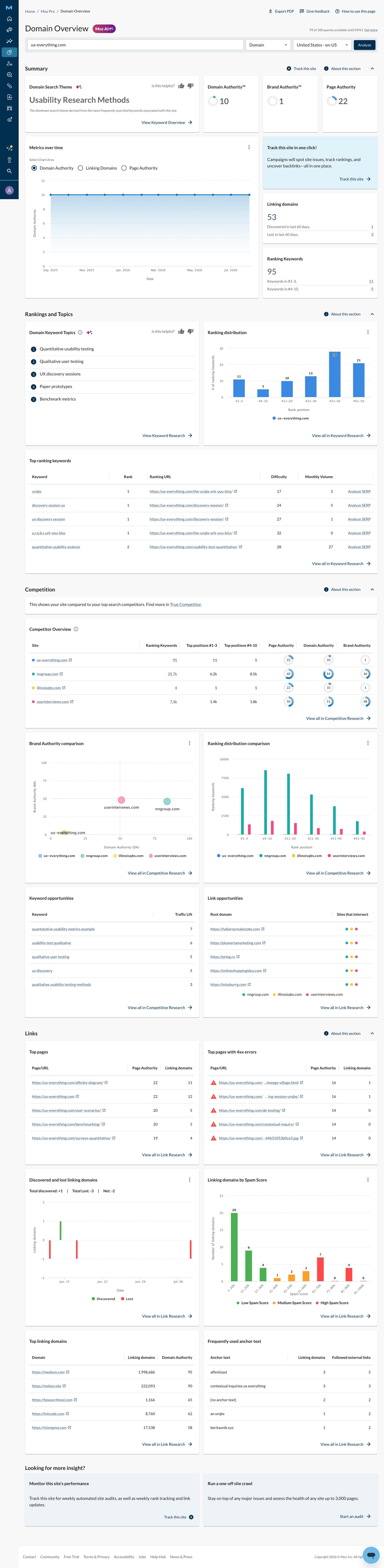
Full width, responsive, updated style. This was the first page in Moz Pro to ship this way and it was very exciting.
Et voila!
Our most successful page to date
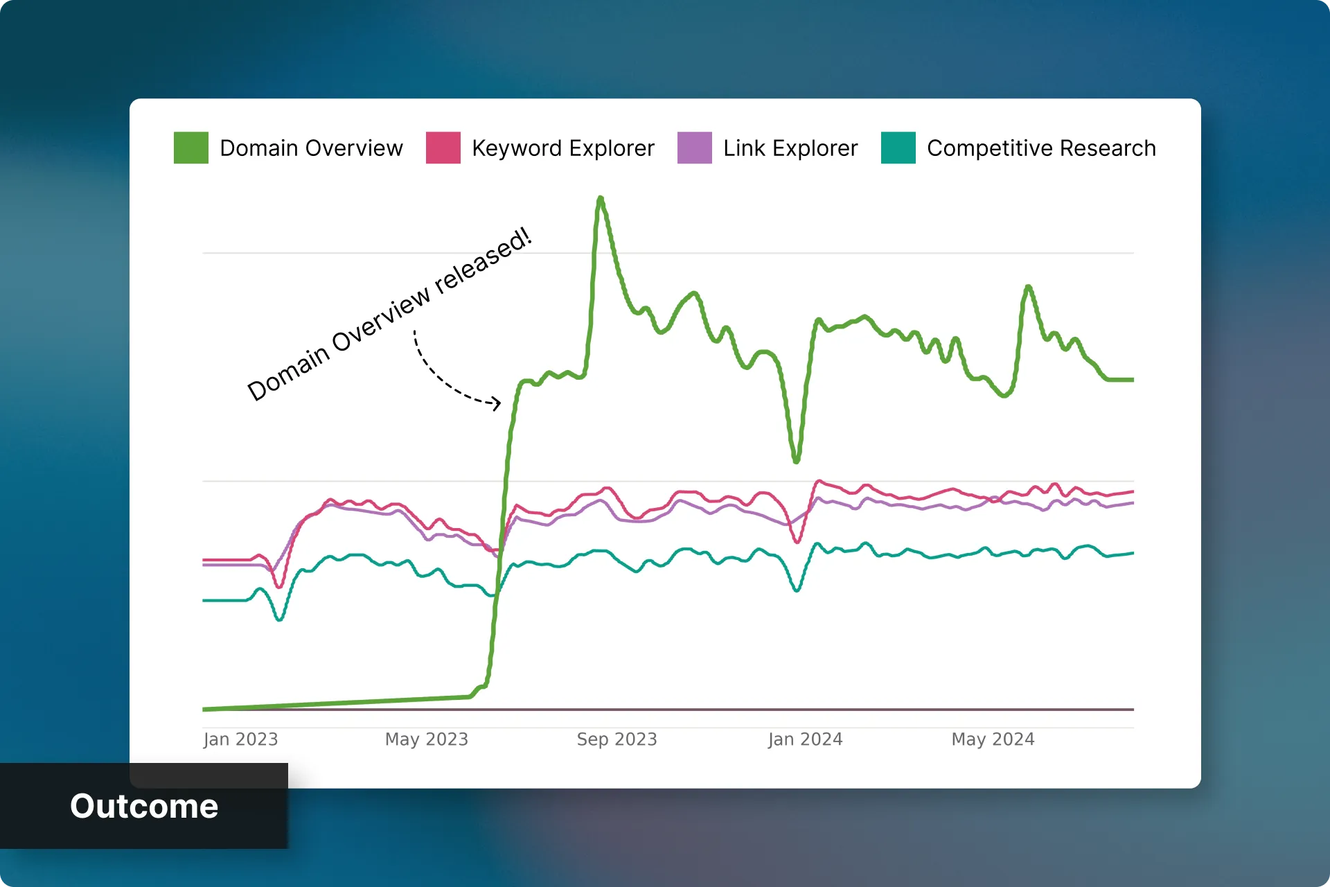
Domain Overview quickly became the top performing research page in the app, getting around 2x the usage over the others. It also increased traffic to the other research pages within Moz Pro, as this eased them into those other pages.
We saw a 9% increase in vesting from Free Trialers who actively engaged* with Domain Overview. It was short of our 20% goal, however, Domain Overview wasn’t the only initiative to increase vesting, so 9% was a great start.
Churn did decrease over the next 18 months, however, this was likely due to several initiatives, including the Moz 2.0 redesign which was kicked off because of Domain Overview.
*“Actively engaged” means they used it 3 or more times, and totalling over 5 minutes on the page.
Moz 2.0
I mentioned it earlier, but I’ll mention it again here; my weekend redesign of Domain Overview kicked off an entire company initiative to be the “Best in-class UX”.
This was not easy, but it was a lot of fun. I highly recommend checking out that case study next.

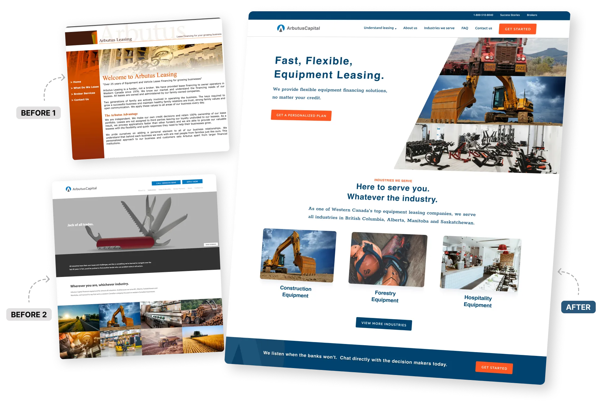 Evolving Arbutus Capital to a modern digital experience
How I rage-redesigned, SEO’ed, and rebuilt Arbutus Capital’s website, leading to a 24x increase in organic business enquiries.
Next Case Study
One good screen kicked off a product-wide redesign
How a weekend redesign helped me get company-wide commitment to rebuild Moz Pro's UI/UX, how I supported my team throughout it, and what happened when it became too slow.
Evolving Arbutus Capital to a modern digital experience
How I rage-redesigned, SEO’ed, and rebuilt Arbutus Capital’s website, leading to a 24x increase in organic business enquiries.
Next Case Study
One good screen kicked off a product-wide redesign
How a weekend redesign helped me get company-wide commitment to rebuild Moz Pro's UI/UX, how I supported my team throughout it, and what happened when it became too slow.


 Email me