One good screen kicked off a product-wide redesign
How a weekend redesign helped me get company-wide commitment to rebuild Moz Pro's UI/UX, how I supported my team throughout it, and what happened when it became too slow.

How it all started
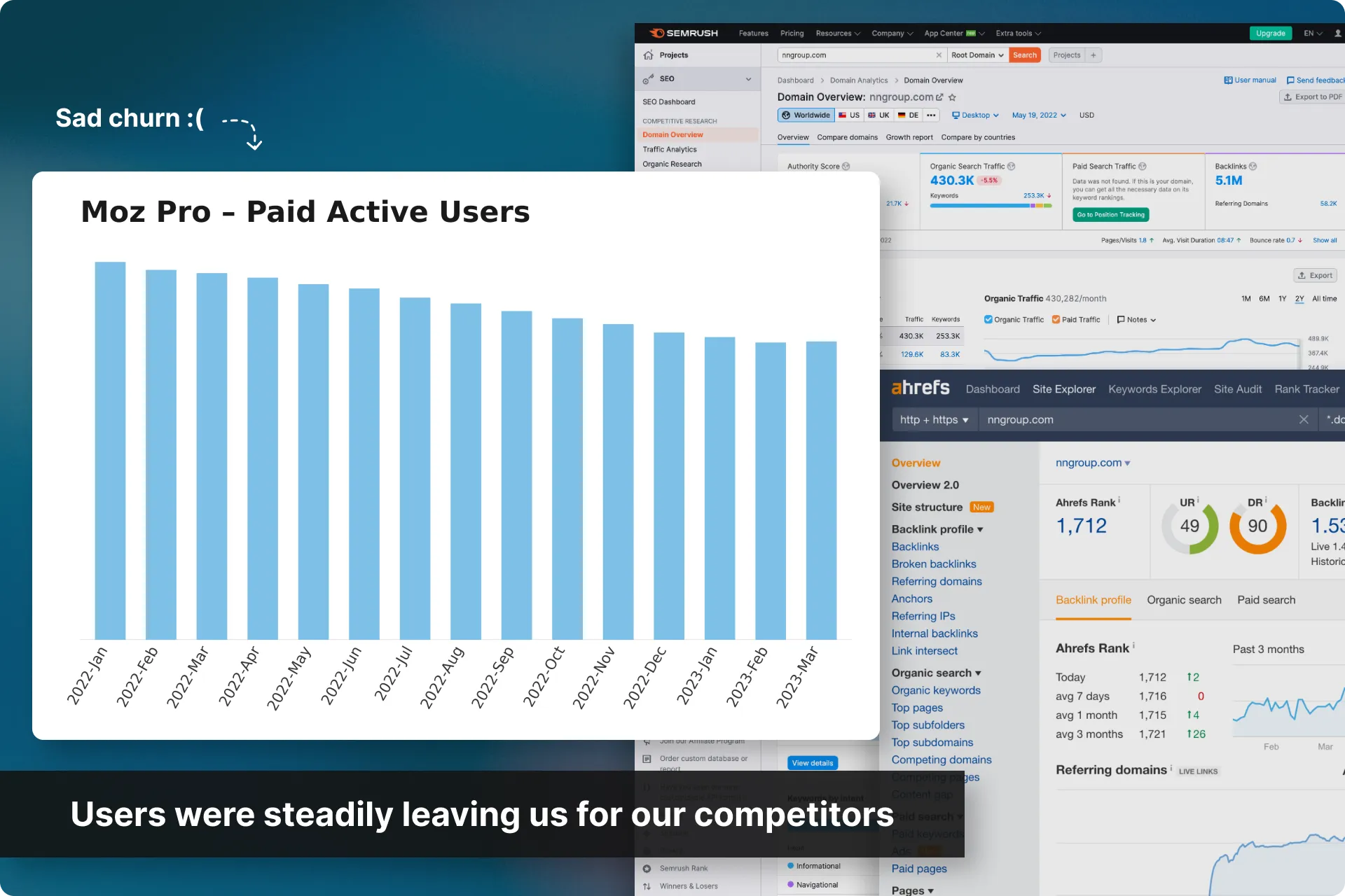
Moz Pro’s monthly active users had been declining for years. Users were leaving for Ahrefs and SEMrush, and conversion rates were slowing alongside them.
Leadership changed hands three times in as many years, and each time, leadership asked the same question: what’s the silver bullet, something so innovative the whole industry would have to pay attention? Nobody ever answered it. For years.
Domain Overview surfaced a big problem
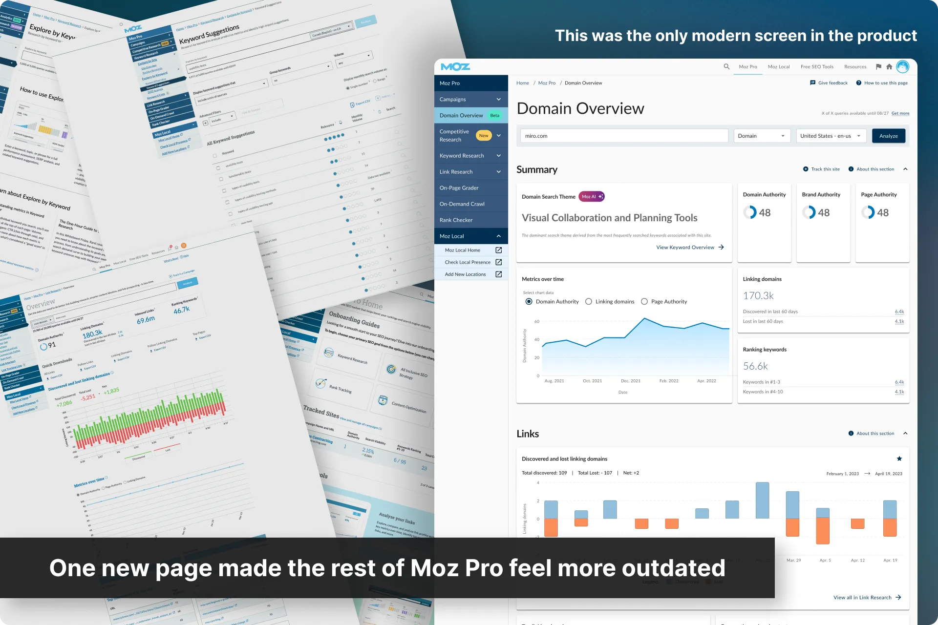
During this same time, we were releasing our first completely new page in years, Domain Overview.
It was extremely well received, but it had been designed in a genuinely modern, full-width, responsive way, on a new pattern library, and was then dropped into a product where nothing else was any of those things.
Problems
So now we had a whole bunch of problems. Some mandated by the company to fix, some by users, and some by my professional integrity:
Declining monthly active users, users were leaving us for our competitors, and conversions were slowing down.
Moz was now built four different ways across three pattern libraries. Changing a component was never global, and the result was a visibly inconsistent product, where our best new page made every other page look dated.
“Too difficult to use” was our second-biggest cancellation reason, behind only price.
It was time for a major design overhaul.
Goals
Reduce churn and increase conversions. This was still the main goal.
Convince the company that “best in class UX” needed to be a company initiative. No more patches or one-off pages, but a single design direction the whole product shared. Our competitors’ UX wasn’t actually any better, so a strong, consistent, and intuitive first impression was an advantage we could hold.
Then actually design and build it. Getting buy-in was one thing. Rebuilding an entire product’s interface (and in a timely manner) was the real work.
Update and release sections one at a time. Get value to customers sooner, rather than disappearing for years behind one big release.
Fold in low-effort feature requests along the way so each release brought as much value as possible without drastically pushing back our timelines.
Constraints
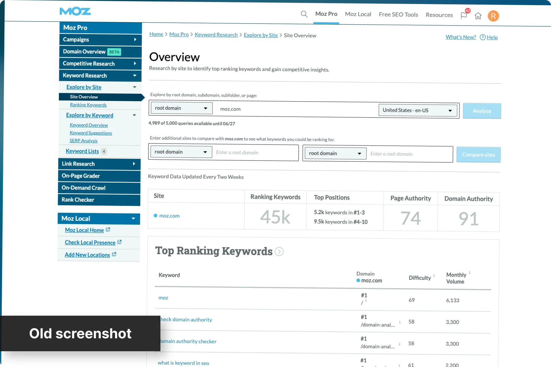
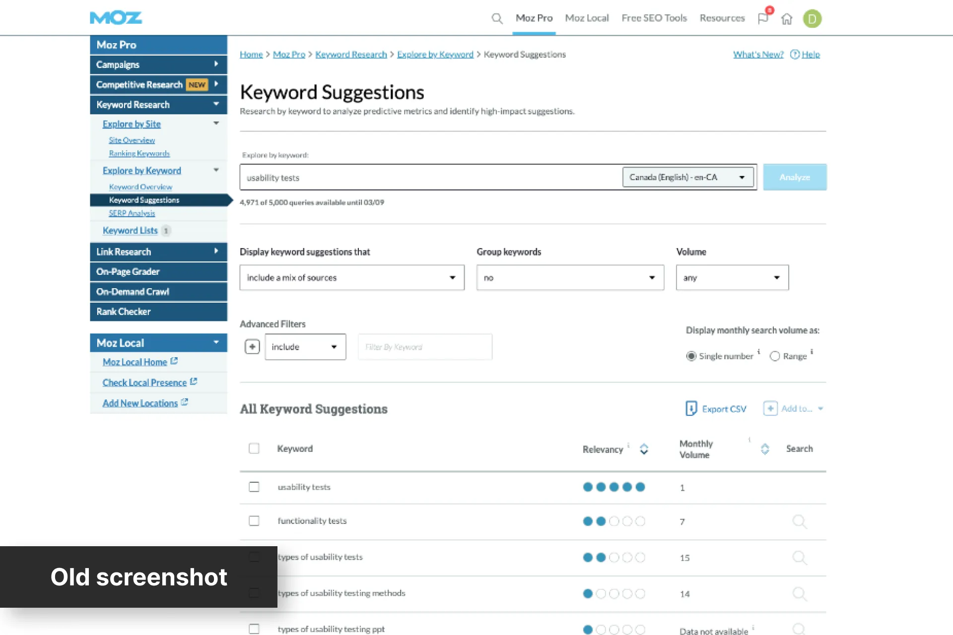
A new pattern library existed, but almost nothing could use it. Our older screens couldn’t simply be moved onto it because they were built throughout three legacy tech stacks with two other pattern libraries, and some fully custom areas. Every page had to be rebuilt from the ground up before it could join the new system.
We had to adhere to design decisions already in motion. Material UI had already been settled as part of the wider initiative and was already being applied elsewhere in the product, so every section had to use it as its framework and base.
Low-effort additions only. Anything larger had to wait, or the section would stall.
How to measure success
It would be hard to attribute any changes in metrics to a specific event since we were going to release this one section at a time while other departments worked at the same goals from other angles. But in general, this was what we were looking for:
Increase Free Trial vesting by 20% (Company initiative)
Cut churn in half (Company initiative)
Increase in engagement - this could be measured easily
Decrease in feedback on UX/UI - this could be measured easily
So how did I get buy-in for a major redesign like this?
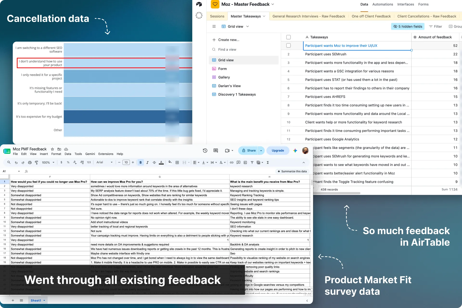
Synthesized every source of feedback we had
With a leadership onsite coming up to lock in the year’s roadmap, I needed a case strong enough to survive that room. So rather than argue from instinct, I partnered with my UX Research & Strategy Lead, Rebecca, and went through everything. Five separate systems:
- Cancellation data — 22,821 records, tagged and narrowed to 61 actionable issues covering 2,244 pieces of feedback
- Productboard — 964 logged notes with a combined user-impact score of 1,903
- Our Product Market Fit survey — 350 tagged suggestions
- NPS results — pain points from detractors and passives
- Our feedback repository — an AirTable base with 1,509 pieces of feedback not yet captured elsewhere
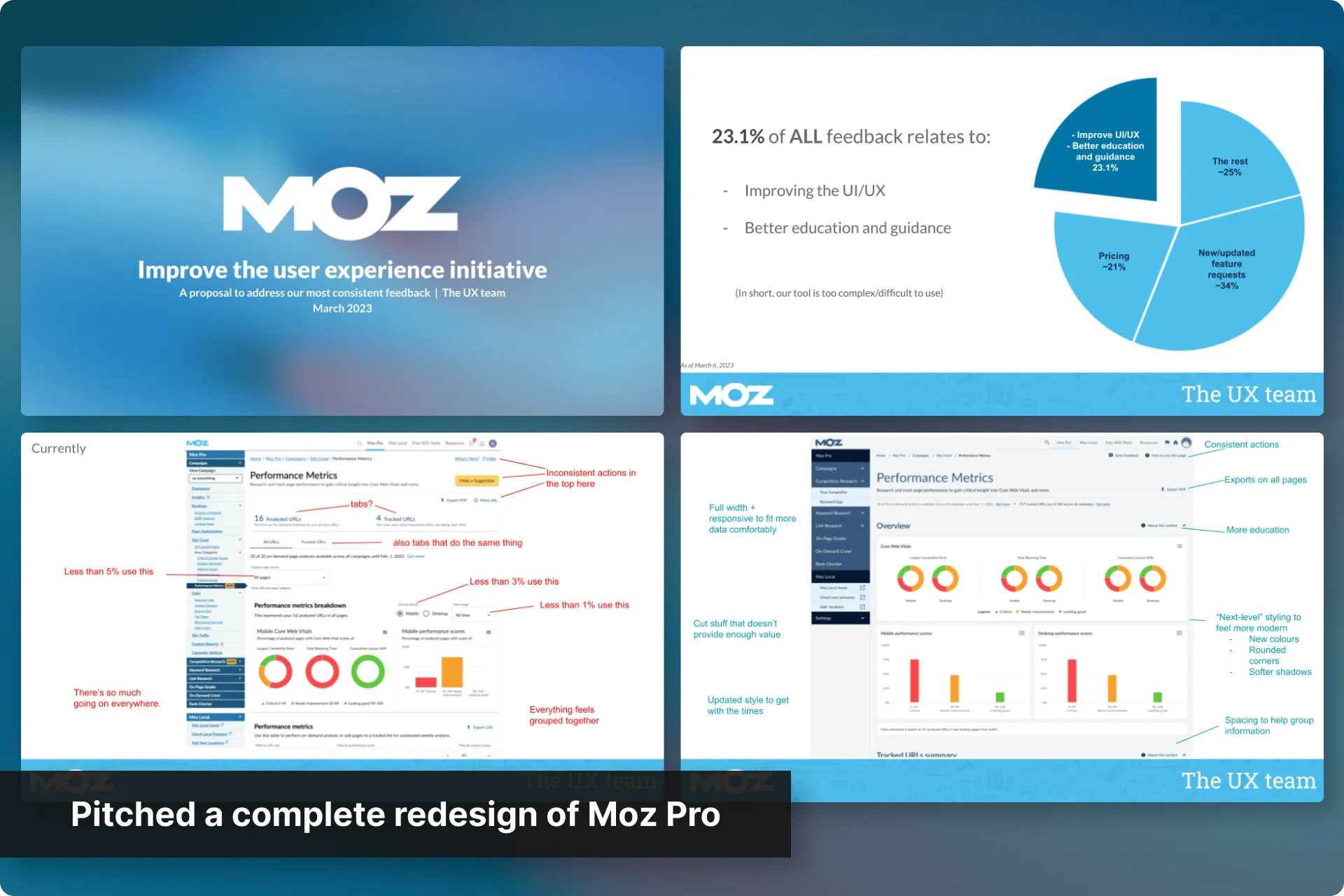
Every source pointed the same direction. Combined, UI/UX and “education and guidance” accounted for 23.1% of all feedback we had, larger than pricing at roughly 21%, and second only to feature requests at roughly 34%.
That number changed the conversation. Instead of my opinion that “Our UX needs work”, I could tell leadership that “Nearly a quarter of everything our customers tell us is about this”. That’s a strong business case.
Prioritized the findings with every department
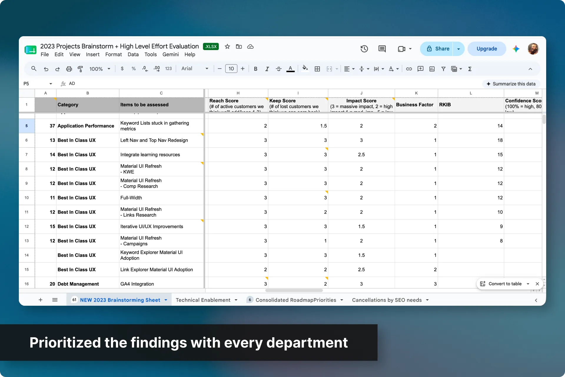
We grouped the UX feedback by area and called out what we felt were low-effort feature requests, then scored everything together with a formula combining reach, impact, business factor, and more.
We took that list and reviewed it with Product, Dev, CS, Account Management, Sales and Marketing.
After everyone had their say and the formulas were adjusted, we now had a prioritized list and consensus amongst our key stakeholders.
Pitched the plan and got buy-in
I put together a formal case and presented it to leadership, highlighting:
- 23.1% of all feedback was around UI/UX
- A three-phase plan mapped to how much of that feedback each phase could address
- Annotated screens showing what wasn’t working
- Features so buried that less than 1% of users ever touched them.
Then the argument that mattered most. Our competitors didn’t have a good UX either, and users who left for them still weren’t happy. This was the silver bullet leadership had spent years looking for, sitting in plain sight.
This needed to be a primary focus though. A company initiative. Moz had a habit of pivoting a quarter into a commitment, but you can’t rebuild a quarter of a UI and then change direction. Not again. So this was the big ask.
It worked. Moz 2.0 was a top-level initiative!
We were all ready to move on to Phase 1 of the redesign… But then…
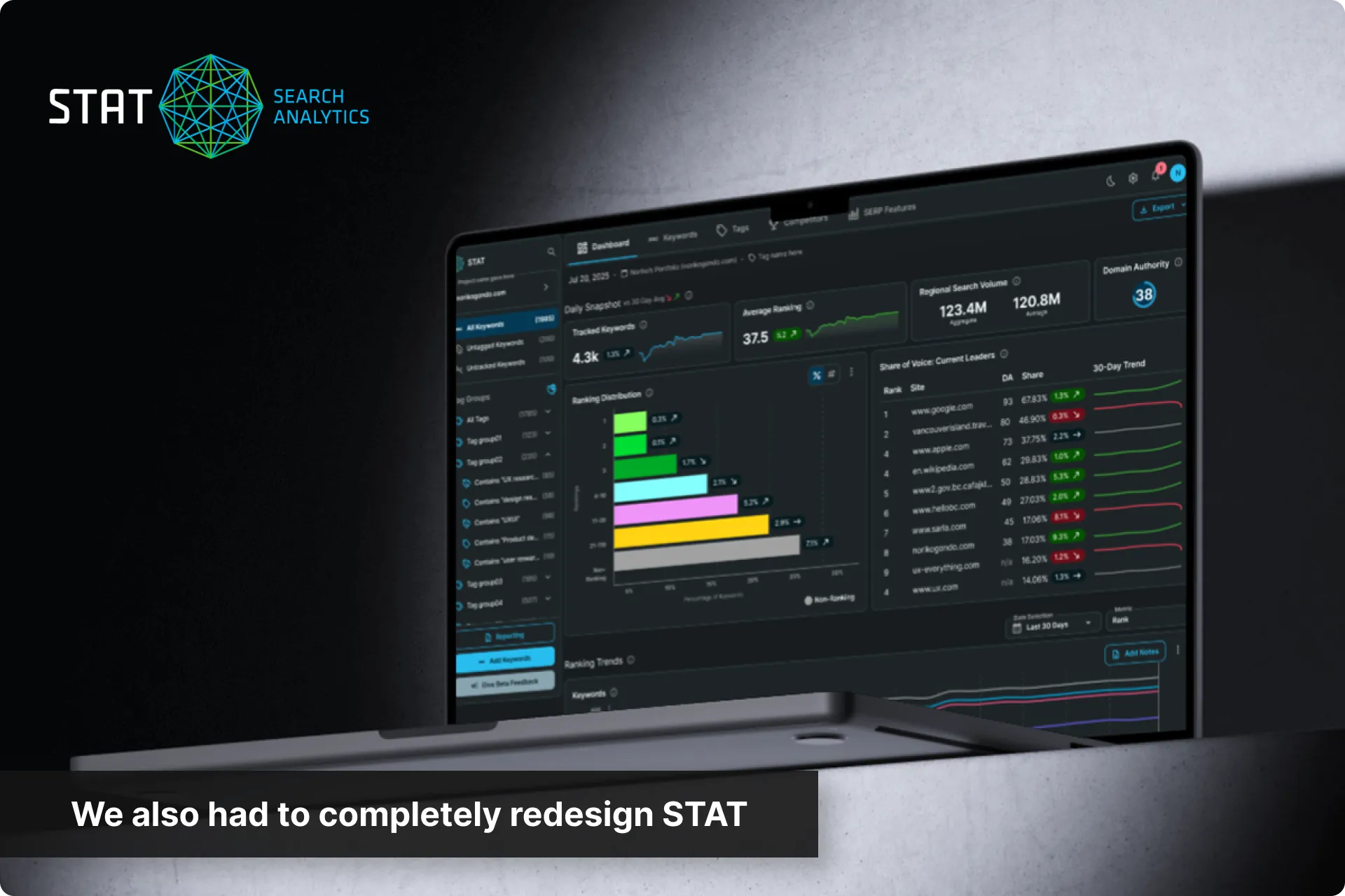
STAT’s redesign was also approved!
To add to our already-full plates, we also just got buy-in for our other main product, STAT, to go through a similar major redesign at the same time (but with no additional resources).
There was going to have to be some shuffling around. The plan now was that I would set up, guide, and support my team through the Moz Pro redesign, while I took an IC role on STAT.
Since I now had to move over to STAT, how did I set up my team for the Moz Pro redesign?
Solidified the plan for Phase 1
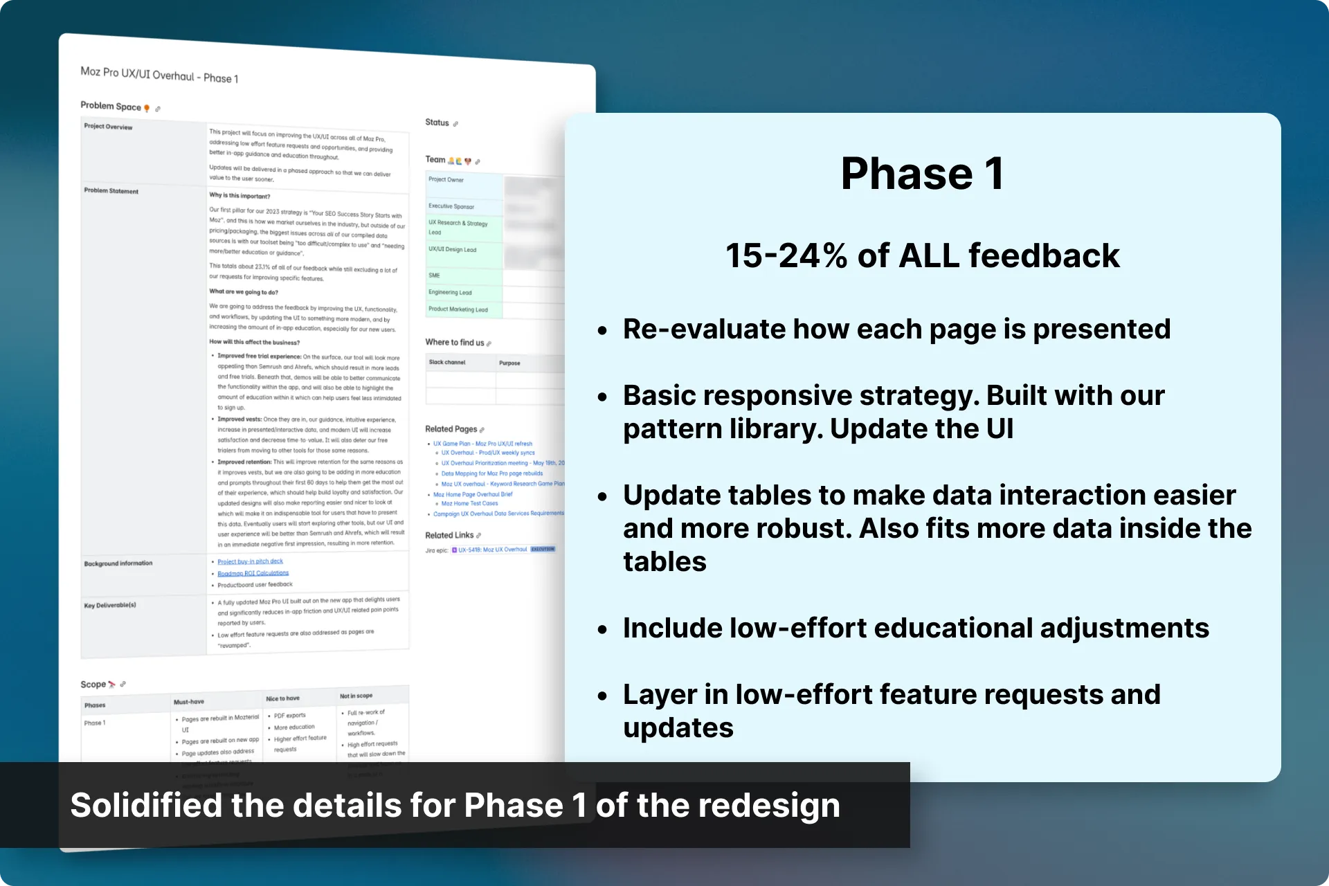
Phase 1 was to tackle one section at a time, in order of importance based on a mix of feedback volume and technical dependency.
Each section would include:
- Re-evaluate how the pages within each section are presented
- Basic responsive strategy, built with our pattern library and updated UI
- Updated tables to make data interaction and manipulation easier and more robust. Also fits more data inside the tables
- Low-effort educational adjustments we identify
- Low-effort feature requests/updates
We would then release and measure success, then adjust or move on to the next section.
Built the foundation of the pattern library
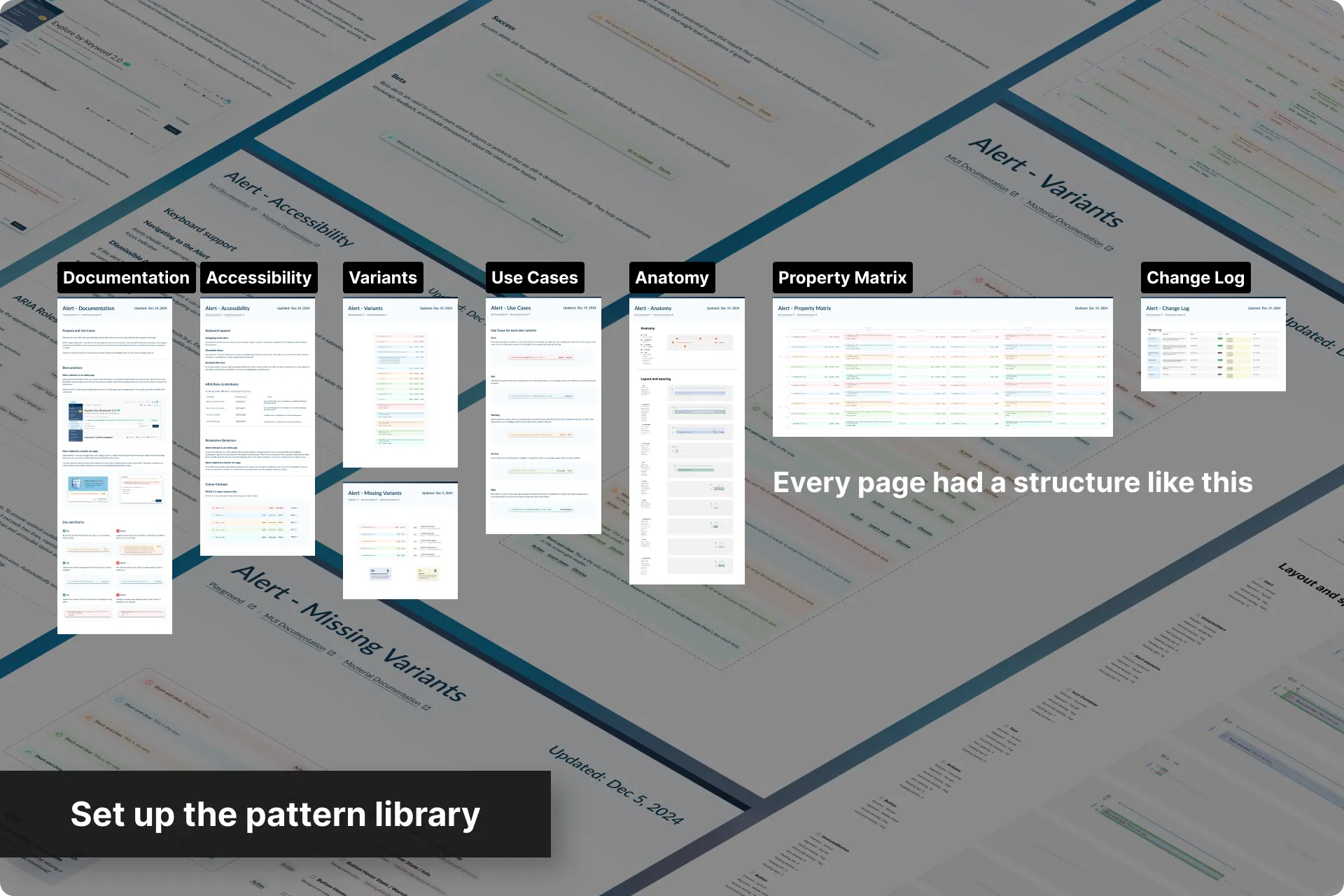
Rather than build the library from scratch, I set the foundation for it using Material UI for Figma then adjusted its structure, naming and documentation rules, and created a template the team could follow when they added to it.
The goal was that as each designer worked through their section, they could intuitively pull the right components into their designs with confidence, and extend the library efficiently without it drifting into the same unmaintained mess we were trying to escape.
On top of the documentation and structural changes, it was a lot of work updating all of the components to our new style. This was made easier by carving out dedicated time with the whole team to divide and conquer each page in our pattern library.
Set up tracking tools for benchmarking
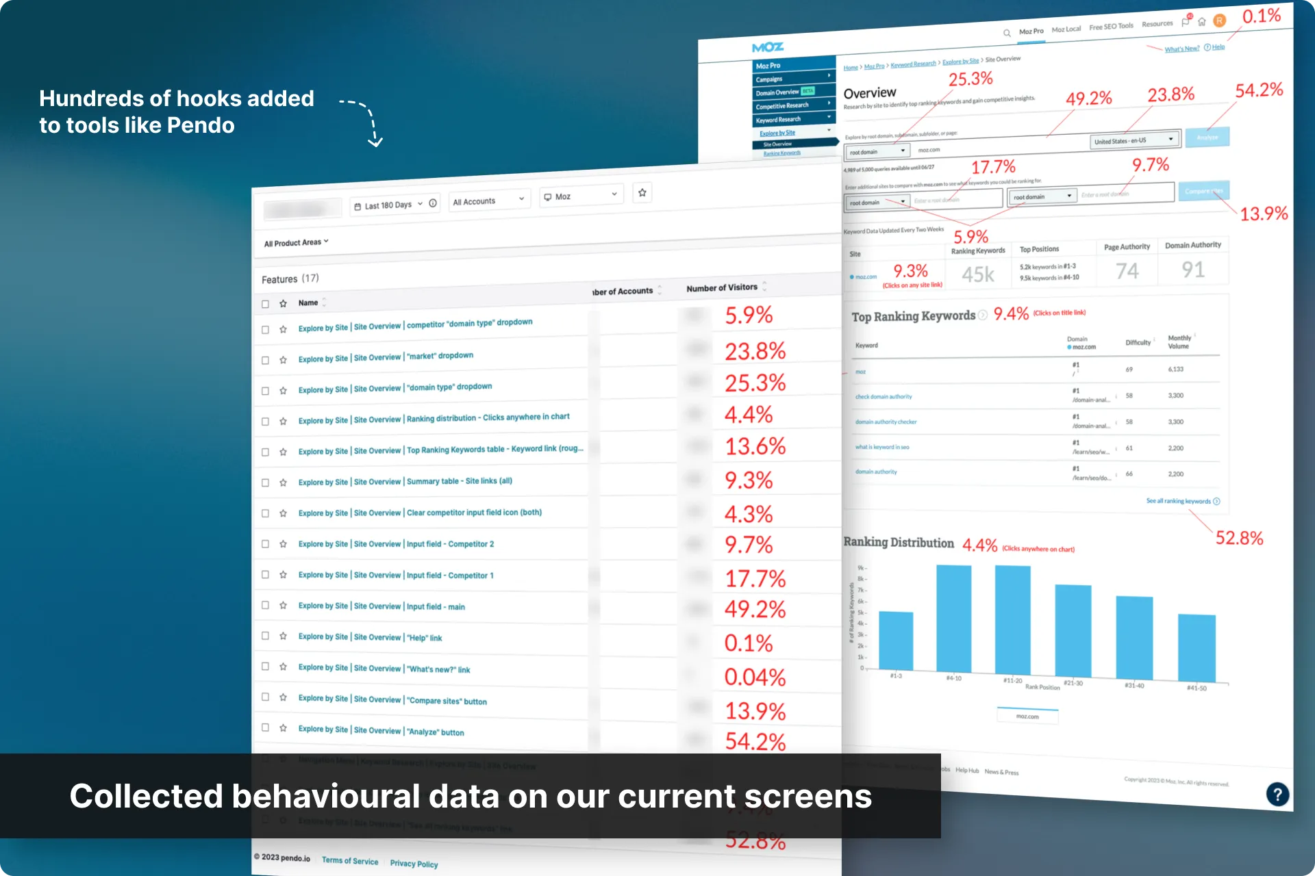
Using Pendo, I made sure tracking was properly configured across the existing product first so we had a real behavioural benchmark to measure each redesign against.
This is also when I introduced Microsoft Clarity to our toolkit, which gave us a much deeper read on how users actually moved through each section.
As the resident Pendo and Clarity person, I tackled any additional requests for the team so they could stay on design.
Restructured the team
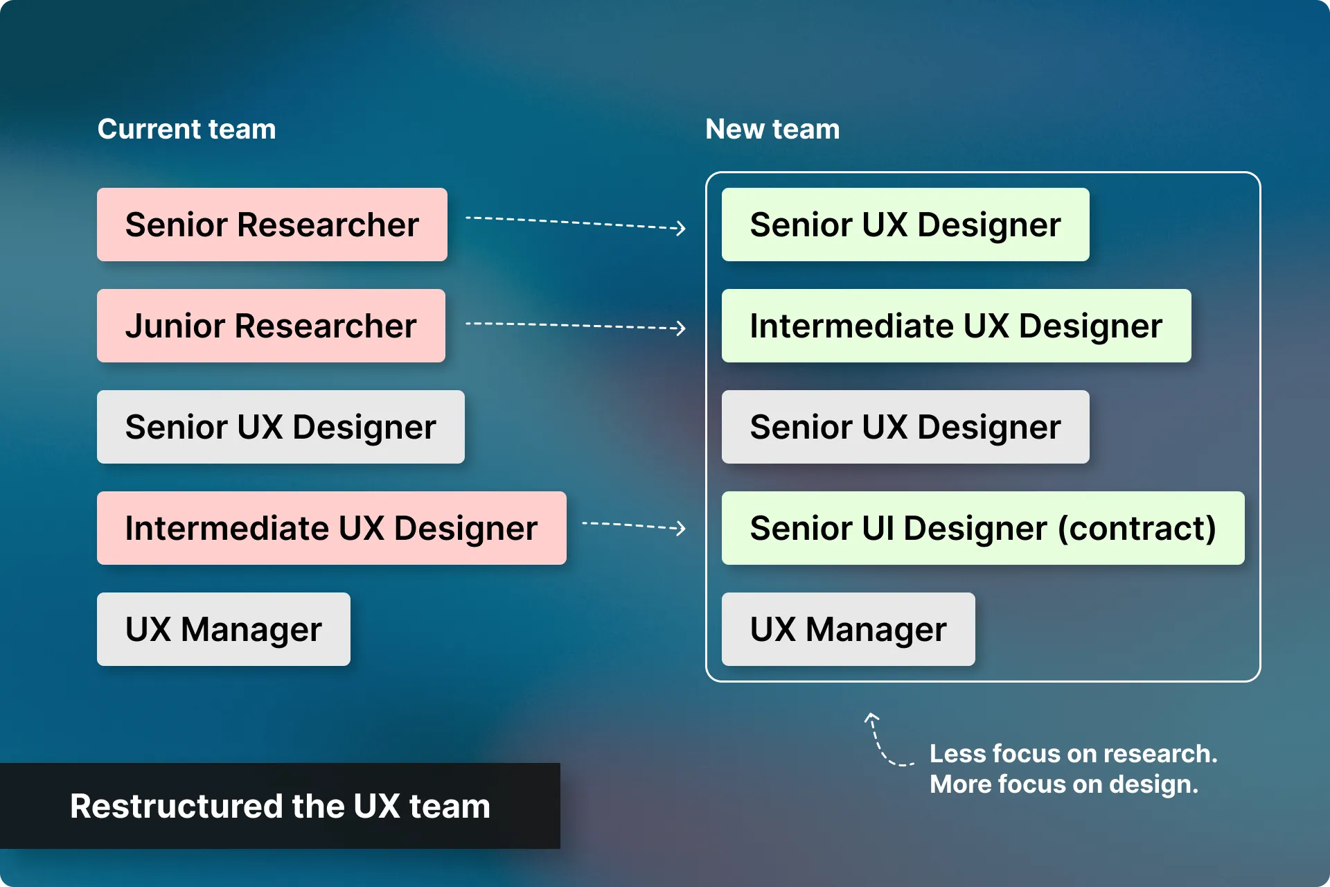
While the planning, benchmarking and pattern library work was underway, I was also actively restructuring the team.
We were research-heavy at a point where we needed design throughput across two giant products. By the end of it, the team was made up of more designers, and stronger ones.
With the plan and tracking tools in place, the pattern library documented, and a design-heavy team, I could confidently switch to a support role and let my team own Moz Pro’s design process, one section at a time.
And how did I guide and support my team throughout each section?
Set a tailored strategy for each section
Sections varied enormously in effort, and each one carried its own set of low-effort requests, many of which needed research or validation before we could feel confident shipping them.
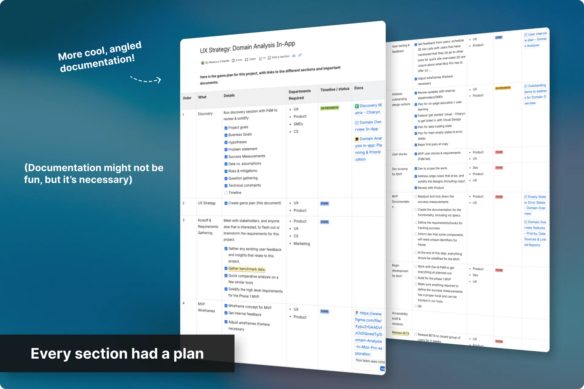
A single template wouldn’t work so I worked with the designer on each section to build a deliberate game plan that included the right UX methods, applied at the right depth, in the right order, and in the right amount of time.
This gave them a step-by-step guide to tackling their section, plus an easy document to follow along for status updates. At any point, I could open that document and see exactly where they were in their process.
Reviewed, mentored, and unblocked
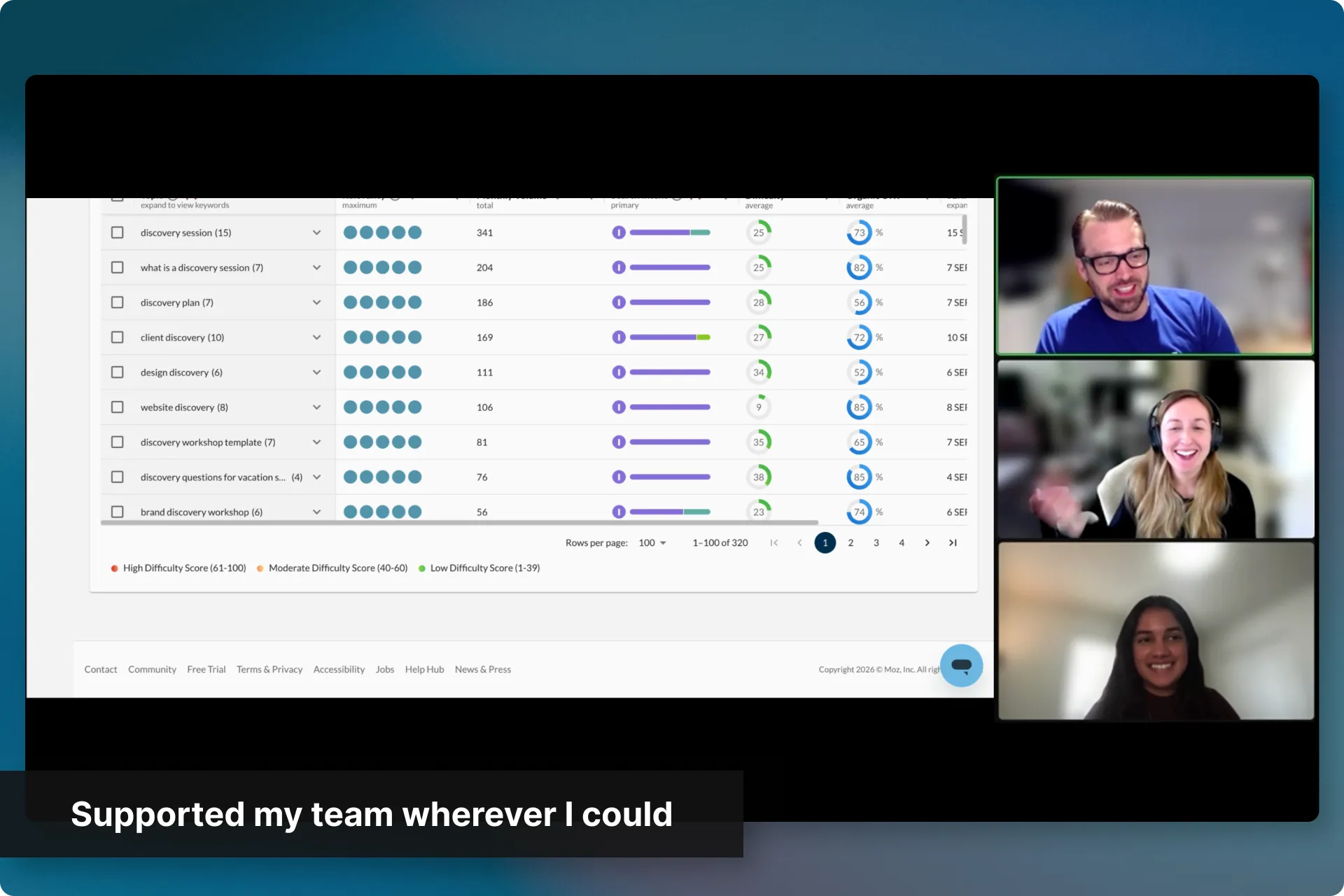
As my team worked their way through their plans for each section, I’d jump in to review designs against the goals we’d set for that section, jumped into design jams when a problem needed more heads, and mentored my reports through the decisions they were making.
I also took on the supporting research work so it didn’t slow them down, including tagging feedback, setting up the infrastructure they needed, and pulling together data when a question came up mid-design.
Kept the pattern library honest
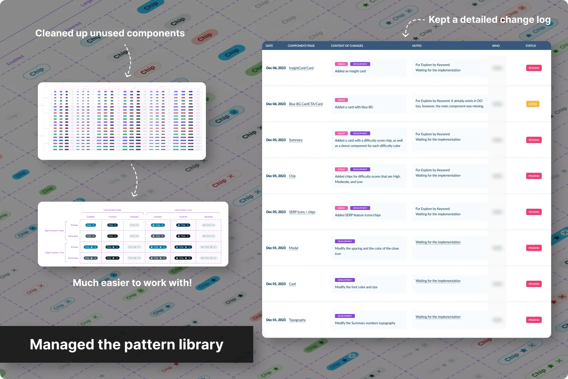
As new designs produced new components, I reviewed commits bi-weekly to ensure additions were coherent and with proper documentation.
Since we were using Material UI as a base, it came with a lot of components that we were never going to use. As designs progressed, I would move clutter and unused components to a separate file so the library stayed digestible rather than becoming its own legacy problem.
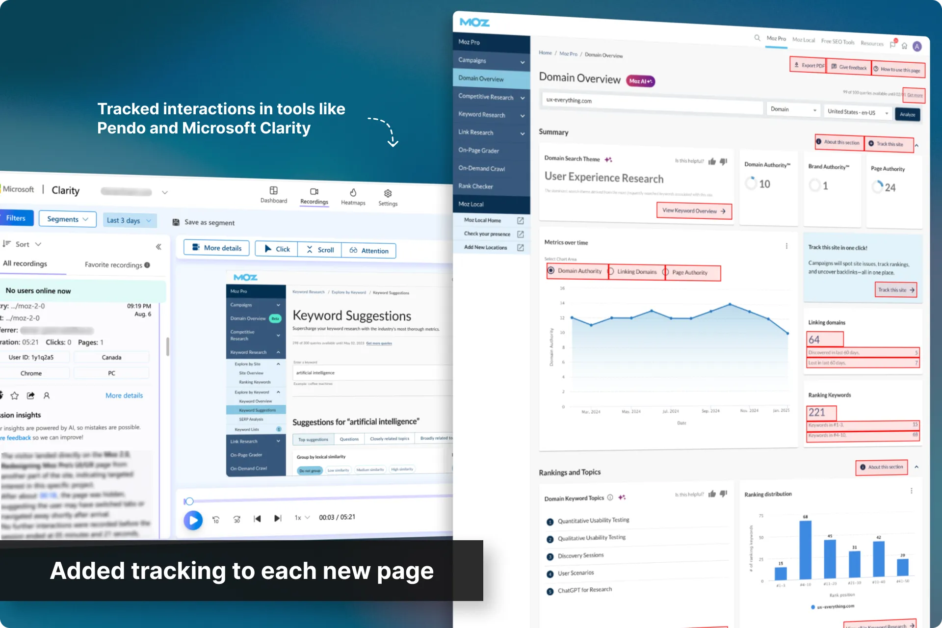
Set up tracking on each new design
As each section was built, I set up new tags in Pendo and Microsoft Clarity so we could track and measure success from the moment it went live, against the benchmark we’d established at the start.
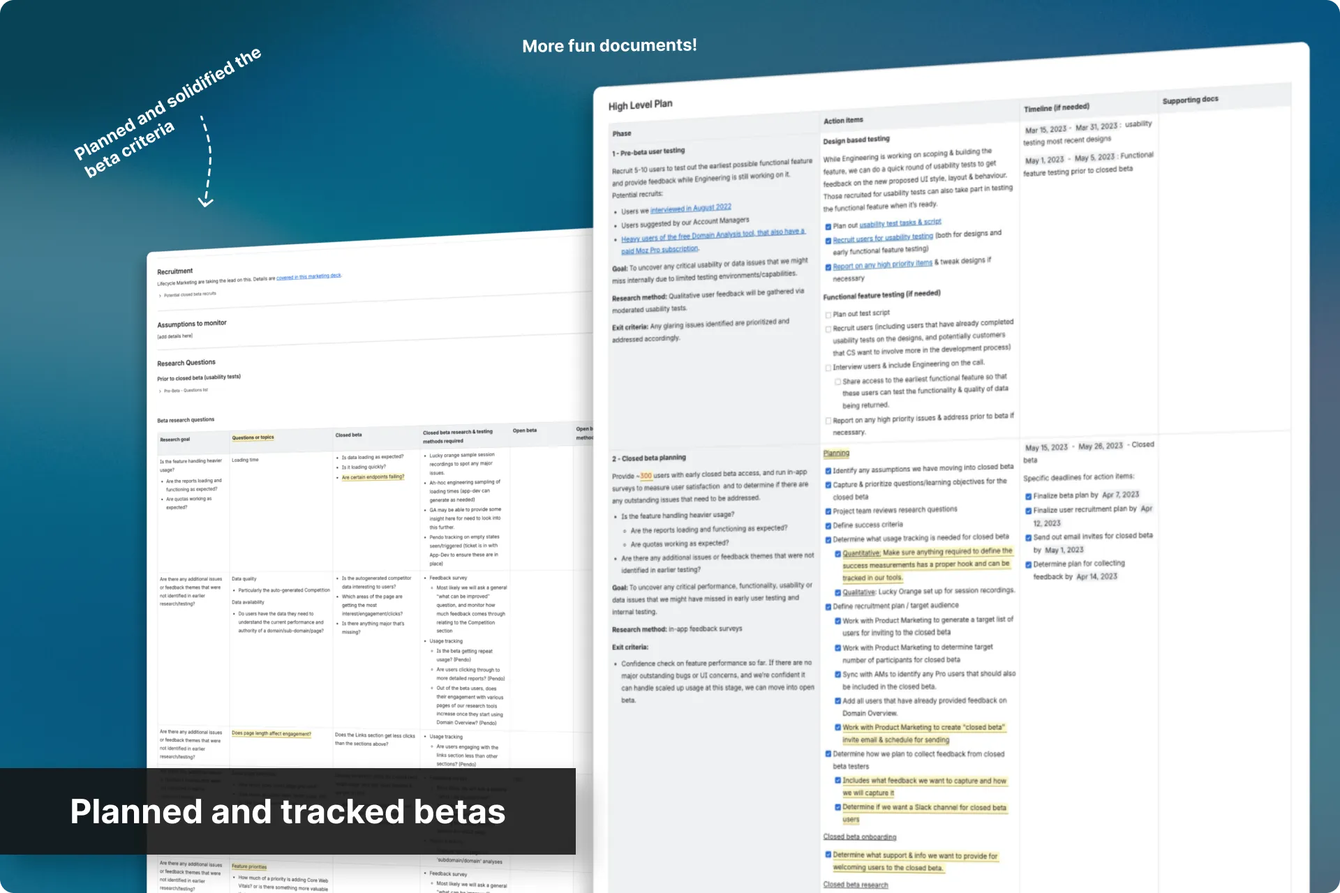
Helped plan the betas and iterate
Some sections needed a beta before release. When that was the case, I helped with planning and setup, such as entry and exit criteria, feedback channels, and turning what came back into concrete recommendations for the team.
Two things came back consistently. Users wanted information shown more densely, not less. They read our extra breathing room as less data. They also disliked the in-between feel of a product being rebuilt one section at a time, which was the tradeoff we’d knowingly accepted.
We iterated in lightweight ways where we could, and that density feedback came back later as a project of its own.
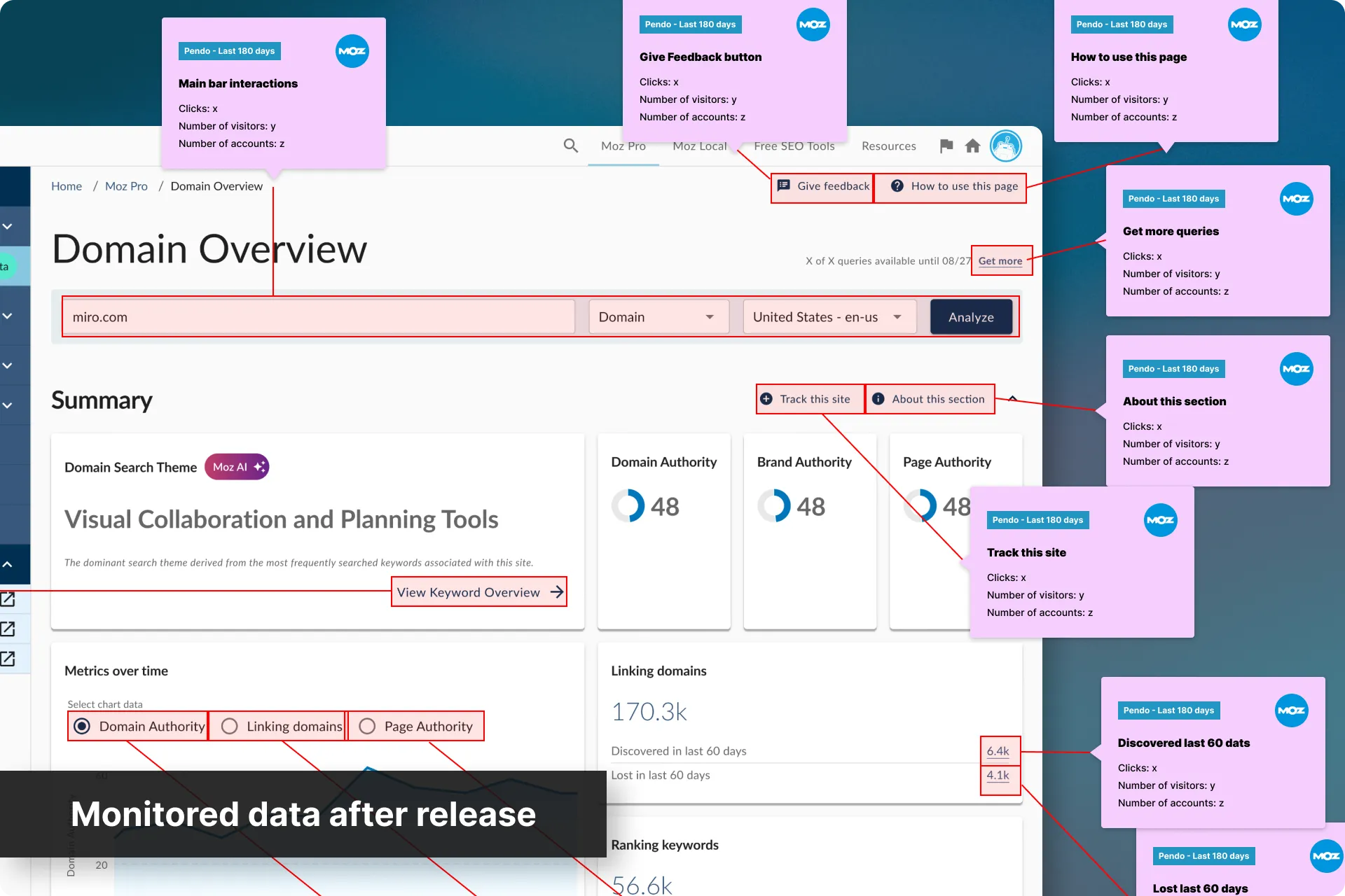
Released, monitored, and went again
As each section shipped, we watched the data and feedback against the success measurements we’d defined for it, and fed anything worth acting on into the next iteration or the next section’s game plan.
Then… we started the loop over. Each time, adjusting what we could to design and build faster, and to reduce the amount of time our users would spend in such a disjointed product.
Everything was going well. We were constantly ahead of Dev and doing our best work… But then…
We were still too slow
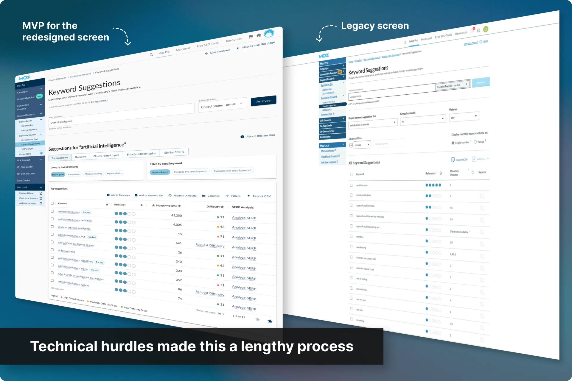
We got through a few sections, but it was indeed a slow process. Every page had to be rebuilt from scratch, and due to backend blockers, we weren’t shipping fast enough.
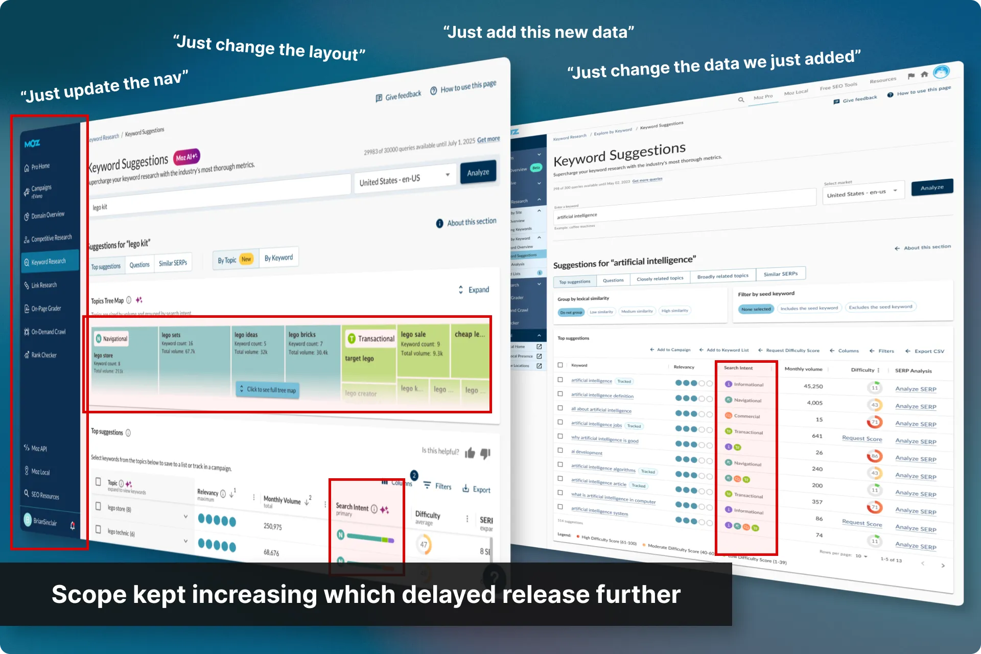
Soon afterwards, leadership’s position became “If we’re taking our time in there, make each release worth the wait. Ship new features alongside the UI update.”, and it kept escalating. Builds already took longer than anyone expected, and as they ran long, more scope arrived. Not small additions any more, but larger features, which took longer still.
This, to me, was the main reason the overhaul underdelivered against its timeline and did Moz Pro a huge disservice as users were still cancelling due to the poor UI/UX.
A fresh dive into the cancellation feedback supported that and found UI/UX was still a top-five cancellation reason.
We didn’t need more features, we needed a faster route to the final UI/UX.
So I pitched a faster approach
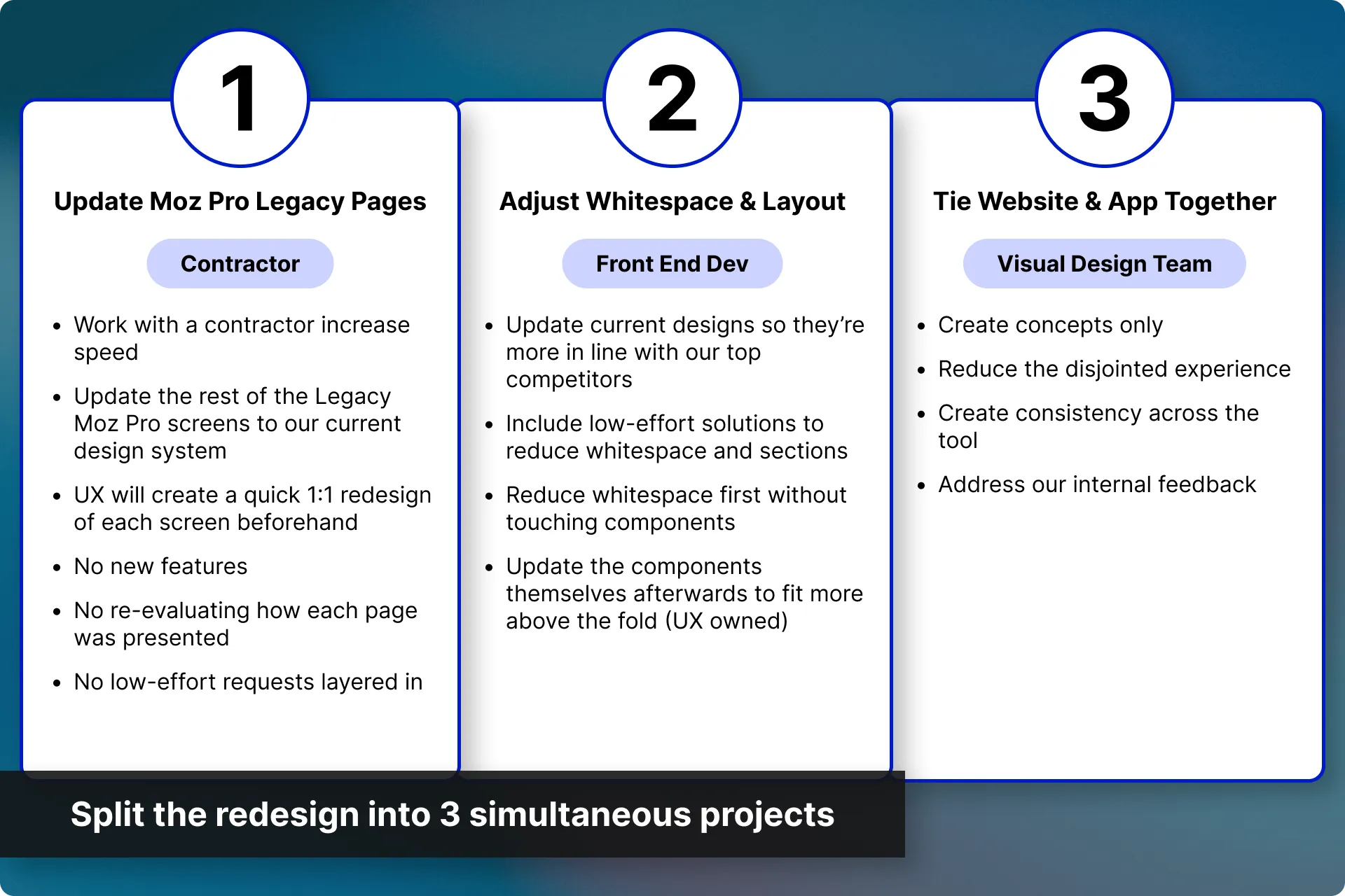
To speed things up and to address the cancellation feedback faster, I kicked off a series of smaller projects that could happen in tandem with each other and with the main UX Overhaul.
These projects were deliberately not all owned by UX. We just helped when needed. This allowed the UX team to continue to focus on the meat of the overhaul.
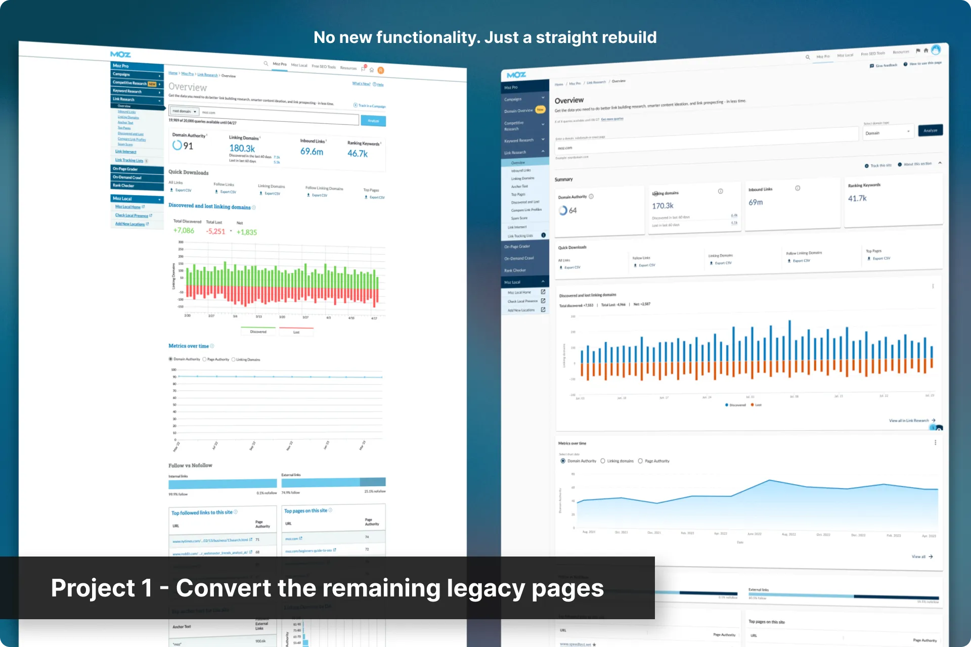
Project 1: Convert the remaining legacy pages
We brought in a contractor to convert the lower prioritized legacy pages to our current designs.
To keep things fast, they had to work with several constraints:
- No new features
- No re-evaluating how each page was presented
- No low-effort requests layered in
My team fed the contractor the basic designs ahead of their build queue and reviewed the finished pages.
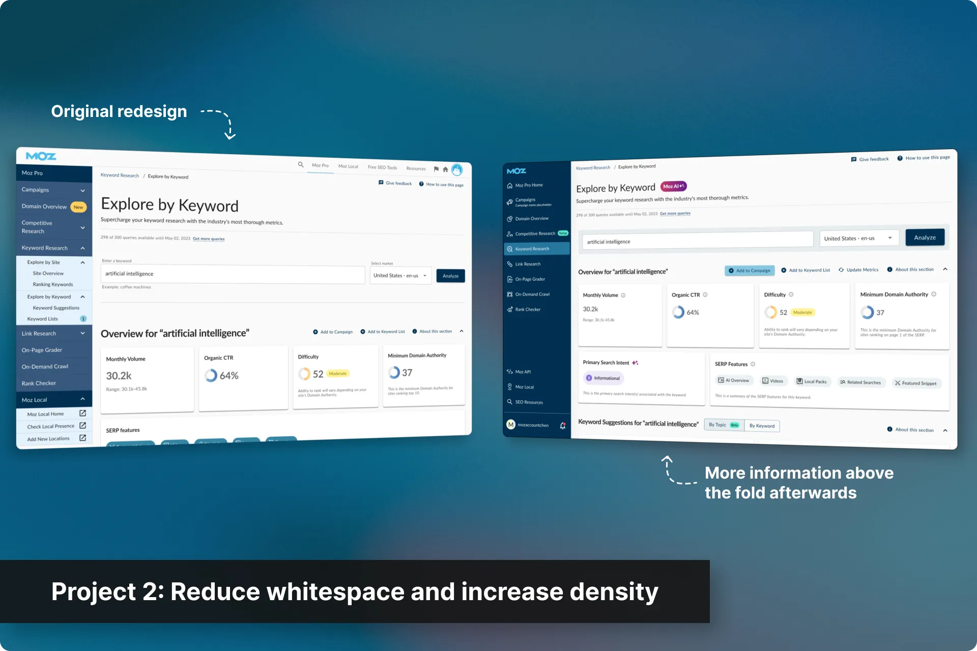
Project 2: Reduce whitespace and increase density
Users were comparing us to SEMrush and Ahrefs, whose tools showed more data above the fold. Our layout and breathing room pushed content down, making the product feel like it had less data than it actually did.
We addressed this in two phases:
- Reducing whitespace without touching components
- Updating the components themselves to fit more above the fold
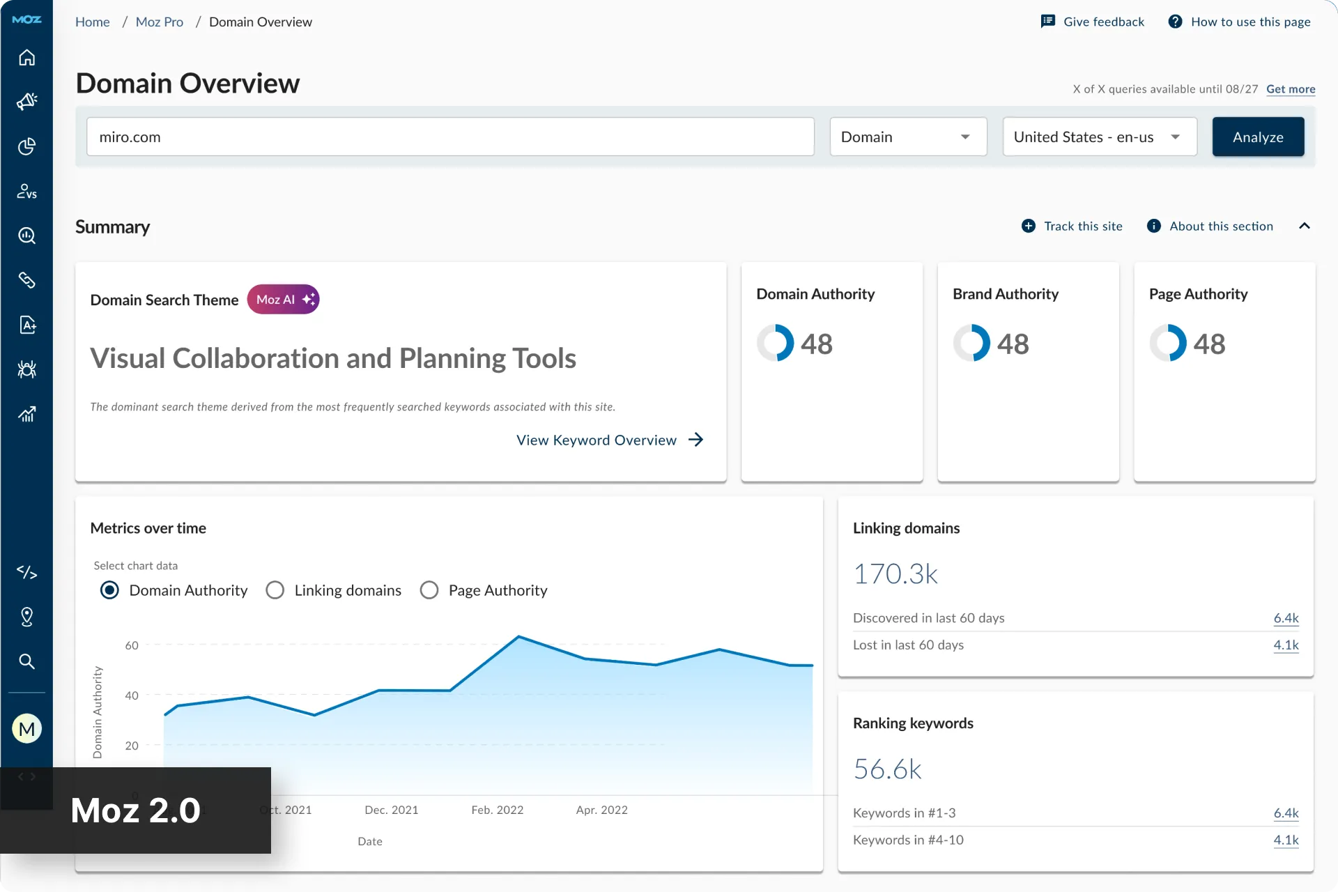
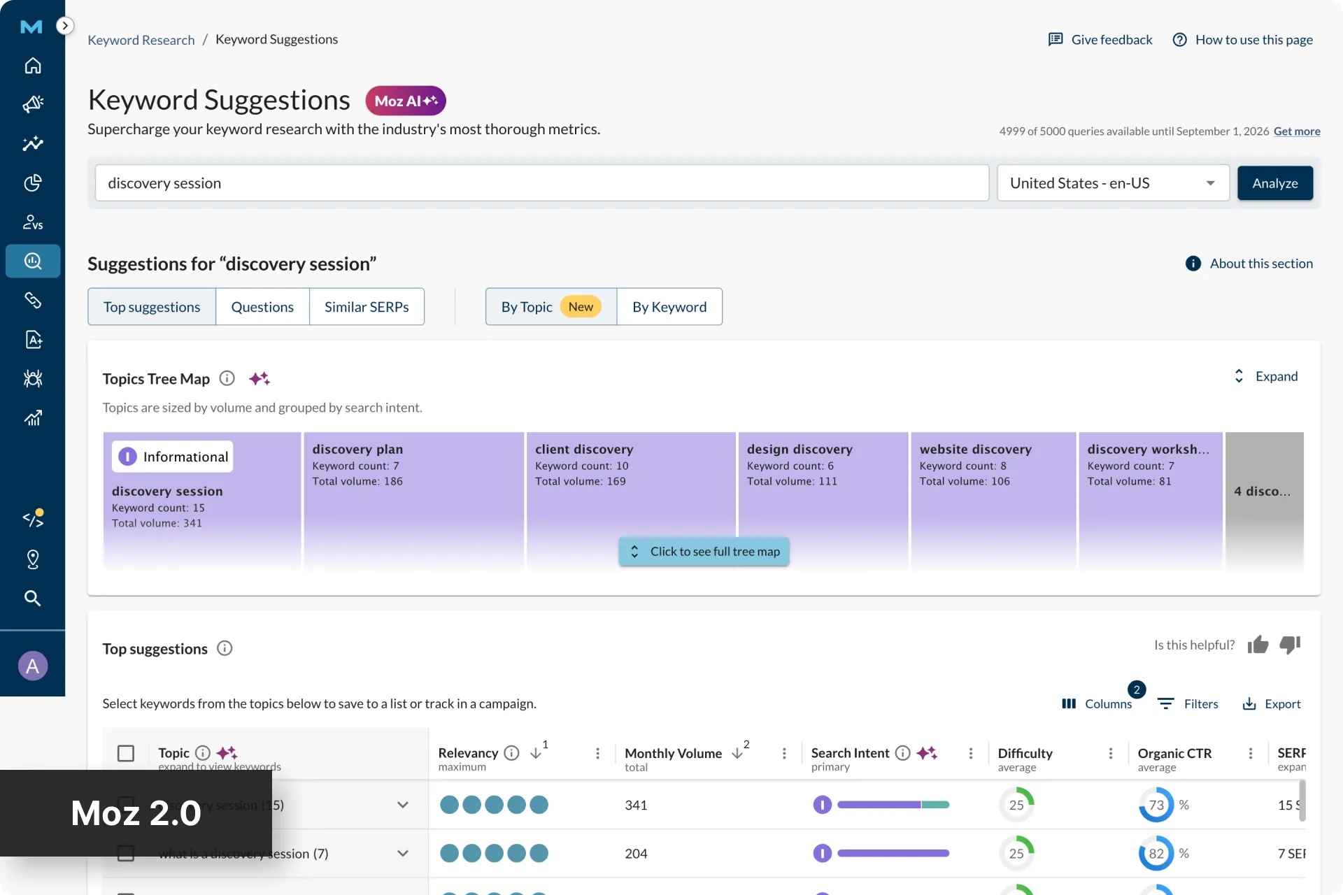
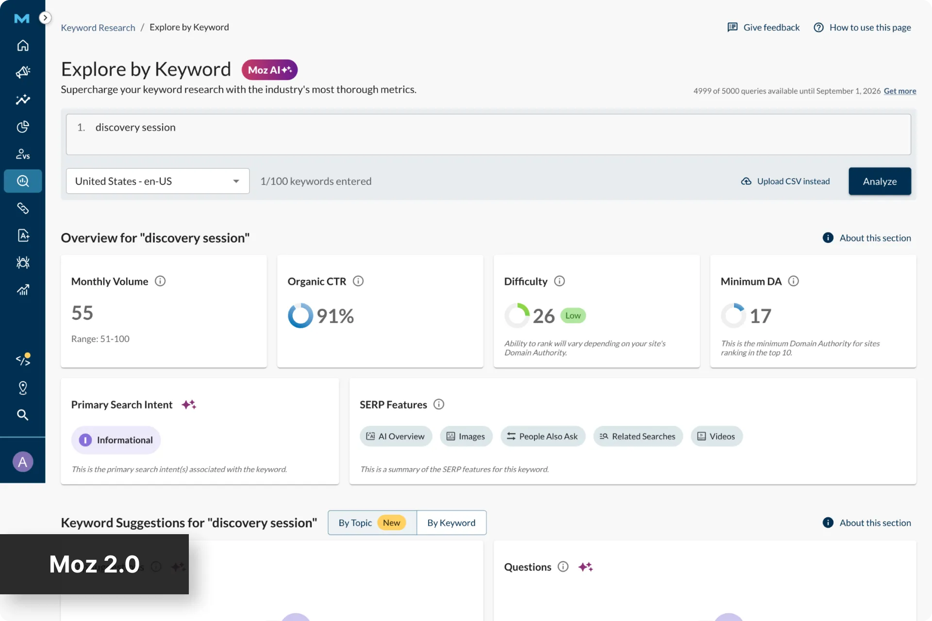
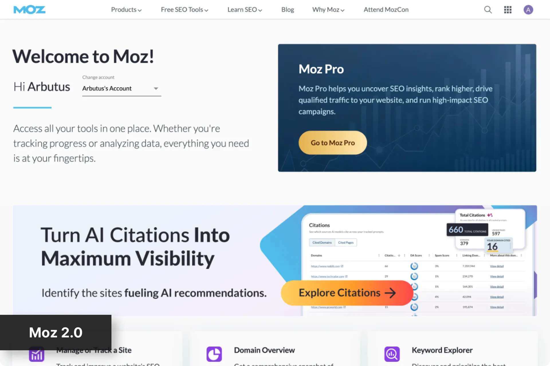
Project 3: Explore tying the website and app together
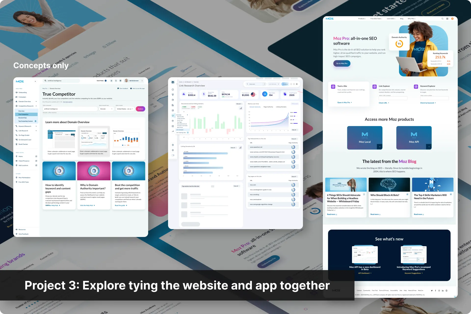
Our marketing site had recently been relaunched with new styling, which left the app looking disjointed next to our own front door. We also had cancellation feedback describing the experience as such.
This project was concepts only, which I handed to our Visual Design team rather than my own, both to balance workload and because a different team would produce genuinely different concepts to critique.
Domain Overview and Keyword Suggestions were the test cases, since between them they cover most of the pattern library.
Et voila!
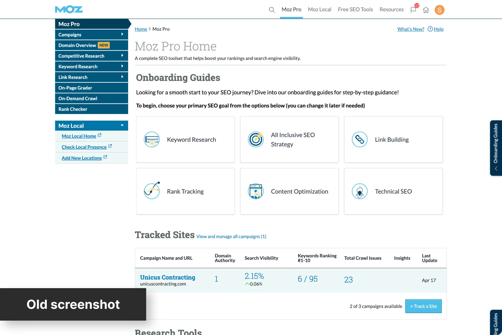
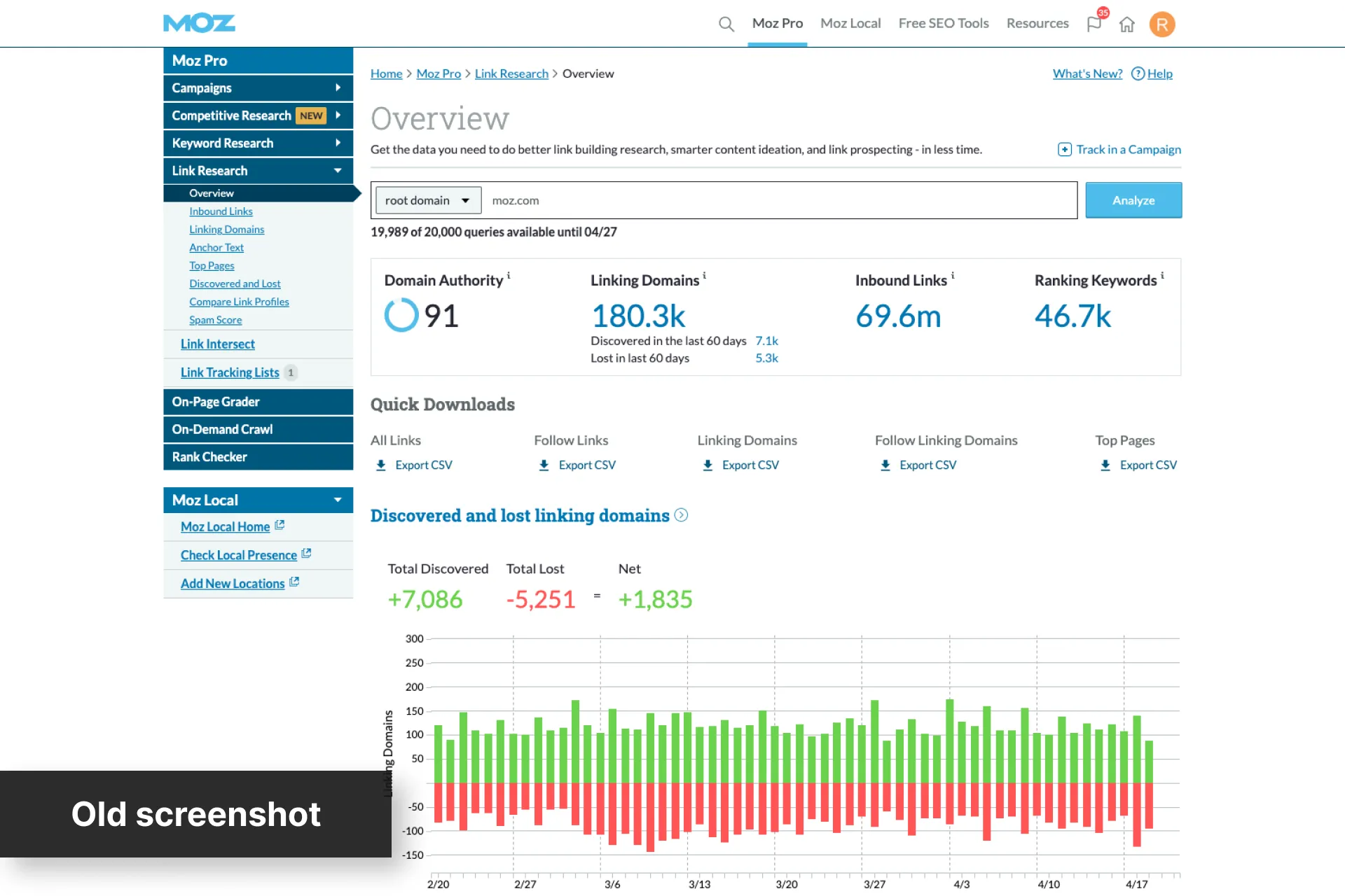
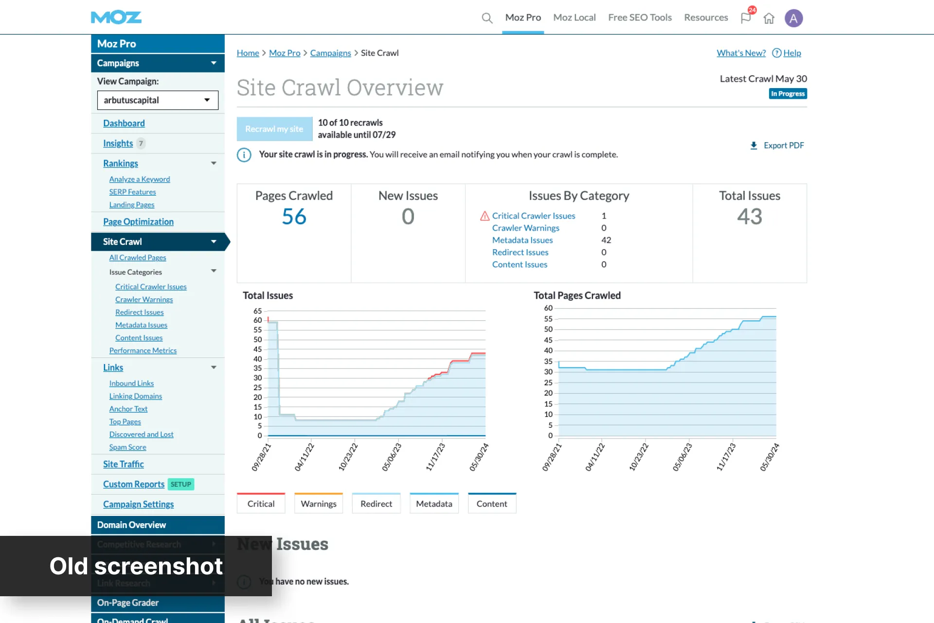
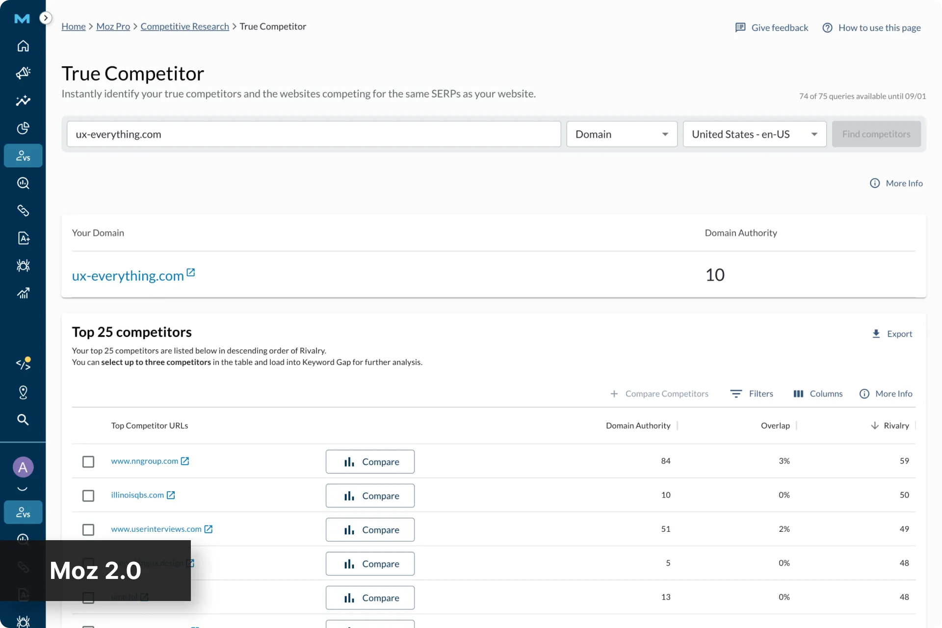
It’s been going well so far!
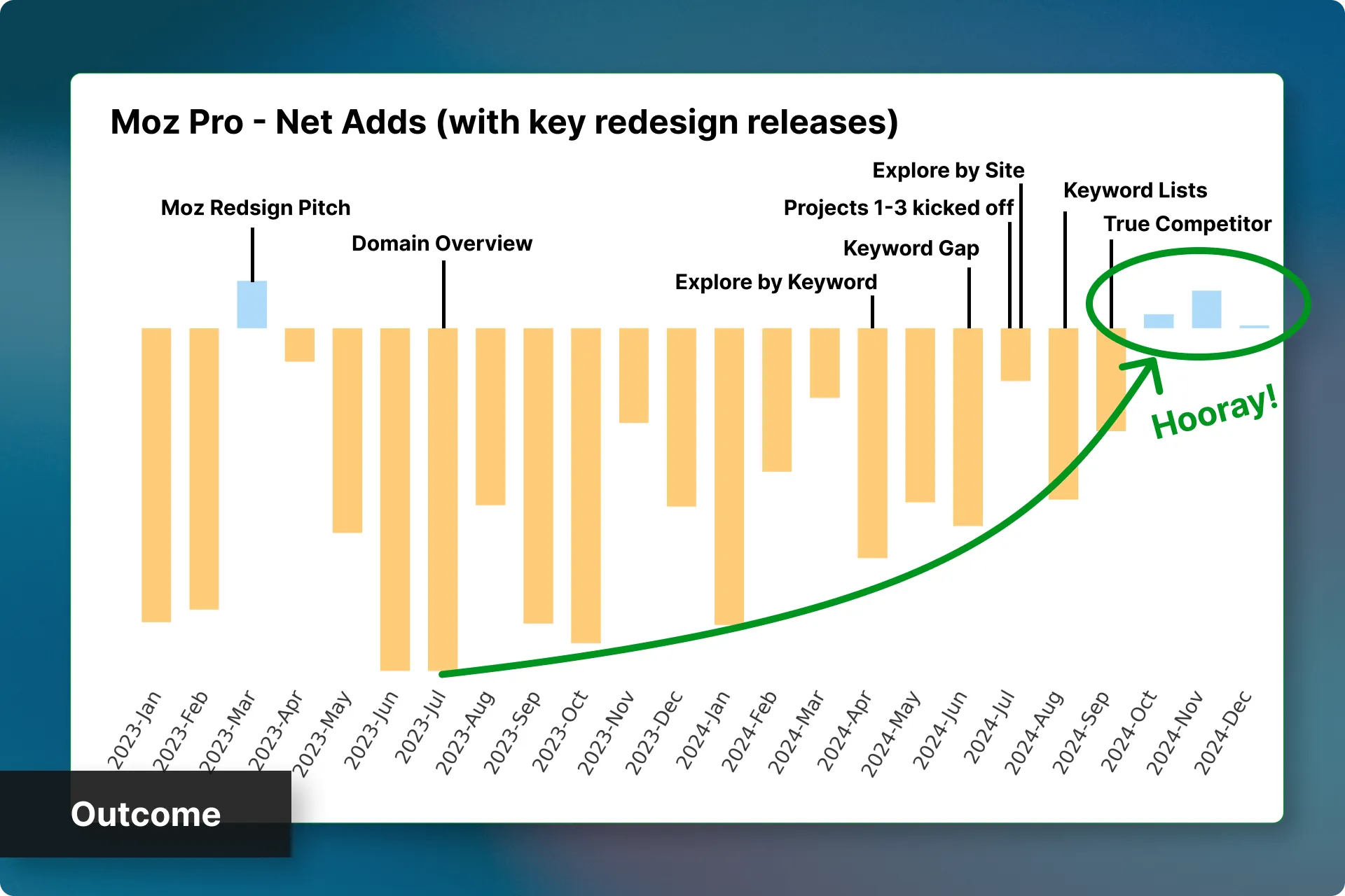
18 months after that first pitch, and after several key sections had been redesigned, we finally started seeing more new paying users than cancellations. Our mission to increase vests and lower cancellations was working.
It’s a little hard to attribute this all on the redesign though, as several other initiatives were underway at the same time, but we did see some other positive outcomes:
- Increase in average interactions per user
- Less exports of our data
- Drastic reduction in negative feedback around our UI/UX
This suggests our users are using the tool more, manipulating the data more instead of exporting it, and generally like the experience better.
 One weekend redesign turned into a new company-wide initiative.
How consolidating our “Aha!” moments into one screen became our most popular page, plus the story of a dramatic redesign that kicked off a larger company initiative.
Next Case Study
One weekend redesign turned into a new company-wide initiative.
How consolidating our “Aha!” moments into one screen became our most popular page, plus the story of a dramatic redesign that kicked off a larger company initiative.
Next Case Study
 An AI passion project I built with Claude
How I used Claude as my design partner and lead developer to build an app that cut my monthly 4-hour bookkeeping task down to 30 minutes.
An AI passion project I built with Claude
How I used Claude as my design partner and lead developer to build an app that cut my monthly 4-hour bookkeeping task down to 30 minutes.


 Email me