Arbutus Capital
Evolving Arbutus Capital to a modern digital experience
How I rage-redesigned, SEO’ed, and rebuilt Arbutus Capital’s website, leading to a 24x increase in organic business enquiries.
Context
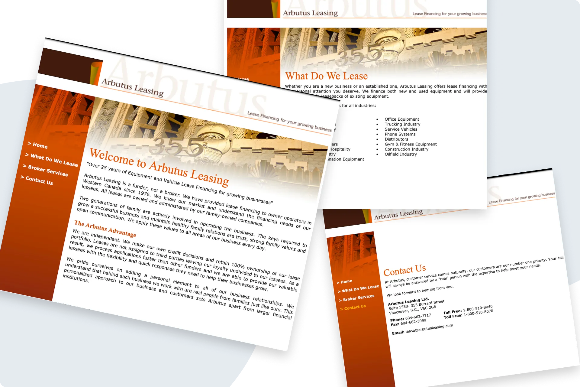
The original site
A longtime friend and owner of Arbutus Capital - an equipment leasing company - was struggling to get new clients.
His site hadn’t been updated in a VERY long time so I told him that he could get more organic business with an updated website and a solid SEO strategy.
More context
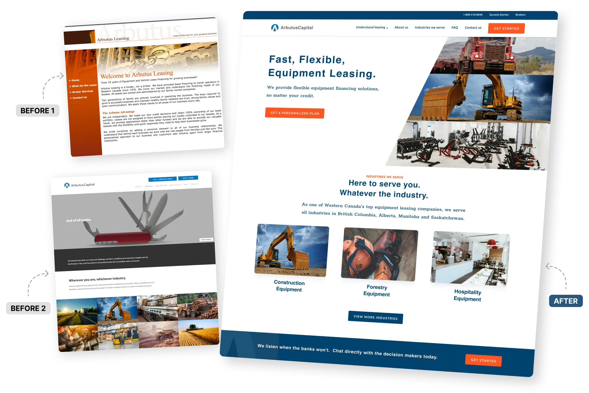
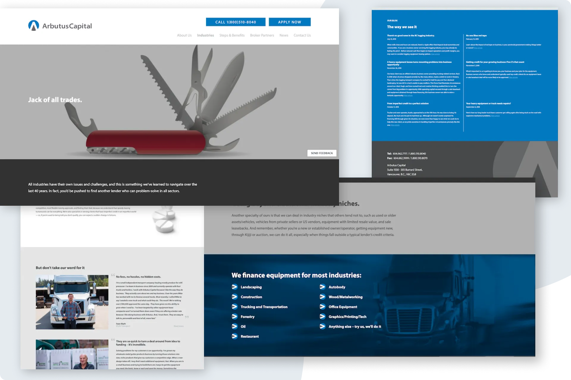
A horrible redesign
18 months later...
They redesigned their site but only received 3 new enquiries in the last year, and that it wasn’t worth the small fortune they paid to do so.
What’s more, those 3 enquiries were a result of paid advert campaigns, not organic traffic.
I looked at their new site and understood what was going on - They went from the world’s worst website to the world’s second worst website.
Other than a few nice images and some new colours, everything was just... horrible.
Problem
Arbutus Capital’s new website was STILL horrible and they only received 3 new enquiries in the past year.
North Star Goal
Increase organic enquiries through the website by improving trust, relevance, and visibility.
Pillars
🎯 Trust
Redesigning the experience to build immediate credibility and reduce friction.
🎯 relevance
Aligning content with high-intent search behaviour to drive qualified traffic.
🎯 Visibility
Strengthening technical SEO to improve discoverability and search performance.
Step 01
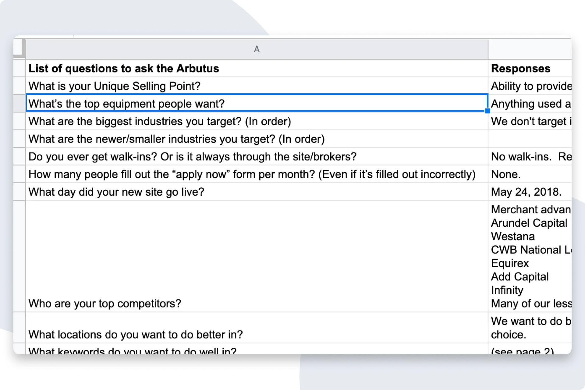
Discovery Session
I kicked things off with a Discovery Session to better understand their business, position in the market, and the current state of their site.
This Discovery Session had some extra questions in there because I was also going to do their SEO work.
Step 02
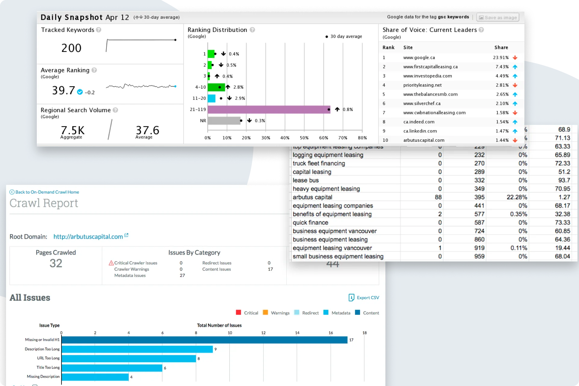
Performed an SEO audit
Using the tools I had access to while working at Moz and STAT, I conducted an SEO audit which included:
- What they were ranking for
- If they ranked for any of their desired search terms
- How their site was performing technically
- How they compared to their competitors
- Opportunities for improving their rankings
Step 03
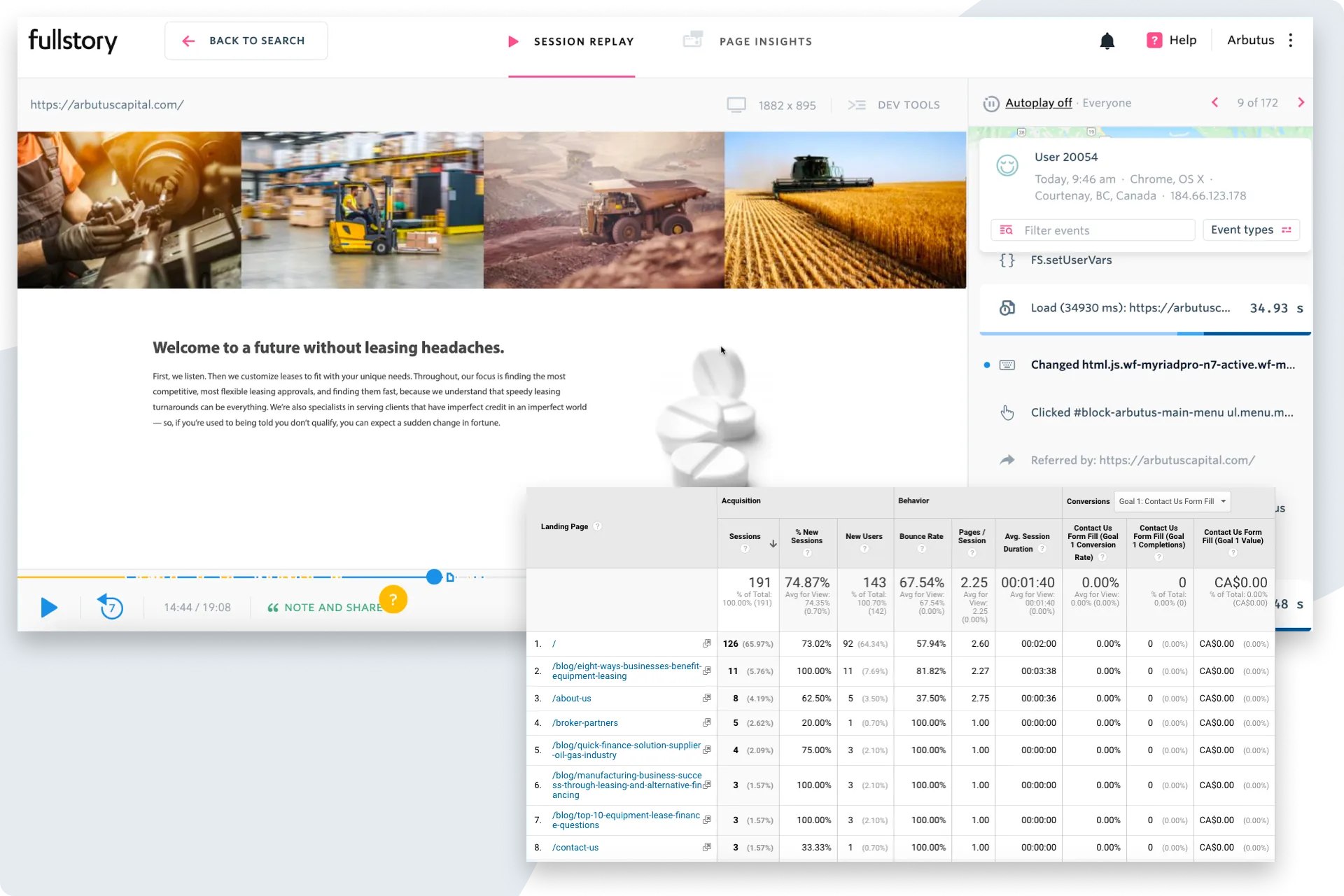
Gathered usage data
I installed Fullstory into their backend to collect recordings of users going through their site. This would allow me to see what users were doing on what page, what they were reading, what they were skipping, etc...
I also dug into their Google Analytics data to see how their pages were performing at a higher level.
What I learned:
They had some blog pages that were performing well, but when users would organically come to their main site, it was obvious they were skipping over the long paragraphs of text and would back out quickly.
The site either didn’t have what they were looking for, or they just couldn’t find what they were looking for.
Step 04
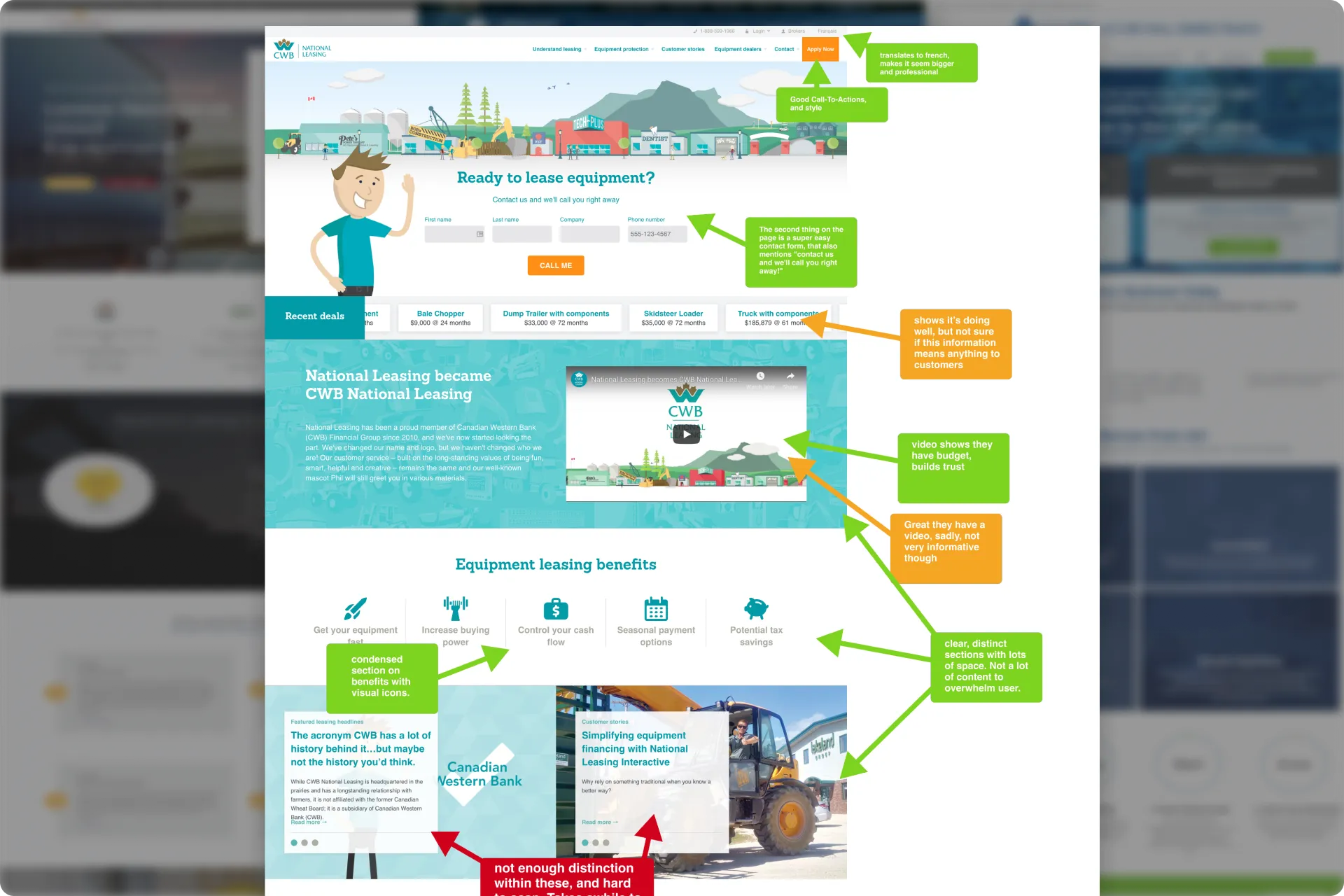
Competitive Analysis
I got a list of their competitors from our initial Discovery Session and dove into their sites, calling out what worked well and what did not from a UX perspective.
What I learned
Interestingly enough, most of their competitors didn’t have amazing websites. Their sites were better, just not great. This meant we had an opportunity to quickly build trust with potential clients.
Step 05
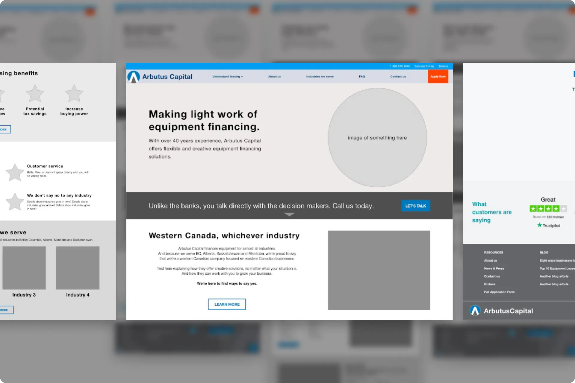
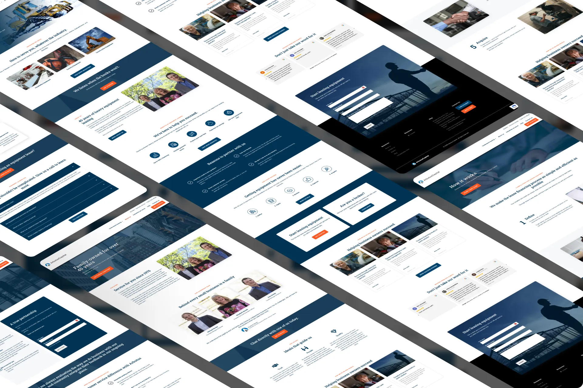
Wireframed the site
We knew from site usage data that 82% of their visitors were on desktop, and 17% were on mobile, so I started with wireframes for the desktop version first.
Step 06
First pass of SEO
With the first draft of the wireframes done, I could see where text was going to be placed and how much room I had to work with.
I started plugging in the list of targeted keywords I created based off my SEO dive and findings.
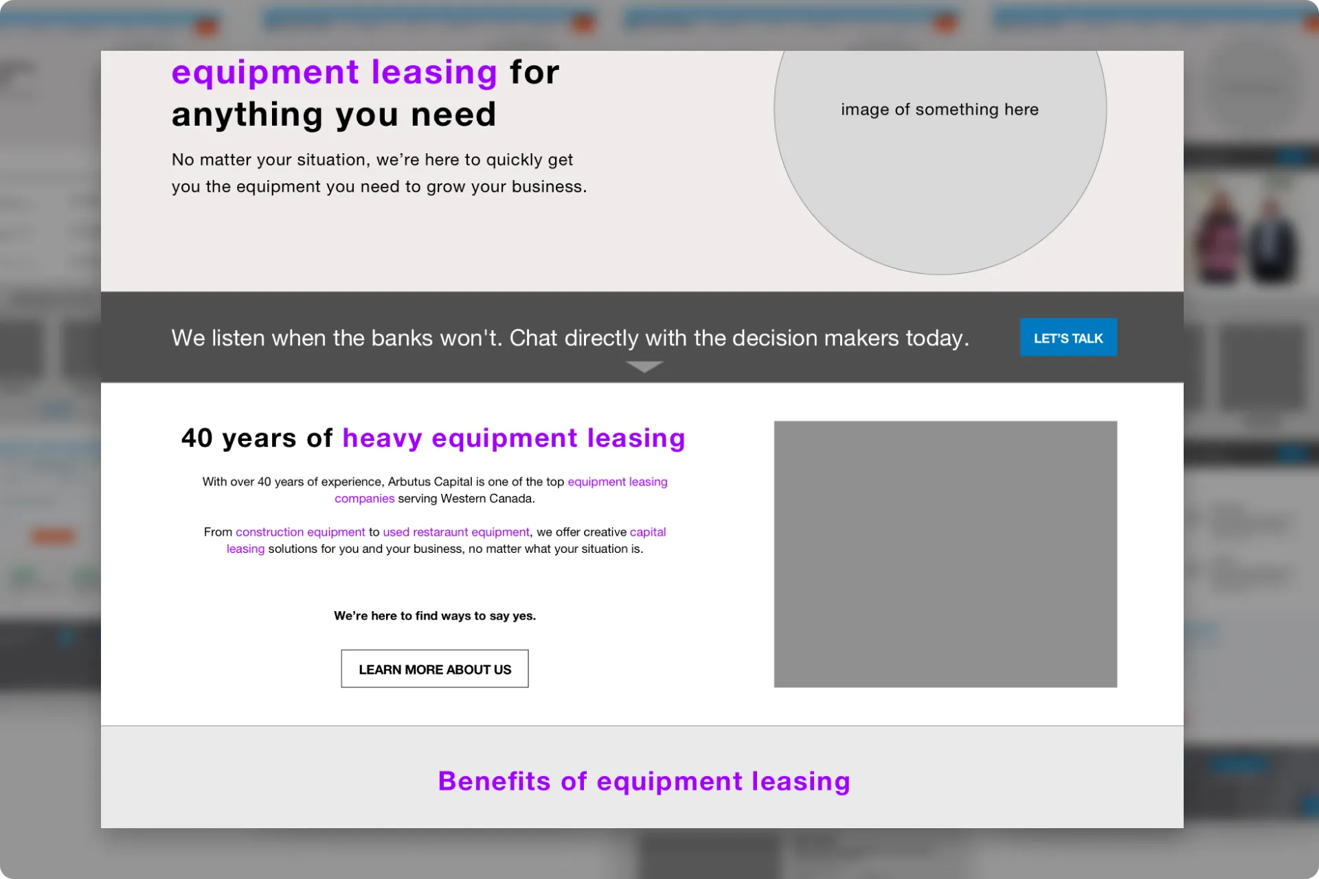
Step 07
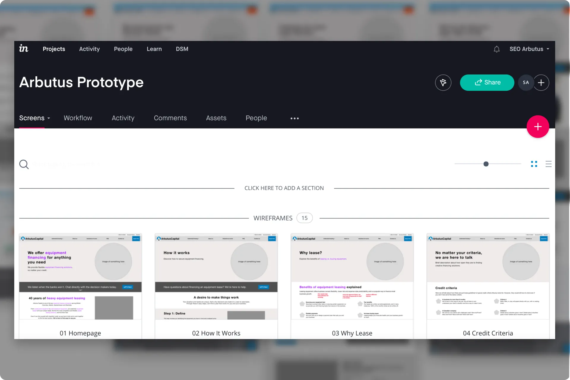
Prototyped and reviewed
I then put everything into an inVision prototype (RIP inVision) and reviewed it with Arbutus. This review was mainly high level functionality, content, and information architecture.
What I learned:
There were a few minor adjustments needed, but with Arbutus happy at the check-in, I was then free to start coming up with some mockups.
Step 08
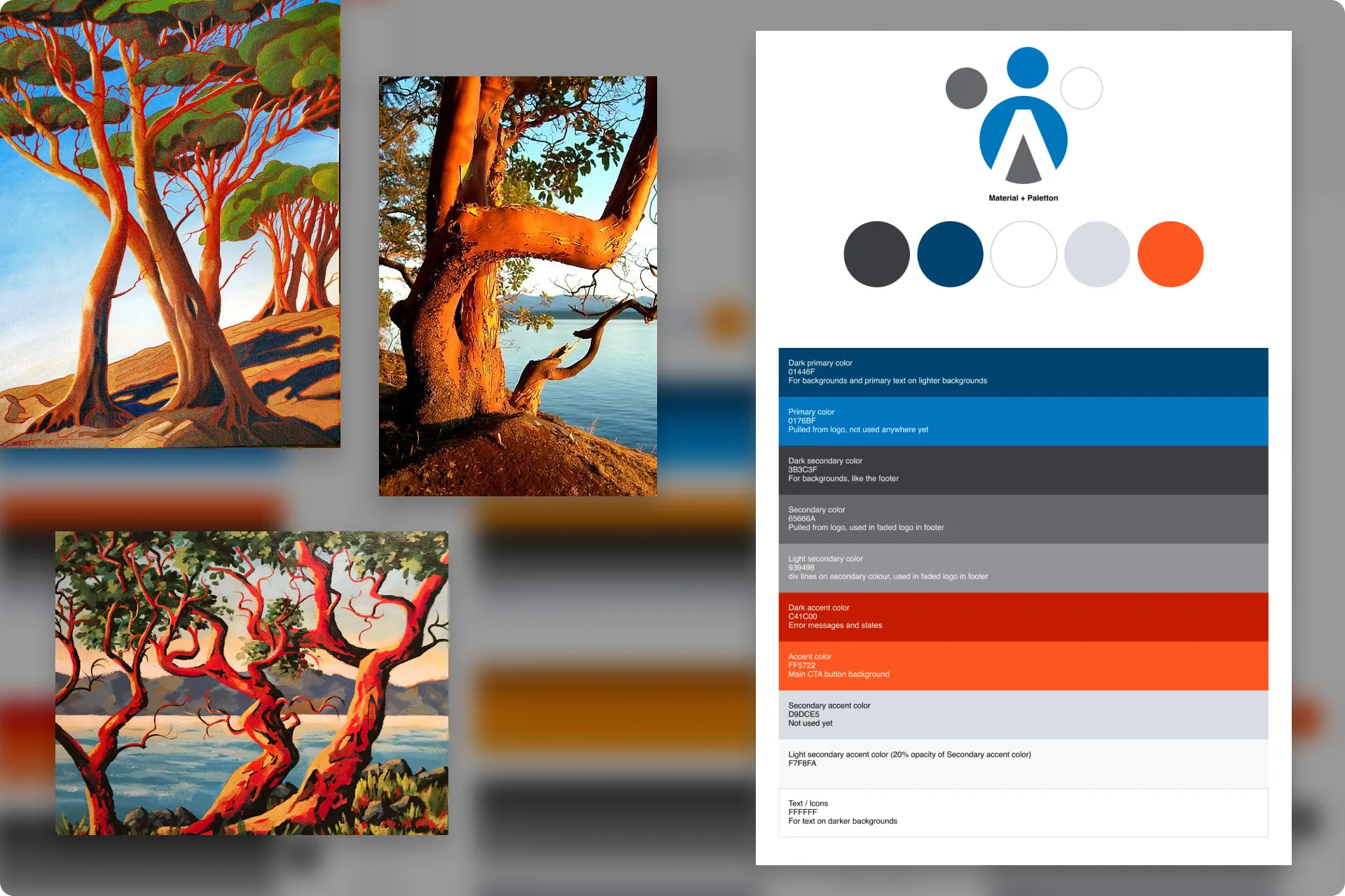
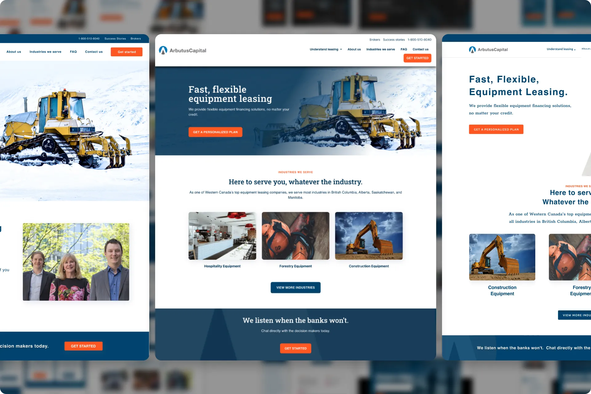
Colour Palette
Their first redesign included a new logo with some updated colours which Arbutus wanted to keep. This gave me a starting point to finalize a colour palette.
The biggest change I added was a vibrant orange-red colour, inspired by the Arbutus tree, for main CTAs and callouts.
Step 09
Mockups and reviews
I created some different mockups and threw them into another prototype to review it more easily with Arbutus. There was also a prototype for mobile and tablet.
What I learned:
Arbutus was extremely happy with the progress and direction of the site. We landed on a final direction and got the sign off to start building it.
Step 10
Built the website
I built the site using Elementor in Wordpress and worked with a content writer to publish Blog posts every few months.
I also added several tracking tools in the backend so I could monitor the performance of the site, its SEO, and provide monthly reporting.
The outcome
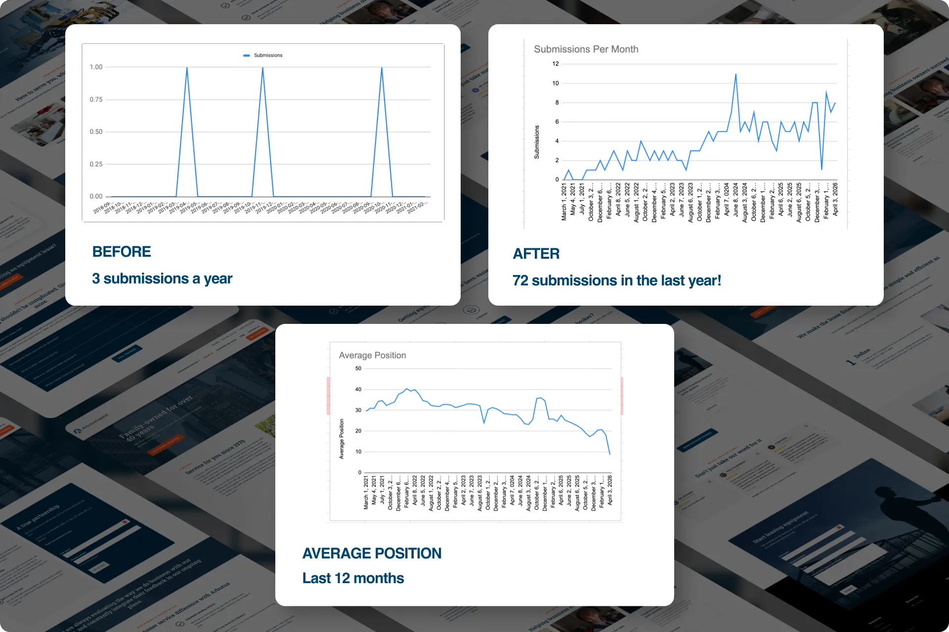
24x increase in submissions
Arbutus went from 3 submissions a YEAR to receiving around 4-8 submissions a MONTH now. They got 72 submissions in the last year alone. That’s a 24x increase in where they started.
Their average position in the search results is also steadily improving which is getting them more traffic and more submissions. It has gone from an average of position 30 to around position 8 (first page on Google)