A new approach to AA Accessibility
Reinvented how Bar charts can meet accessibility standards without sacrificing aesthetics.
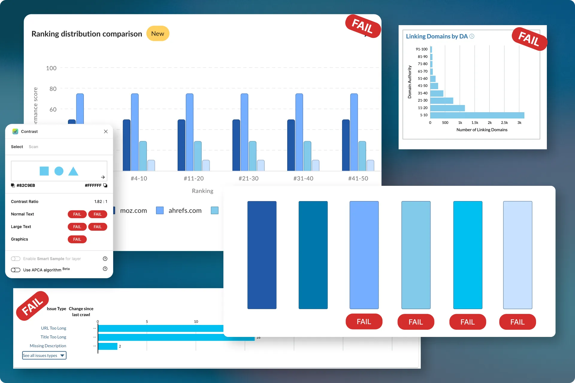
Bar charts were not accessible
Our UX overhaul of Moz Pro was a big opportunity to improve accessibility within the tool, however, charts and visualizations proved difficult due to 2 main guidelines:
1.4.1 Use of Color (Level A) Color is not used as the only visual means of conveying information, indicating an action, prompting a response, or distinguishing a visual element.
1.4.11 Non-text Contrast (Level AA) The visual presentation of the following have a contrast ratio of at least 3:1 against adjacent color(s):
- User Interface Components
- Graphical Objects
This meant that our current bar charts could not rely on colour alone and needed to pass a contrast ratio of 3:1.
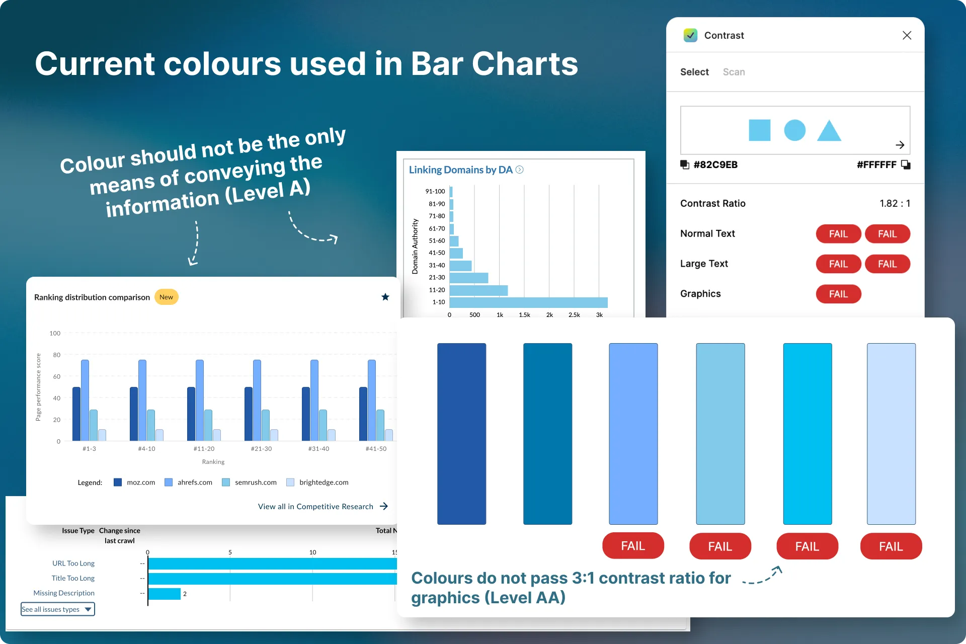
Problems
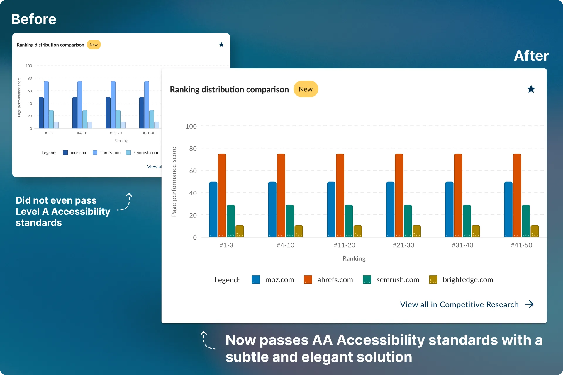
Bar charts did not pass Level A accessibility standards
Our bar charts only relied on colours to convey information, and even then, those colours did not meet the required 3:1 contrast ratio. This violated 2 basic guidelines
1.4.1 Use of Color (Level A) Color is not used as the only visual means of conveying information, indicating an action, prompting a response, or distinguishing a visual element.
1.4.11 Non-text Contrast (Level AA) The visual presentation of the following have a contrast ratio of at least 3:1 against adjacent color(s):
- User Interface Components
- Graphical Objects
Goals
Redesign our bar charts
Bar colours should pass a 3:1 contrast ratio with their immediate background
Bars should be easily distinguishable and identifiable to their correlating data
Close the competitor-parity gap on quick-start overview pages
Addressing the contrast ratio
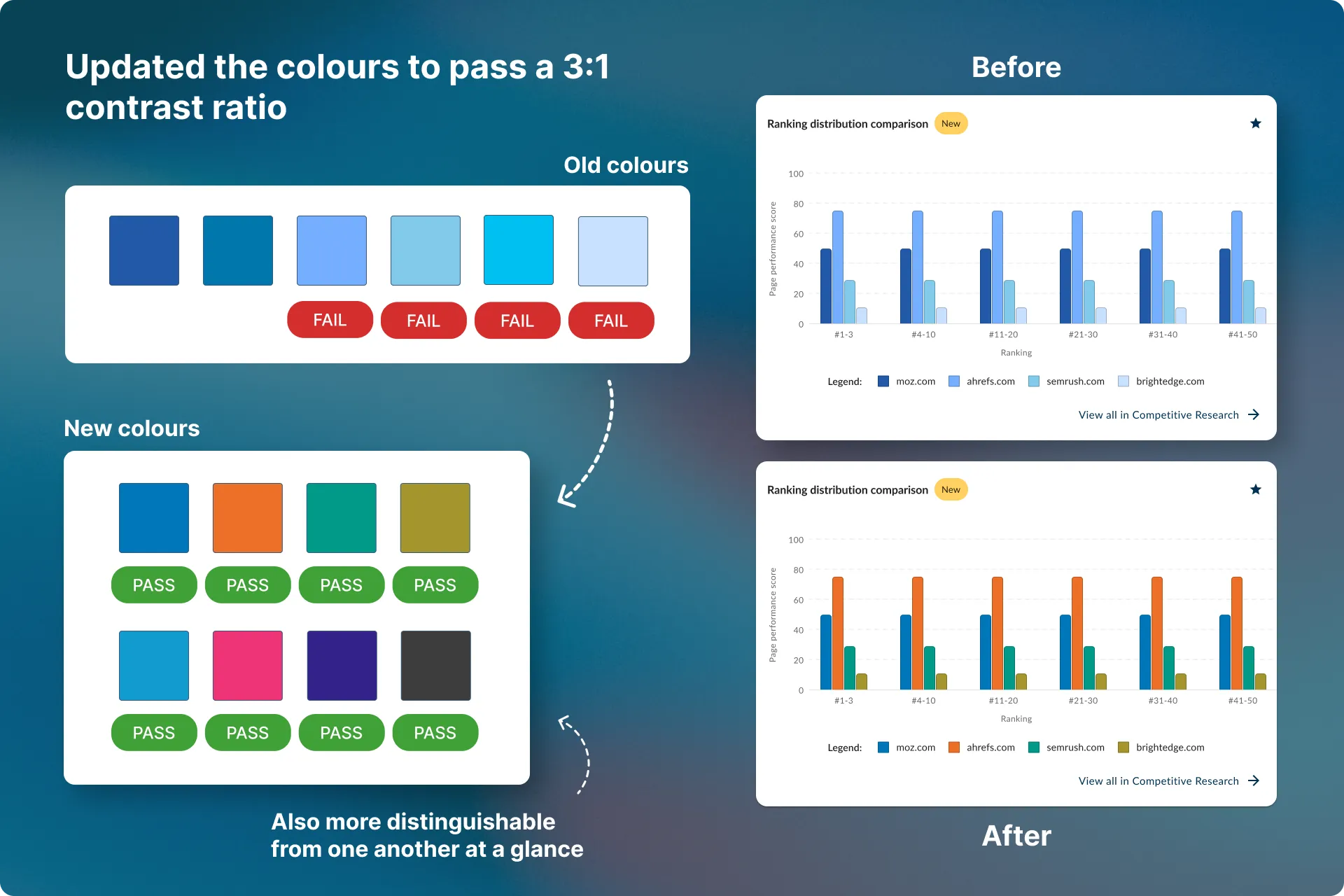
The first thing I did was work on a set of new colours that passed a 3:1 contrast ratio.
As this would be for charts, I also wanted the colours to be more distinguishable from one another at a glance.
Review with our Accessibility Agency
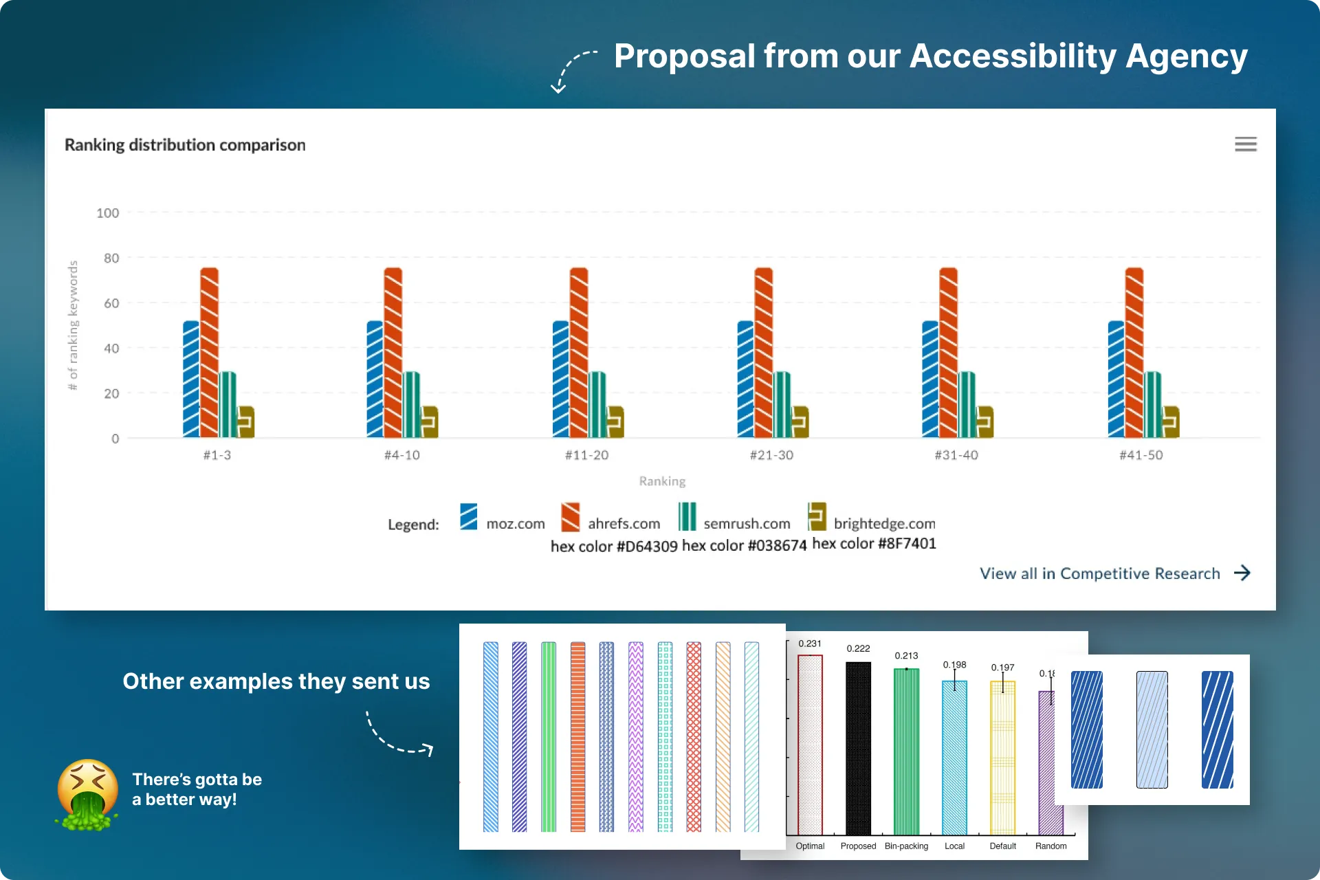
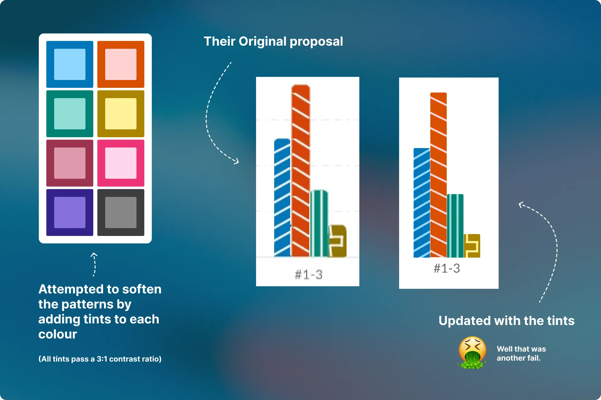
Throughout our redesign, we worked with an accessibility agency to critique and guide us. As colour alone could not be the only means to convey information, they told us the ONLY solution is to place patterns inside of our bars.
They sent us some examples, however, what they were proposing for our bar charts was not an elegant solution, and risked ruining the experience for a lot of our users.
Adjusted the colours and created tints
I understood why the patterns were important; however, their proposal was not elegant.
I thought maybe I just needed to soften the patterns inside each bar so they were not so prominent. To do that, I adjusted the colours so each one had a tint that also passed a 3:1 contrast ratio.
What I learned
This didn’t work either. At all. More subtlety was needed.
Explorations
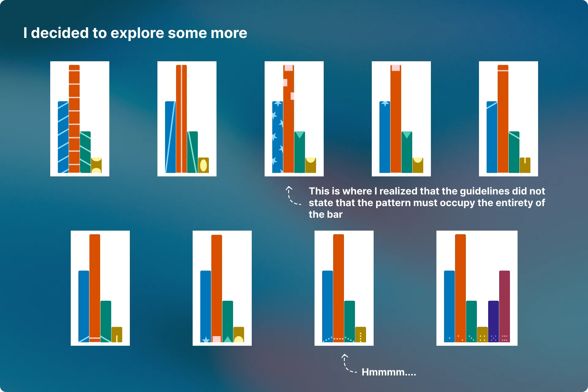
Softening the lines inside did not do the trick so I decided to play around with the patterns themselves to make them less prominent.
One thing I quickly realized is that the guidelines did not state that the pattern must occupy the entirety of the bar. This paved the way for more subtle explorations, eventually leading to the final outcome.
Final designs
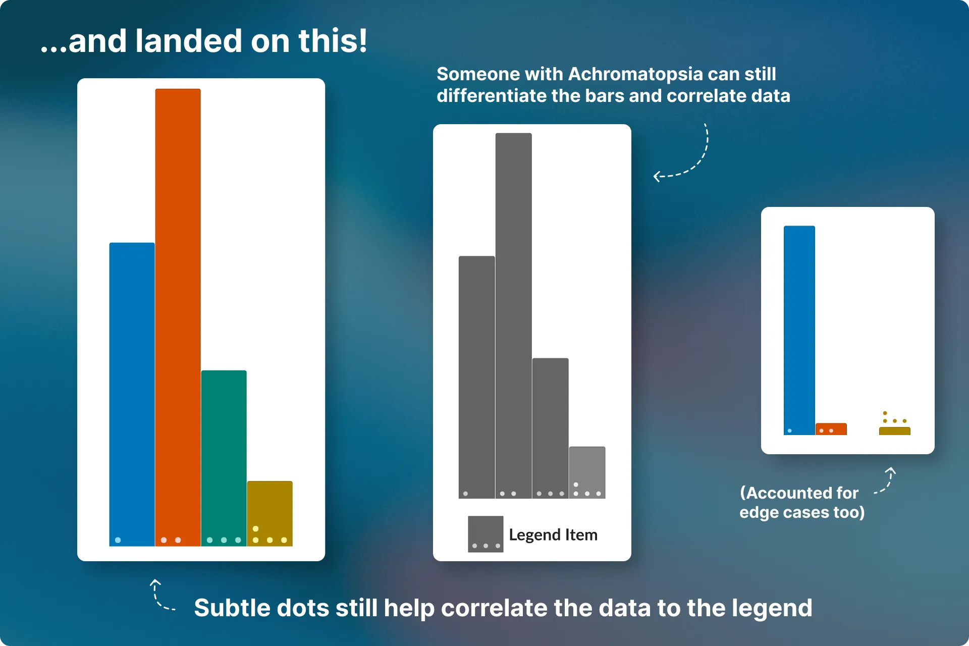
I eventually landed on this. It passes contrast and uses subtle dots to tie the legend items to their appropriate bars.
Even someone with complete Achromatopsia will be able to understand these bars.
Bar charts that meet WCAG AA standards
We have not received any feedback, good or bad, about this change.
That’s okay, though. The bar charts that once failed a basic Accessibility test now pass AA standards. It’s one more step we’ve completed toward making our product accessible to more people.
 Making it easier for users to compare their data
A quick project with an extremely lean design process that decreased our Churn rate by 41%.
Next Case Study
Making it easier for users to compare their data
A quick project with an extremely lean design process that decreased our Churn rate by 41%.
Next Case Study
 Evolving Arbutus Capital to a modern digital experience
How I rage-redesigned, SEO’ed, and rebuilt Arbutus Capital’s website, leading to a 24x increase in organic business enquiries.
Evolving Arbutus Capital to a modern digital experience
How I rage-redesigned, SEO’ed, and rebuilt Arbutus Capital’s website, leading to a 24x increase in organic business enquiries.


 Email me