STAT 2’s Design sprints
Diving into our repeatable design process
How we modernized STAT incrementally through a repeatable design sprint process that kept UX ahead of Dev without sacrificing research, validation, or confidence in our decisions.
Context
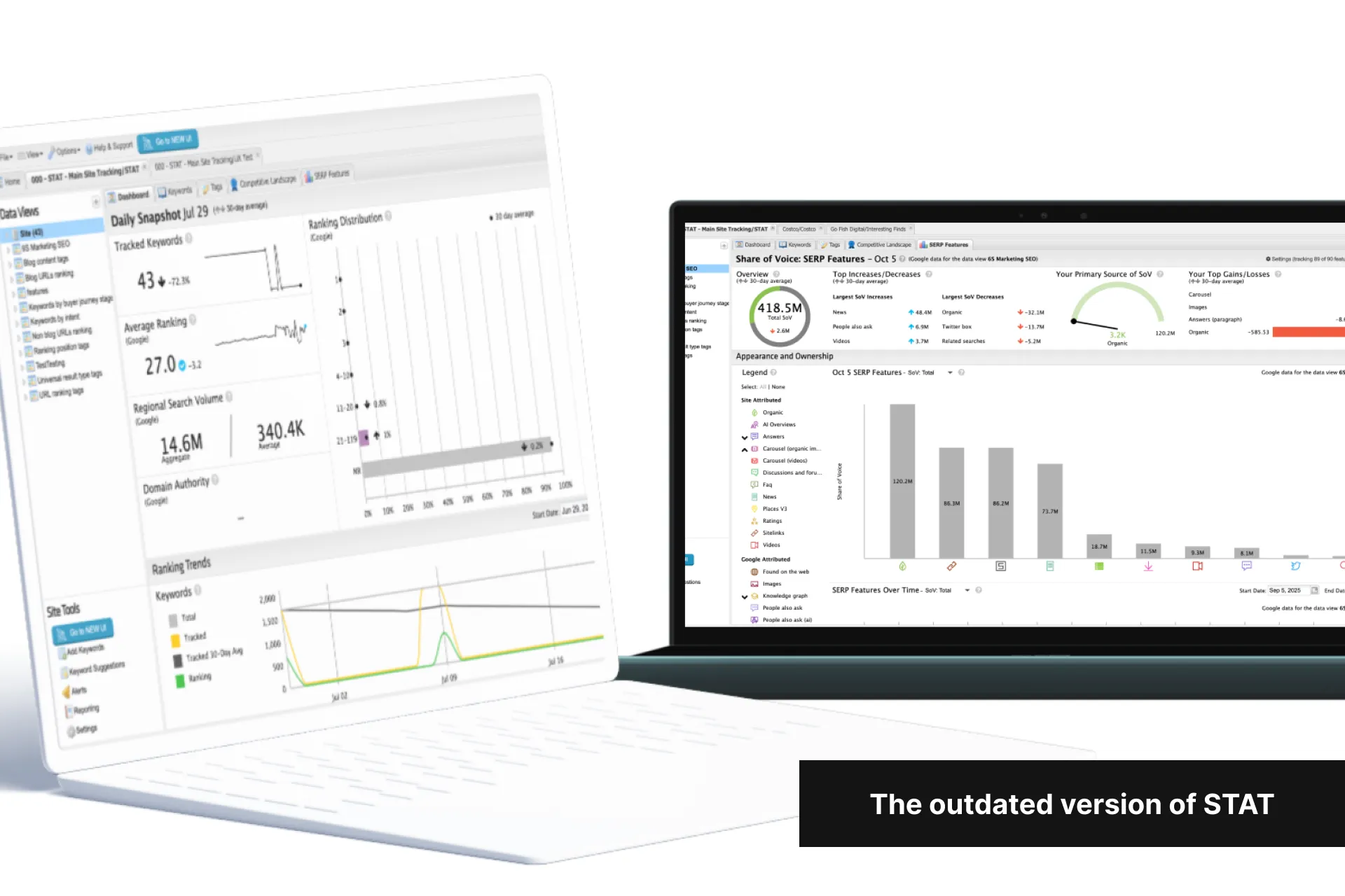
Some STAT history
After 14 years of the same design and frontend framework, the UI/UX was now one of our top pain points and costing us clients at a faster rate.
To retain existing clients and close new deals, I convinced the company that STAT needed a full UI/UX modernization and needed to be built on a modern framework to move faster going forward (link to case study).
A decision was also made to release each section as it was completed (instead of all at once) in an attempt to retain unhappy clients and to demo it to prospects.
ProblemS
While rebuilding STAT addressed higher level product problems, we were presented with a new set of problems at the execution level:
- We couldn't afford an 18 month redesign that shipped all at once: Clients were already leaving us at a faster rate due to our UI/UX issues, and to convert prospects, Sales also needed a modern UI to demonstrate before the full redesign was complete.
- UX was understaffed: Moz Pro took half of our team for a similar redesign project (case study coming soon) so UX capacity was limited and likely to become the project's bottleneck.
Side Note
This case study focuses on the execution challenges our sprint process needed to solve.
For details on the higher-level Product problems, please check out this case study here
Goals
- Design, validate, and release in increments: Releasing product areas incrementally would accelerate customer impact while reducing financial risk.
- Stay ahead of Dev: We needed to stay at least one sprint ahead of the Dev team without sacrificing our process and the integrity of our work.
How to measure success
We weren’t expecting big changes in our numbers while this project was ongoing, so we agreed to measure success by:
- UX was not blocking Dev
- Positive feedback from clients that were frustrated with our existing UI/UX
- Positive feedback from Sales demos
- General positive feedback around the new UI/UX from any other clients
Constraints and considerations
- No changes to the backend: We were allowed to change how existing data was presented on the frontend, but changing or recalculating our data in the backend would be too time consuming.
- Release new STAT in sections: This is to be planned and released in sections so we could sooner show something to our users that were thinking of leaving us due to the outdated UI/UX.
- Low-effort additions only: This needed to be done as quickly as possible, so only low-effort additions were allowed. All other features had to be an exact 1:1 rebuild.
- New frontend framework: For years, our outdated frontend framework hindered us from implementing even the smallest of changes to the front end. Feature requests were no longer cost-effective to implement and we could not work around this issue any longer. STAT’s new frontend was to be built in React using MUI so we could iterate faster going forward.
- UX was understaffed: We would need to adapt our process perfectly to give us the most confidence in our decisions while staying ahead of the Development team.
So with all that, here’s the redesign process we went through for each section of STAT
Step 01
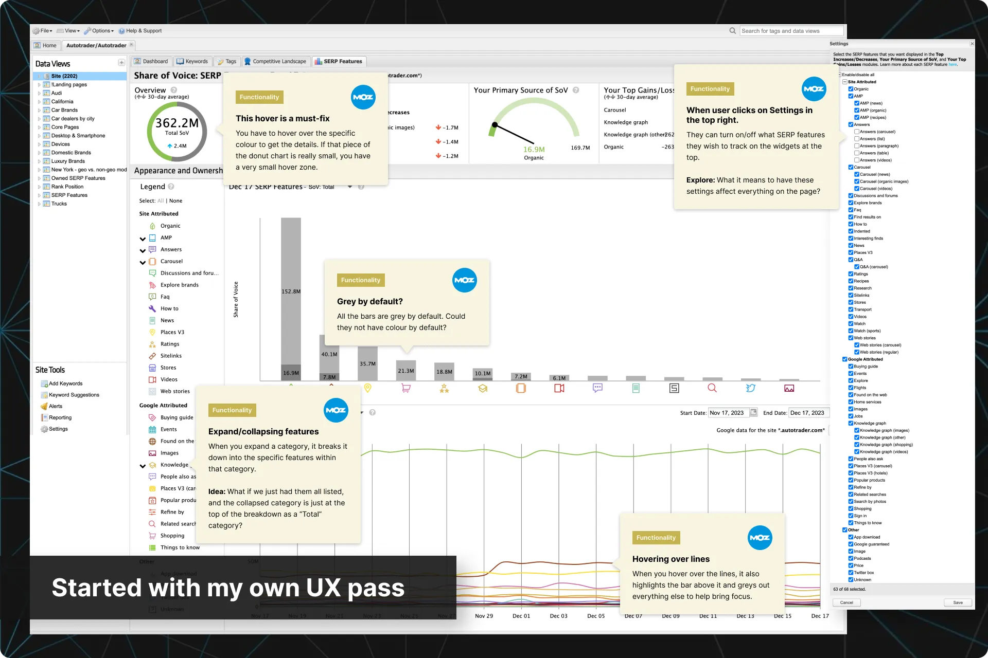
Performed a UX pass
As this rebuild was also an opportunity to simplify and streamline STAT, the first thing I wanted to do was a pass on the current functionality myself. I was looking for anything that jumps out and may need to be updated, or reversely, anything that I liked and should try to keep. This was the start of my list of recommendations to surface to the team.
Anything I felt that needed more information gave me some starting questions for research interviews and usability tests.
Step 02
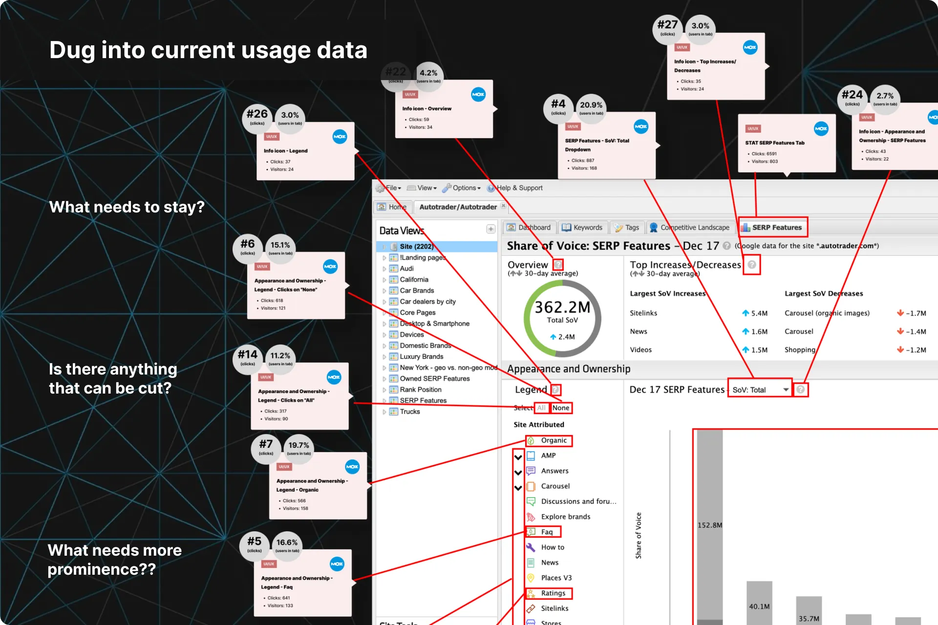
Dug into current usage data
I then dug into the Pendo data for every interaction within each section.
This showed us what features were used the most, and which ones could be cut, modified, or postponed for future sprints.
Step 03
Pulled together ALL existing feedback
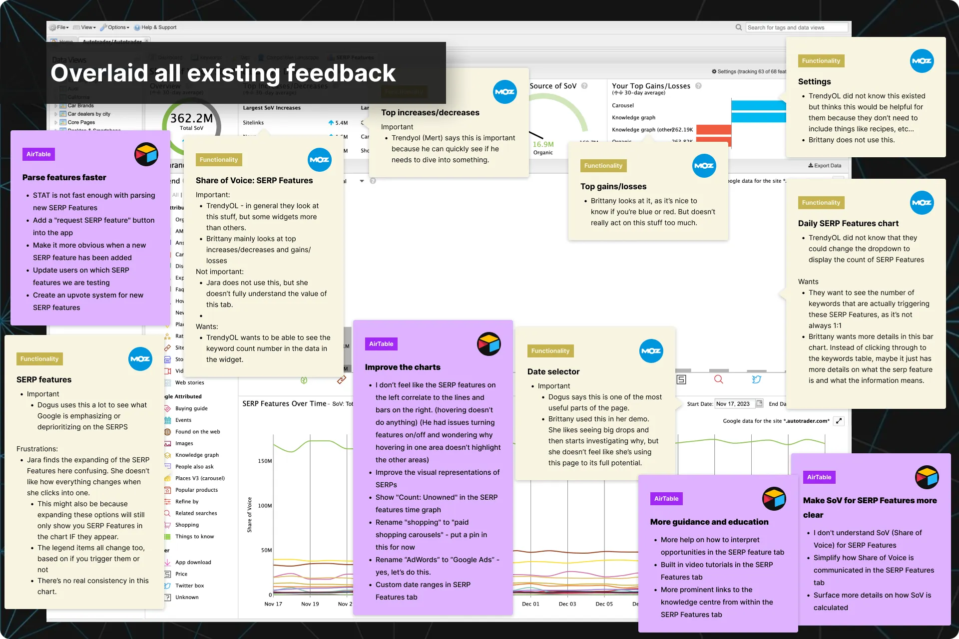
I would go through old interviews and our other repositories and overlay the relevant feedback from them directly onto the screens.
This gave me a better view of everything that could be fixed, and made it easier to communicate the issues and my recommendations to the team
Step 04
Competitive Analysis
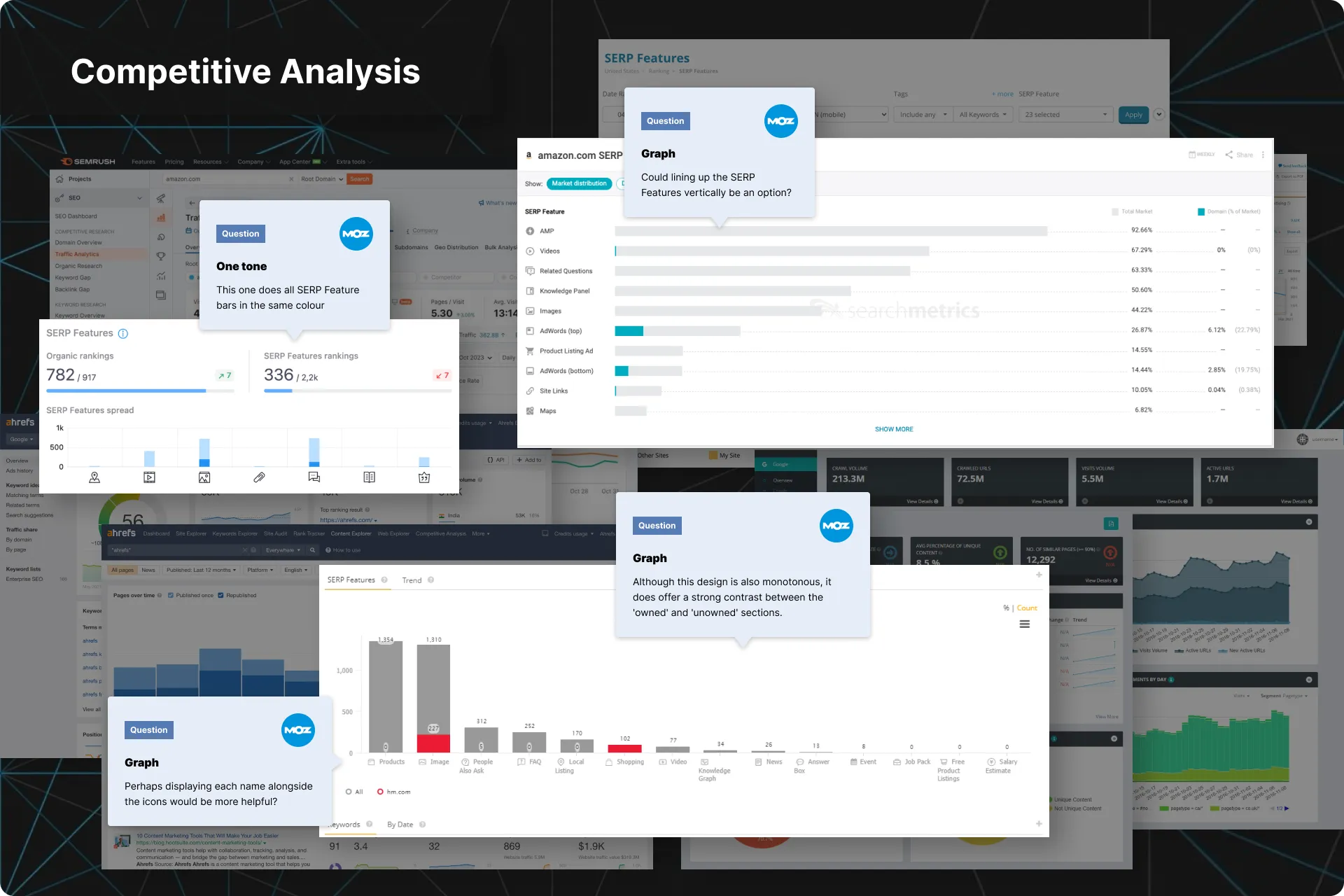
I also conducted a competitive analysis of leading SEO analytics platforms to understand where STAT stood out and where it lagged. By comparing similar workflows, interactions, and visualizations, I identified opportunities for the redesign.
Step 05
Pulled low-effort requests from Productboard
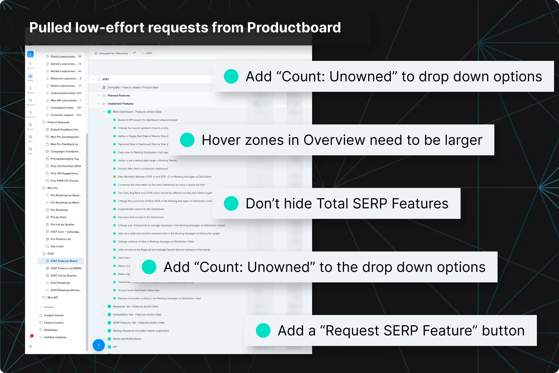
Productboard was where we kept the feature requests we had already vetted for impact and effort.
As I went through the design process for each section, I would pull in any low-effort requests found in Productboard and add them to my list of recommendations to review with the team.
Step 06
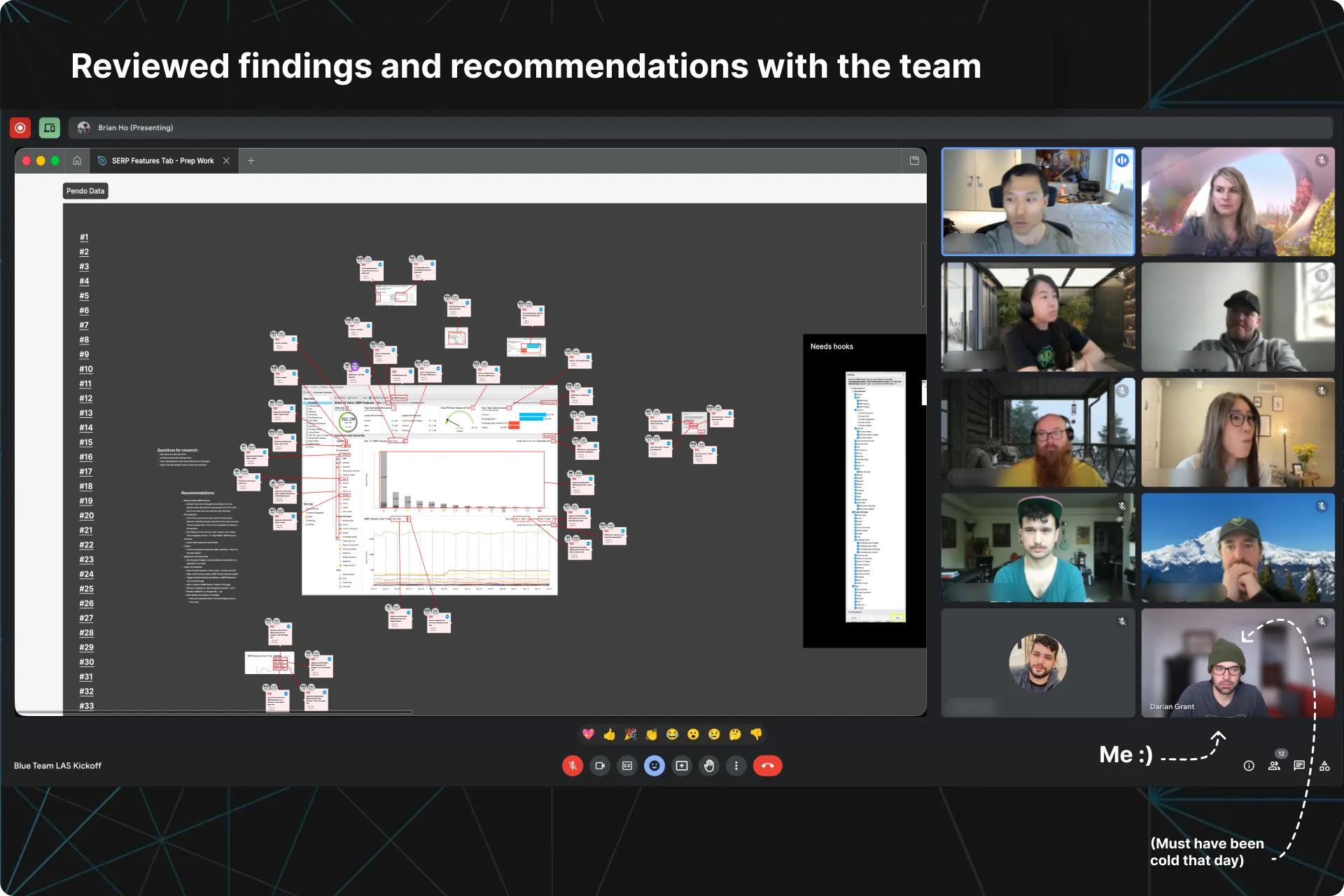
Reviewed with the team
Working directly in Figma, I would run the team through the user pain points, relevant data, and improvement ideas. This created a shared visual reference for discussions with engineers and PMs and allowed us to begin locking down the deliverables for the section we were working on.
We would create a first draft of the requirements for v1, and anything that needed more information would turn into a question I could ask at our upcoming research interviews.
Step 07
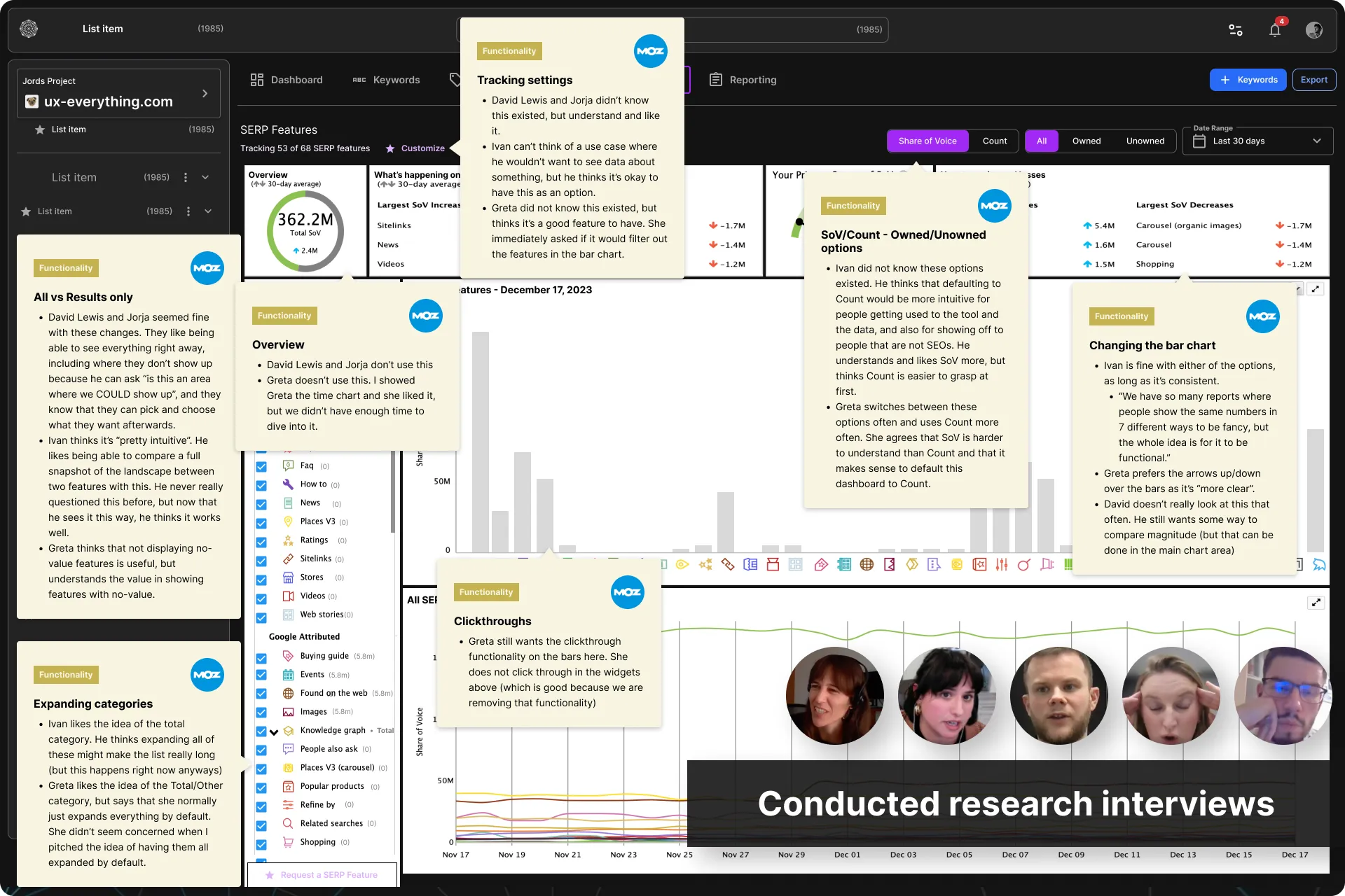
Research interviews
I would then conduct a handful of research interviews in order to answer the questions from my team so we could confidently solidify the remaining requirements for v1.
We did not need many participants as we were mainly looking for insight on why some features that do not have a lot of usage may or may not be important. This would help us refine our scope for v1.
STEP 08
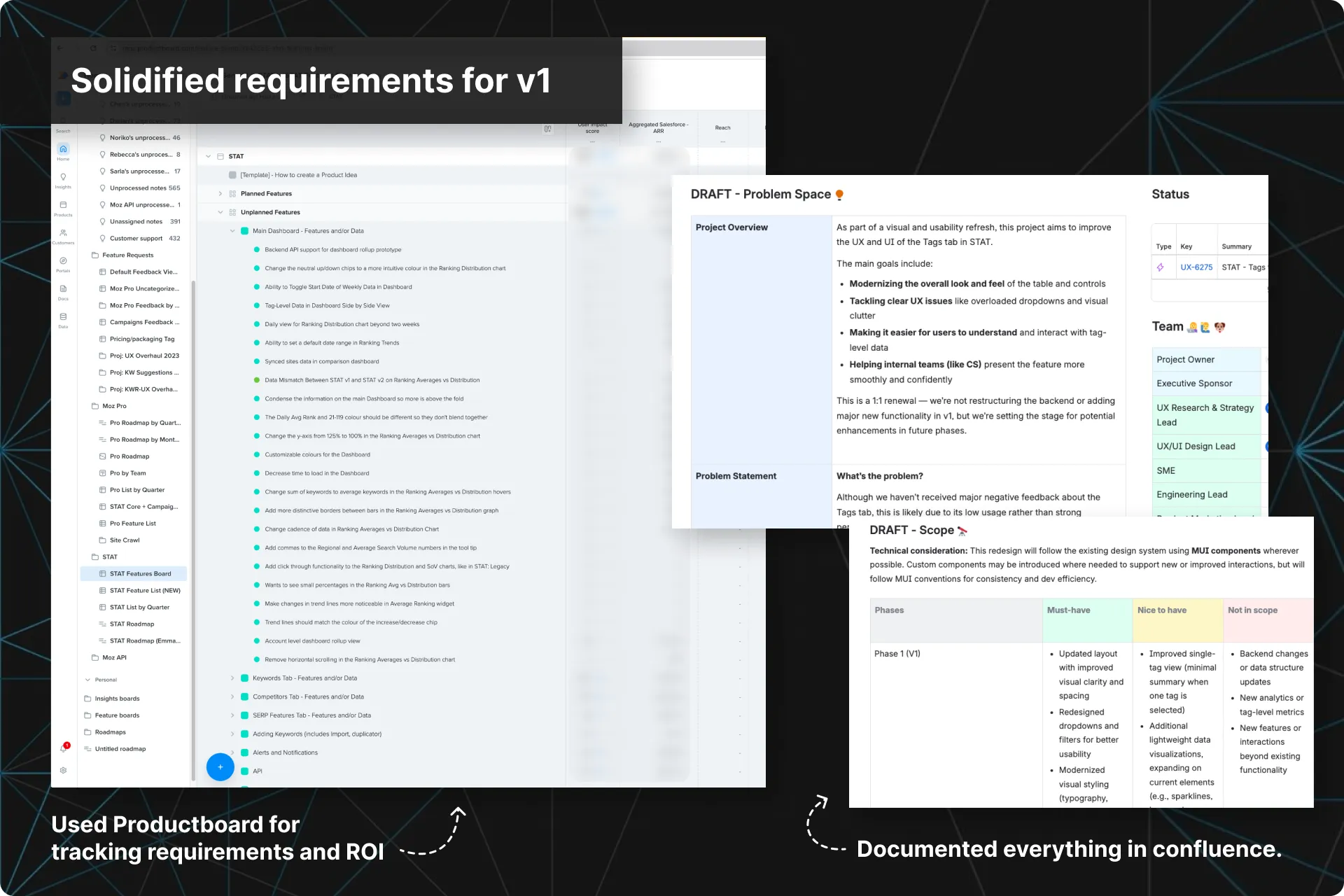
Finalized requirements and documentation
I would report the findings from the interviews to the team and we would lock down the requirements for v1.
I then translated everything into proper documentation for the Dev team. This living document aligned the team around what needed to be solved, why it mattered, acceptance criteria, and how we would measure success.
Step 09
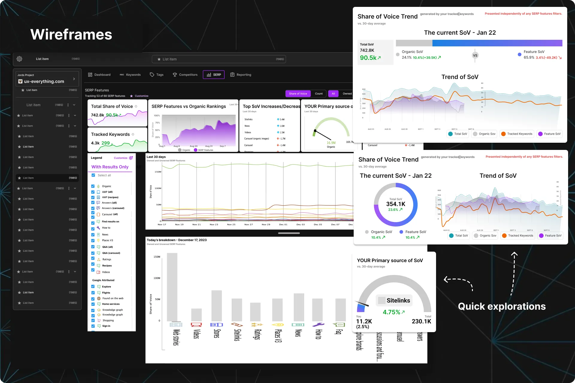
Wireframes and explorations
Now it was finally time for pen-to-paper.
I would map out user flows and create low-fidelity wireframes to visualize and validate initial ideas. These wireframes served as the foundation for usability testing before evolving into refined high-fidelity designs with consistent UI patterns.
STEP 10
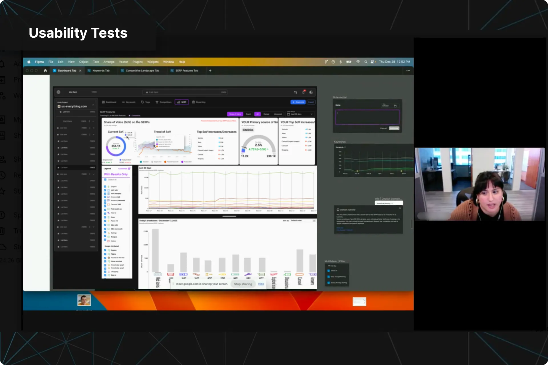
Usability tests
As this redesign was a big deal, I made sure we budgeted time for Usability Tests.
For each section, I defined research goals and wrote test scripts, recruited participants, and conducted sessions.
Synthesized insights from these tests directly informed our design decisions, ensuring that our final output truly enhanced the UX of our product.
Step 11
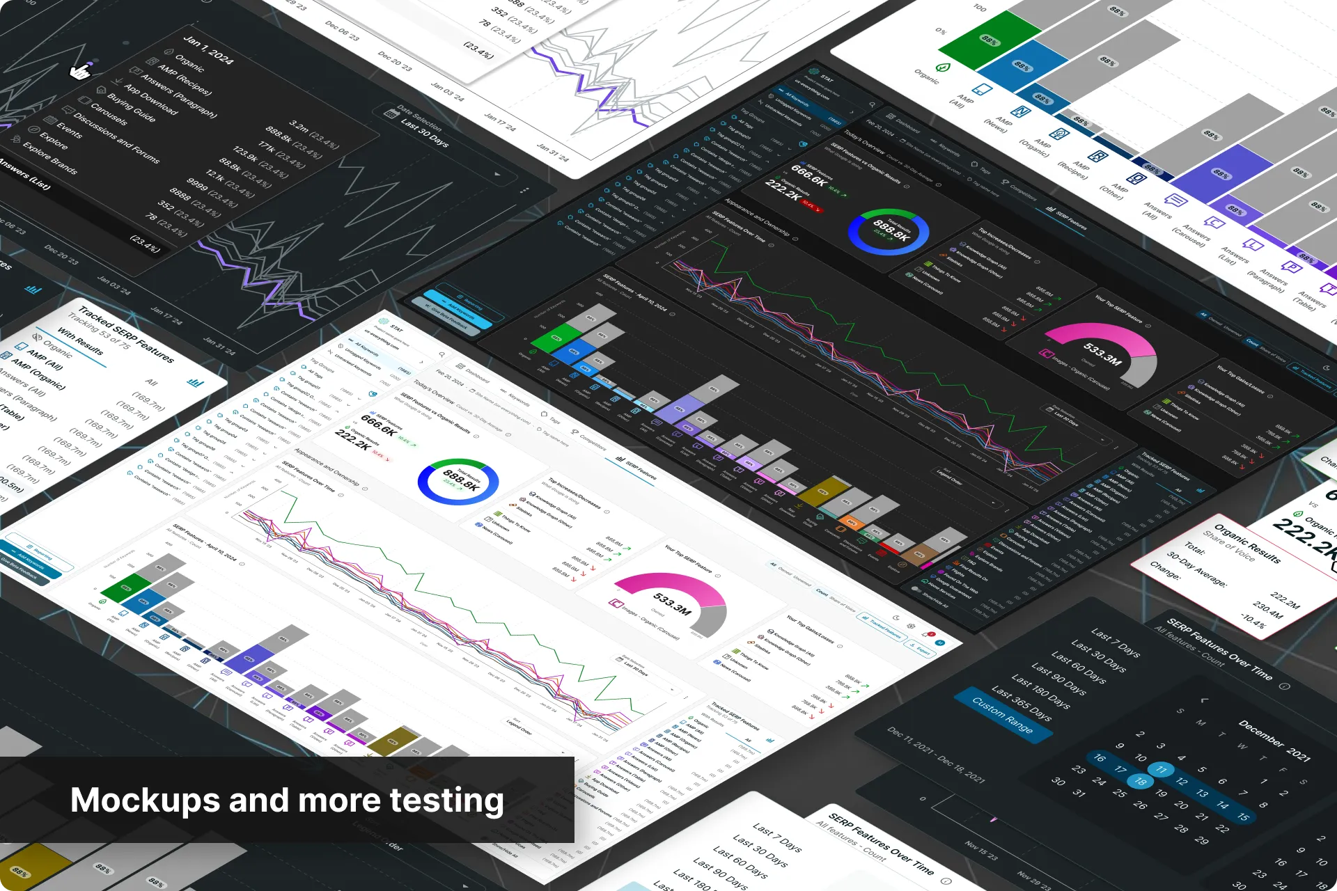
High-fidelity mockups and more Usability Tests
High-fidelity mockups were then built in Figma and then tested one more time with users.
This allowed us vet the final designs and see if there were any further areas to improve before passing it off to Dev.
STEP 12
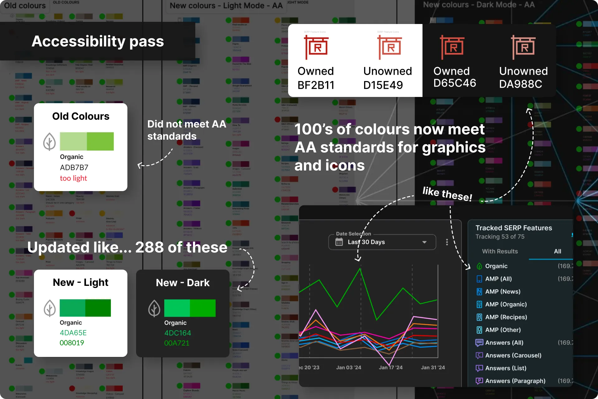
Accessibility pass
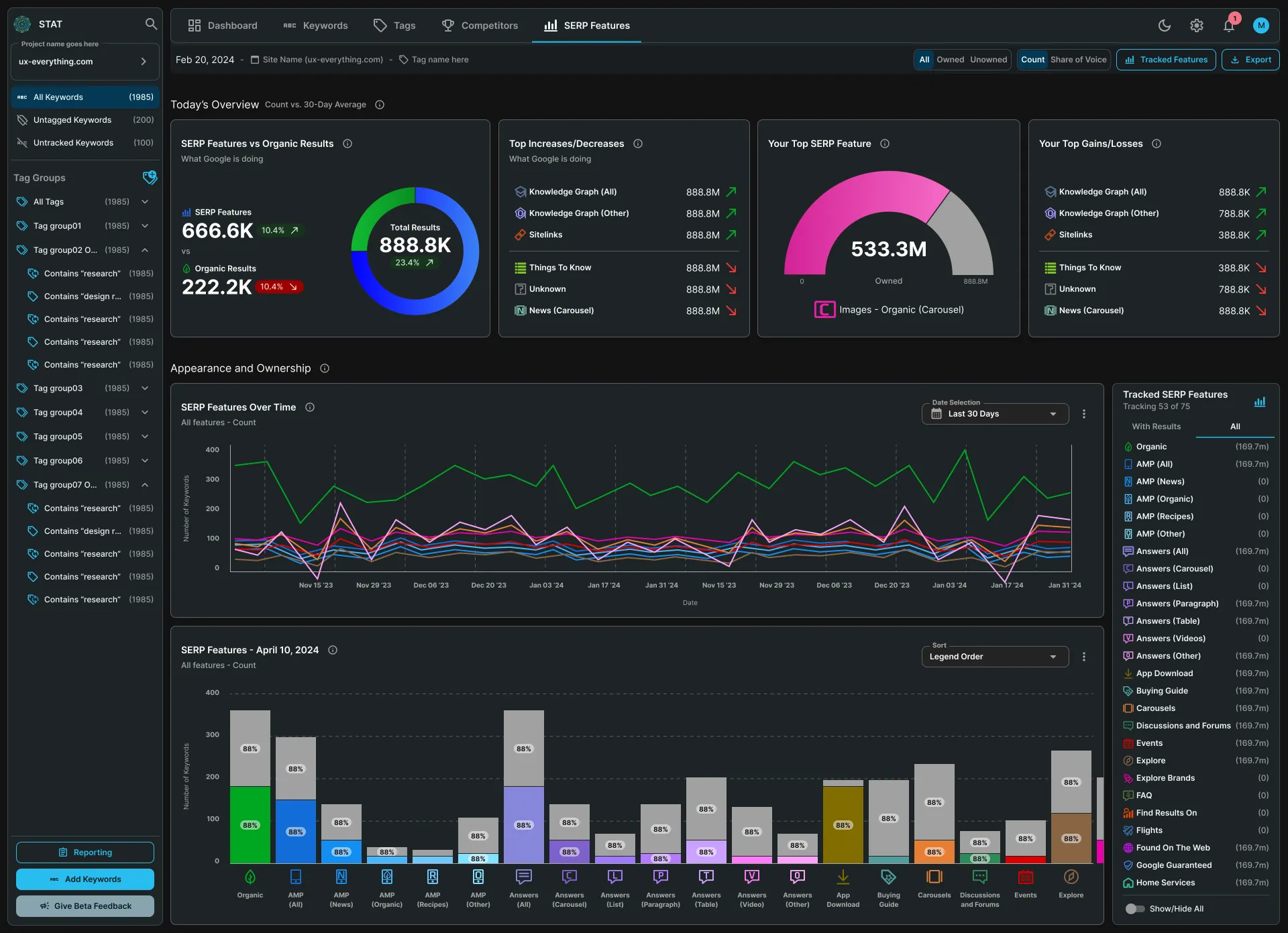
Dark Mode was going to be a new addition to STAT. This meant we had a lot of colours that needed to meet WCAG guidelines.
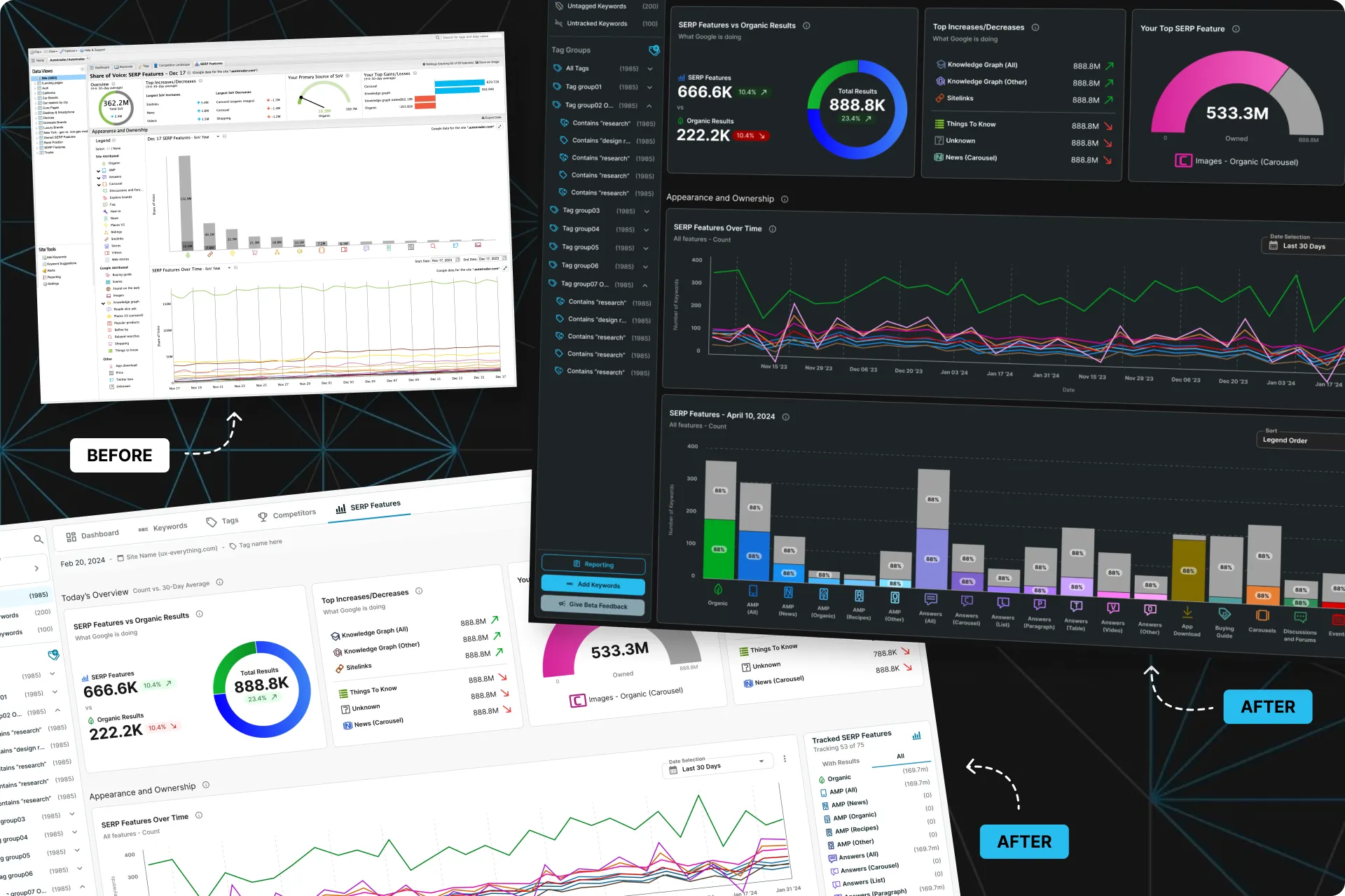
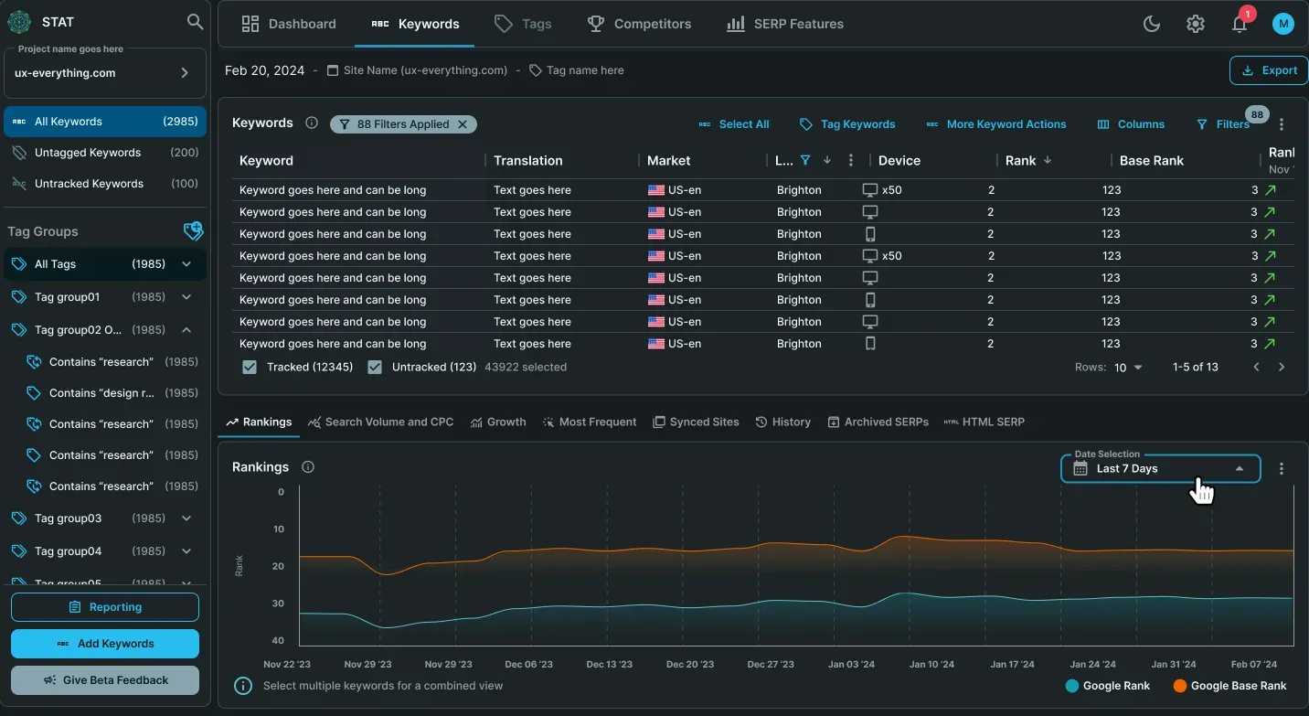
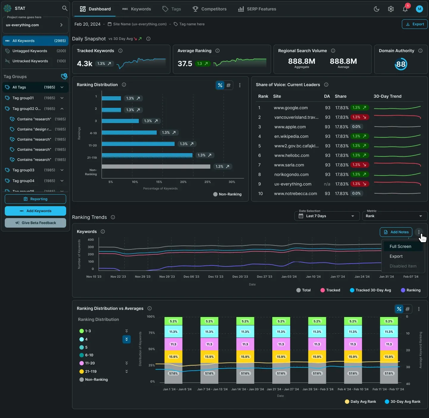
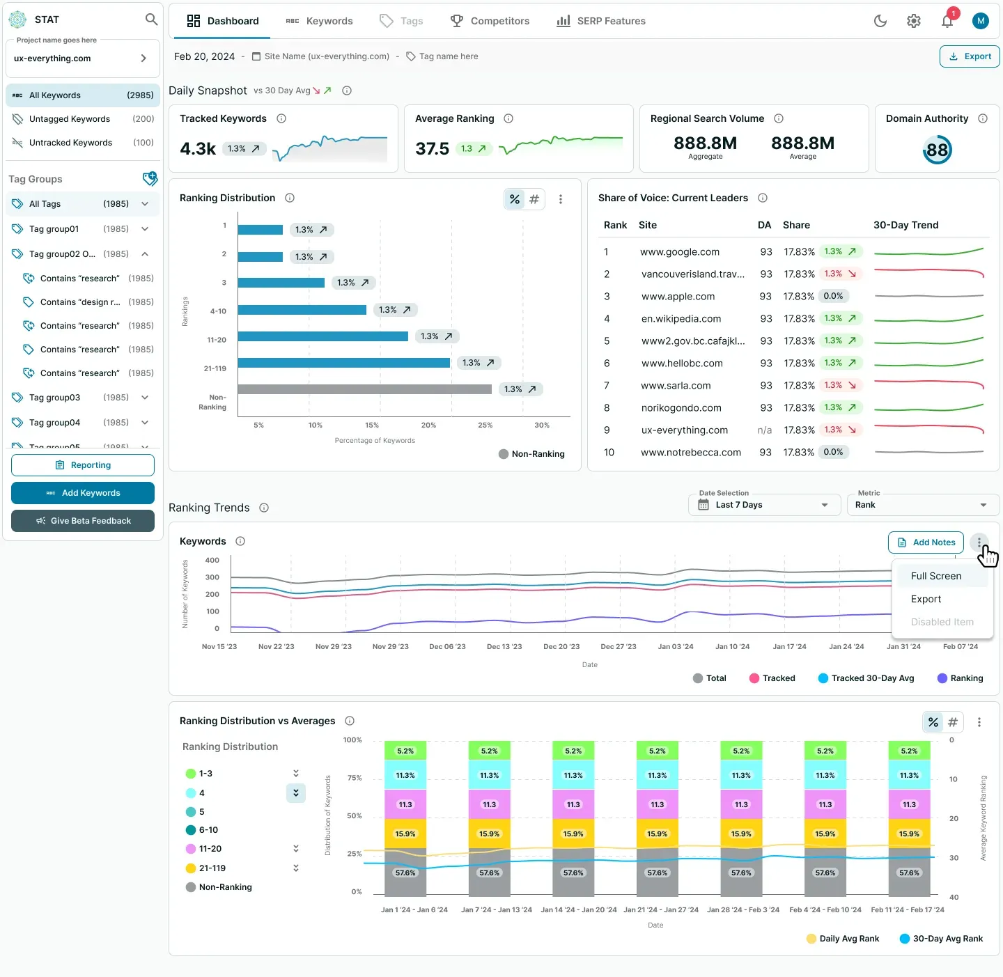
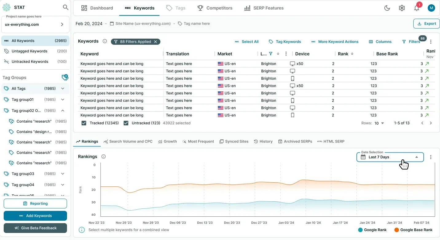
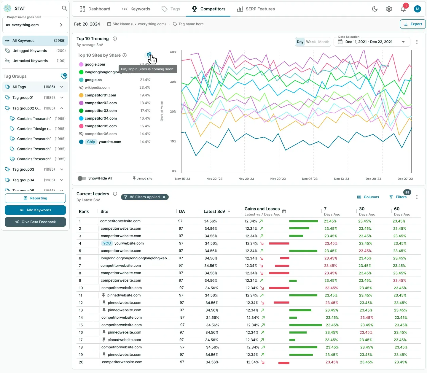
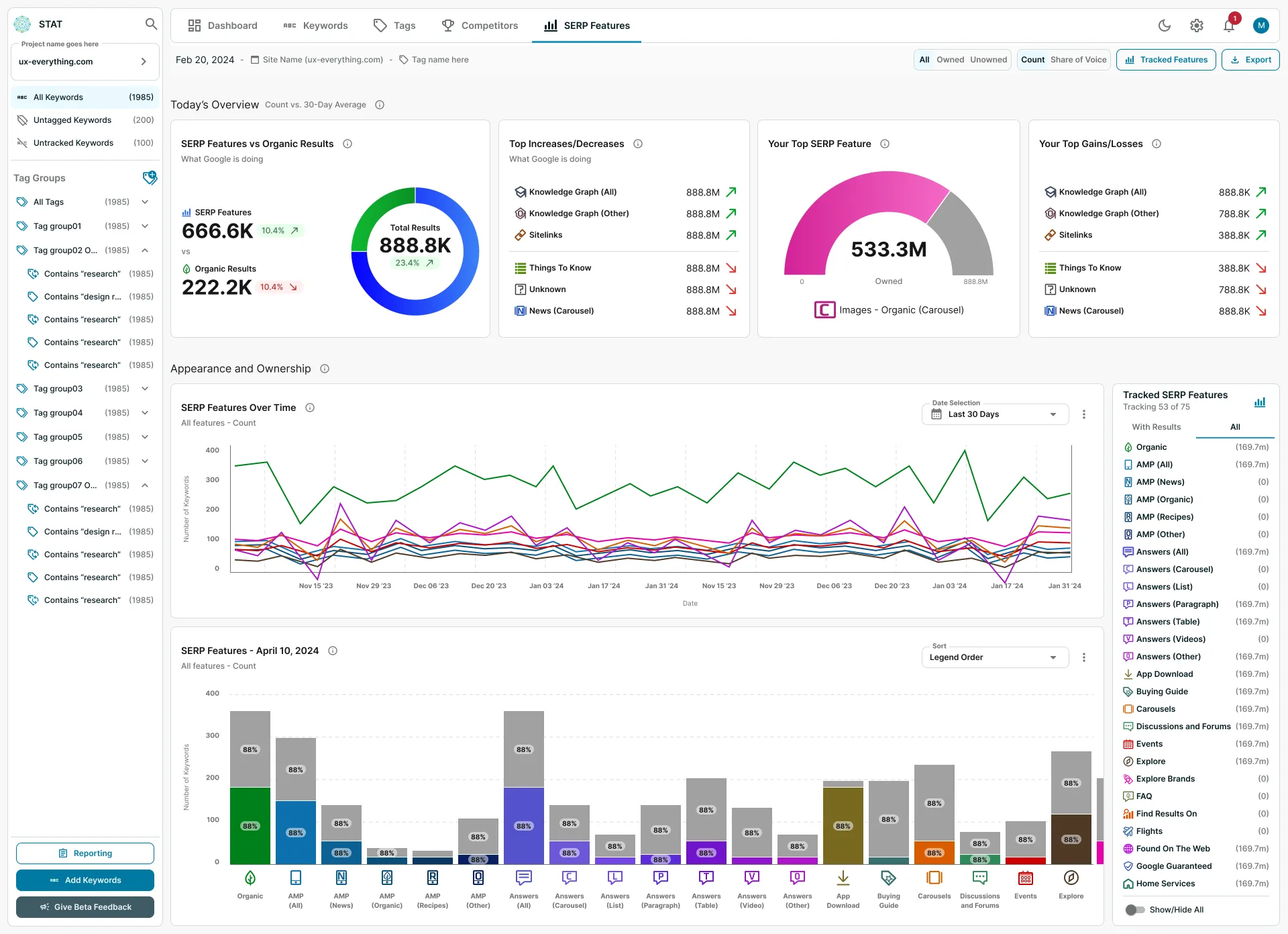
The SERP Features tab is a great example of this as I had to go through 144 colours currently being used for the icons and data visualizations. I then had to tweak those colours so they would pass AA standards, then create a whole new set of colours for Dark Mode.
In the end, there were close to 300 different colours on the SERP Features tab alone (that now all pass AA standards).
Before anything was finalized, I would organize audits with our Accessibility Agency who would point out anything we may have missed.
Step 13
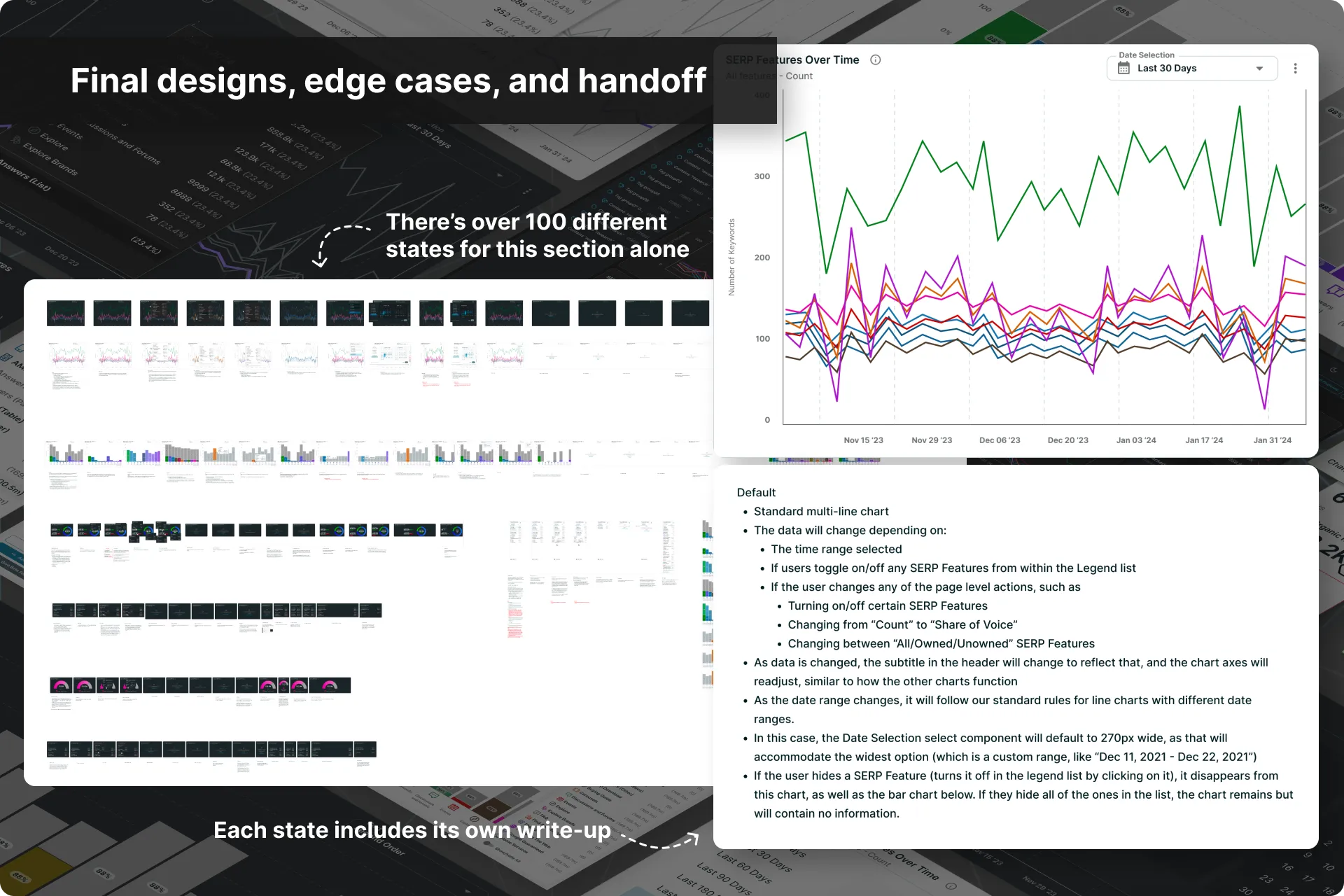
Final design execution and Dev handoff
Final designs were then broken down into scalable components, complete with interaction specs and annotations for the Dev team.I led asynchronous design reviews with engineers and PMs, addressing edge cases early and collaborating closely during handoff.
Throughout the process, I ensured technical feasibility and adapted designs based on feedback and implementation realities.
STEP 14
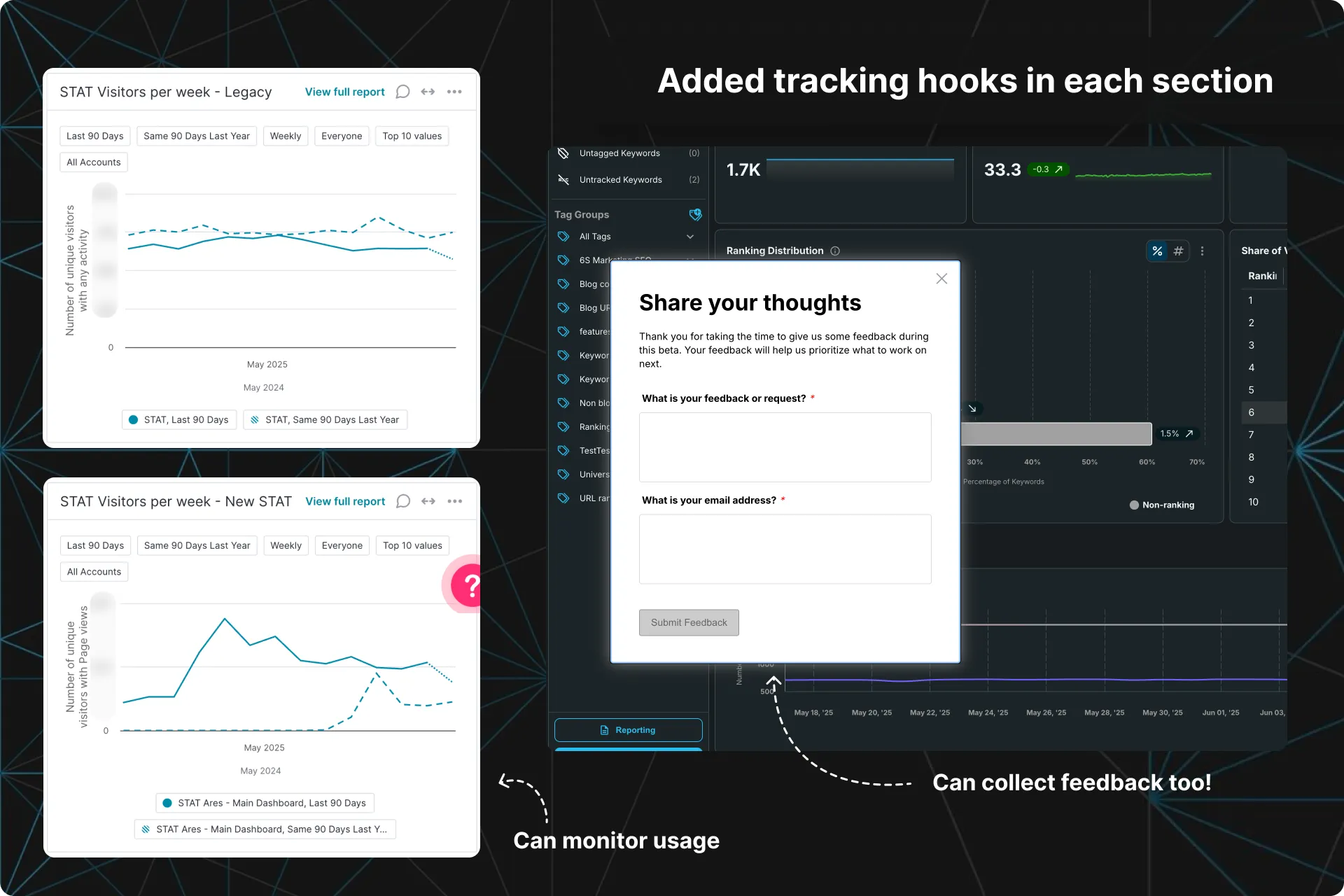
Pendo hooks and Clarity to measure usage and success
As each section was built, I then set up Pendo hooks and Microsoft Clarity on everything so we could begin collecting data immediately upon release and monitor usage.
I also leveraged Pendo’s feedback forms to collect qualitative feedback and requests from our users that could then inform updates and fixes.
Et voila!
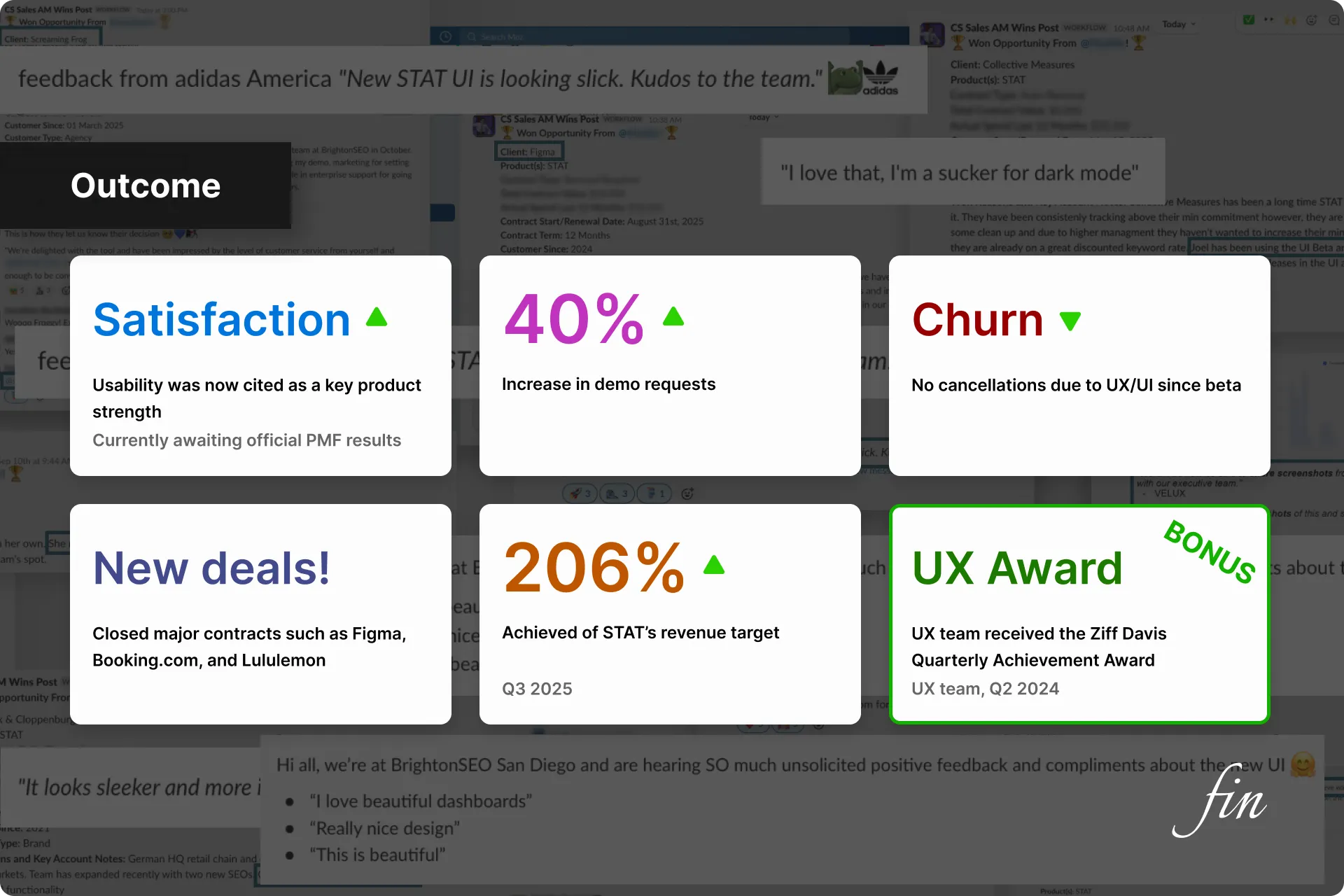
The OUTCOME
Less cancellations, more demos and satisfaction!
Since STAT 2.0 was released as a separate product, engagement was extremely low until everyone was forced to move over to the new version. Once that happened:
- Client satisfaction soared — usability was now cited as a key product strength
- +40% increase in demo requests
- Churn dropped significantly — there were no cancellations due to UX/UI since beta
- We closed major contracts such as Figma, Booking.com, and Lululemon
- STAT achieved 206% of our revenue target in Q3 2025 — driven by the UX overhaul
Bonus UX Outcomes:
- A new product that adhered to modern design and functionality standards
- A product finally built on a scalable pattern library
- The UX team received the Quarterly Achievement Award (UX team, Q2 2024)