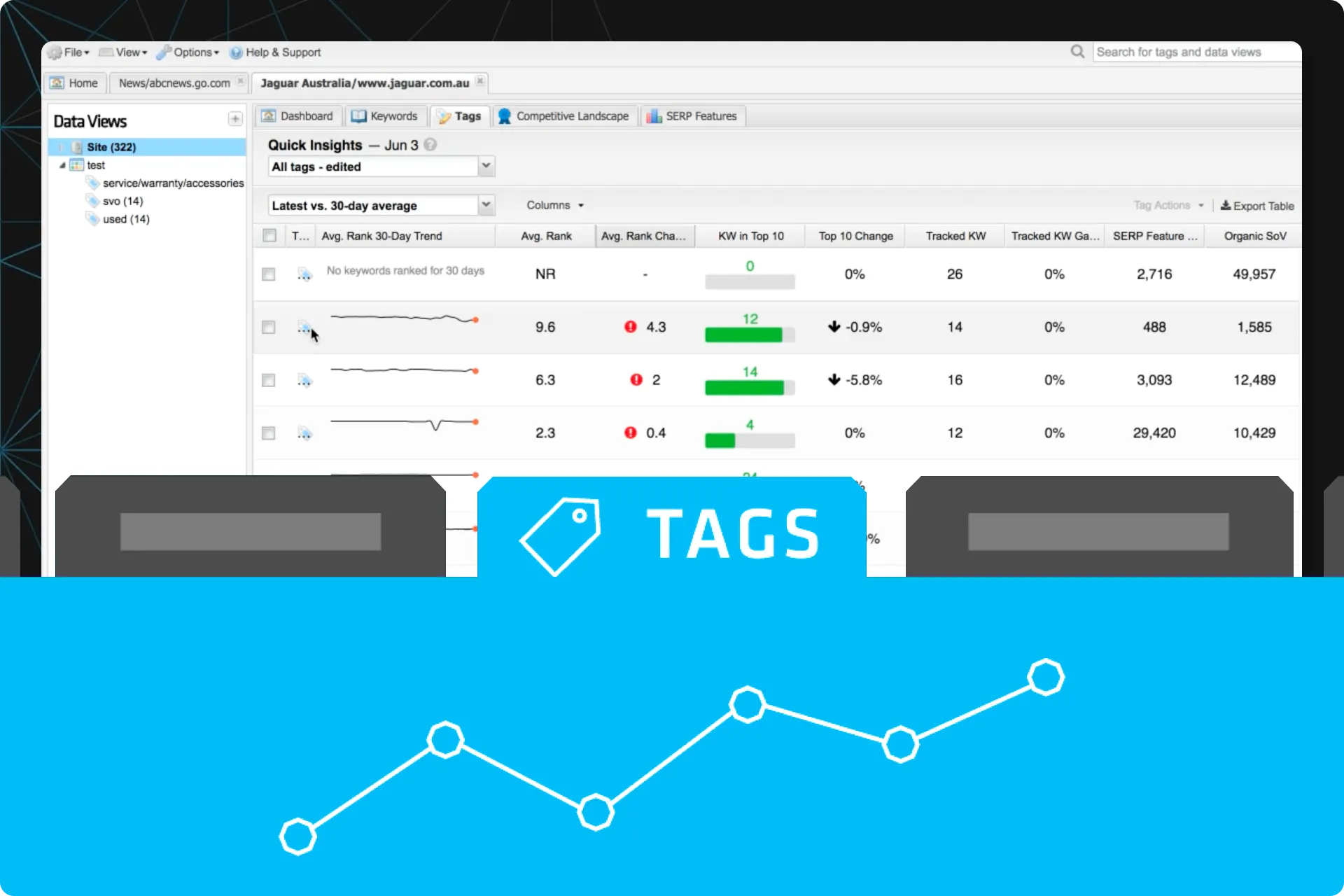
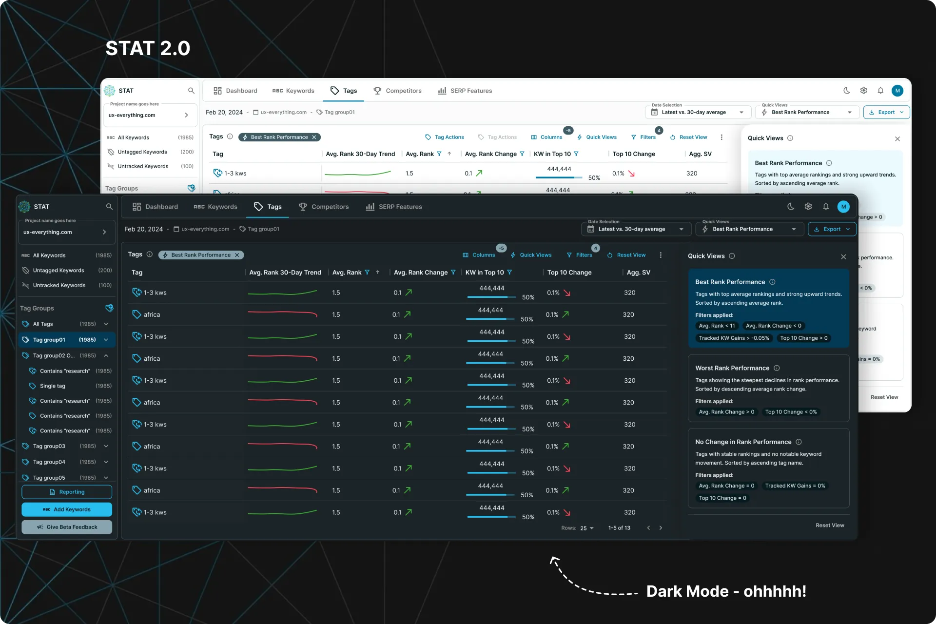
The Tags Summary Tab
Making it easier for users to compare their data
A quick project with an extremely lean design process that decreased our Churn rate by 41%.
Context
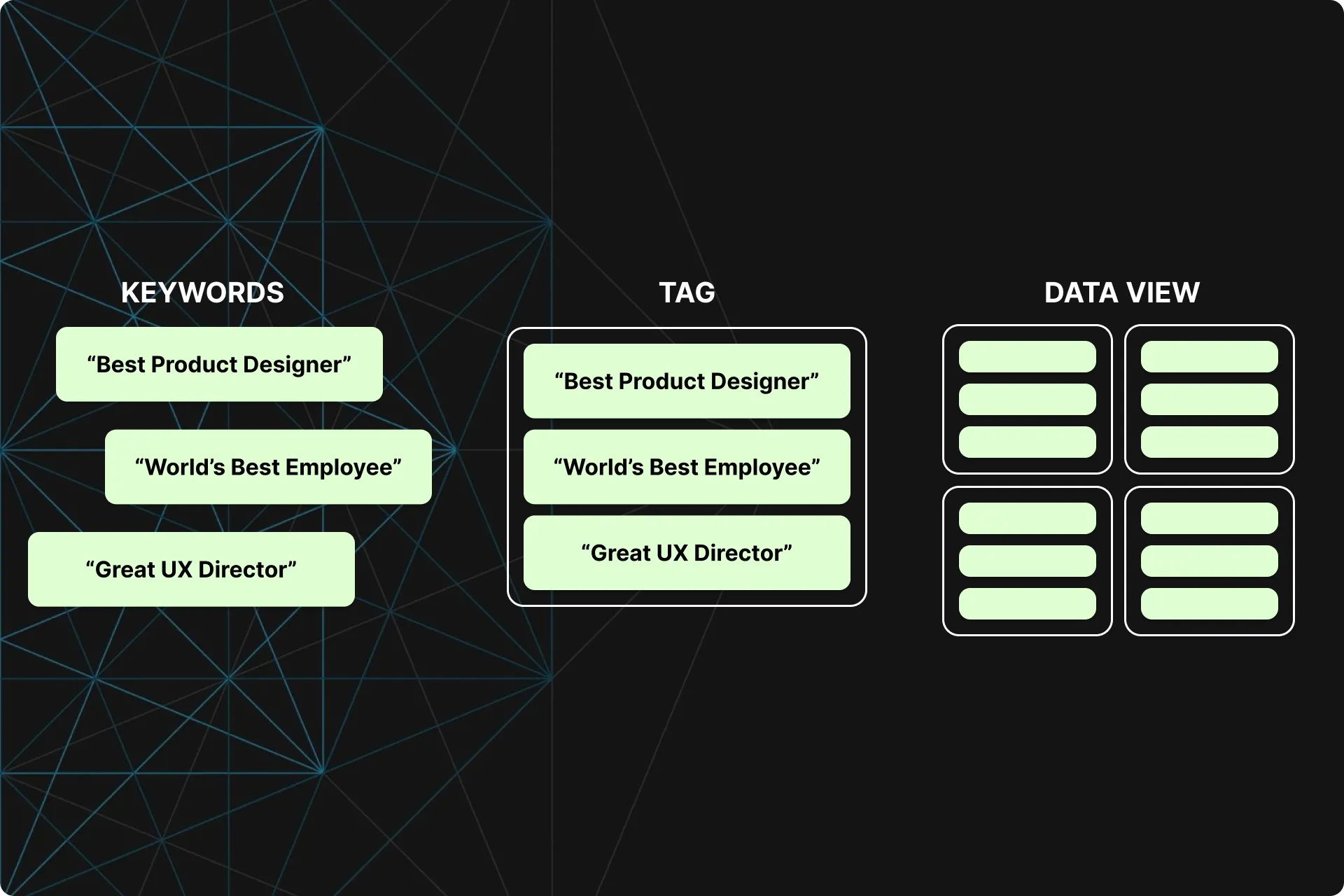
Tags and Data Views
STAT allows users to track data for thousands of keywords and then updates that data daily. In order to digest all of this data, we train our users to segment their keywords into “Tags”.
Each Tag displays information strictly for that group of keywords in its own dashboard. Tags can also be grouped into Data Views, which also have their own dashboard.
All this allows users to get very specific with their data and quickly pull up information for their keywords, groups of keywords (Tags), or groups of Tags (Data Views) that are meaningful to them at the time.
ProblemS
Comparing Tags is a cumbersome process
To compare the data between Tags, users have to click on one tag, memorize the information, then click on another. When comparing 10+ tags at once, this process becomes increasingly more difficult.
Users want an easier way to compare the performance of their various keyword segments.
Goals
Allow users to easily compare the performance of their various keyword segments.
How to measure success
- Increase in the average number of Data Views created per account
- Increase in the average number of Tags created per account
- Decrease in the average number of clicks on individual Tags per user
- Decrease in the average time spent on the main Dashboard per user
- No increase in churn
- No decrease in Daily Active Users
Constraints and considerations
- We needed this quickly: Our SERP Features Dashboard was wrapping up so we needed another project for Dev to pick up right after. This meant a very lean approach was needed.
- No new data allowed: To decrease effort, we could not take the time to create new data. We had to use data that was already existing in the app.
Step 01
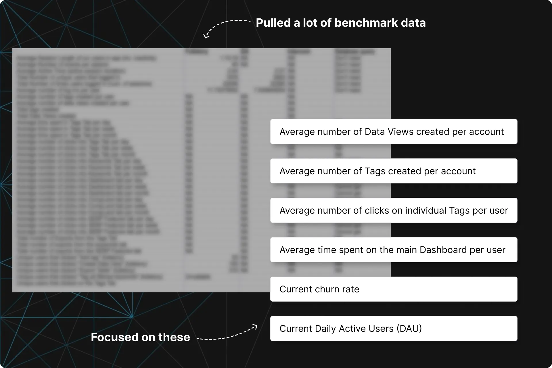
Benchmarked usage data
Working with our tracking tools (and BI for the more complicated requests) I pulled a lot of usage data around tags and our main dashboard.
Most notably for this case study were:
- Average number of Data Views (groups of Tags) per account
- Average number of Tags per account
- Average number of clicks on individual Tags per user
- Time spent on the main Dashboard
- Current churn rate
- Current Daily Active Users (DAU)
This information gave us a baseline for us to measure success with later on.
Step 02
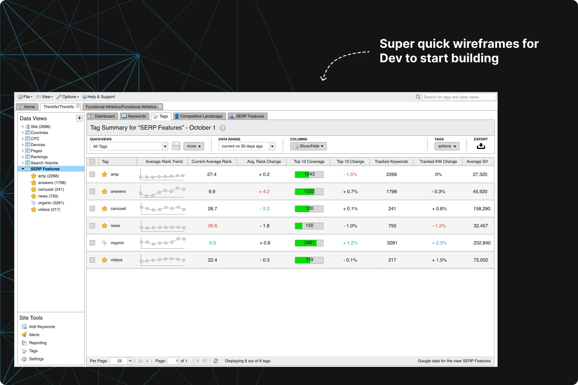
Wireframes for Dev and Alpha
Since we were just consolidating our existing data in a new dashboard, we were able to take a very lean approach.
The plan was for Dev to quickly put together an Alpha while Design gathered additional feedback via Usability Tests.
At this step, I provided Dev with wireframes to give them an idea of what to build.
Step 03
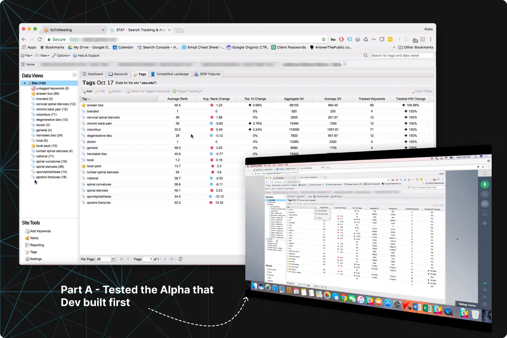
2-in-1 Usability Tests - Part A
Dev had completed their Alpha of the Tag Summary tab, but it did not include some of the additions we were hoping to get in for the MVP.
I decided we could get feedback on both the Alpha and the new additions by combining them together for each participant in our upcoming Usability Tests.
We tested the Alpha in Part A, and med-fidelity wireframes in Part B.
- More trends displayed alongside the data, similar to the trend graphs we display elsewhere in the app. (in Part B!)
- The ability to show/hide some of the columns (in Part B!)
- A way to create and save specific filters so they did not have to set these filters each time they used it (in Part B!)
- A way to change the timeframe of the data being displayed (in Part B!)
- Anything else that can help them work faster. It's all about drilling down into their data faster for them.
Step 04
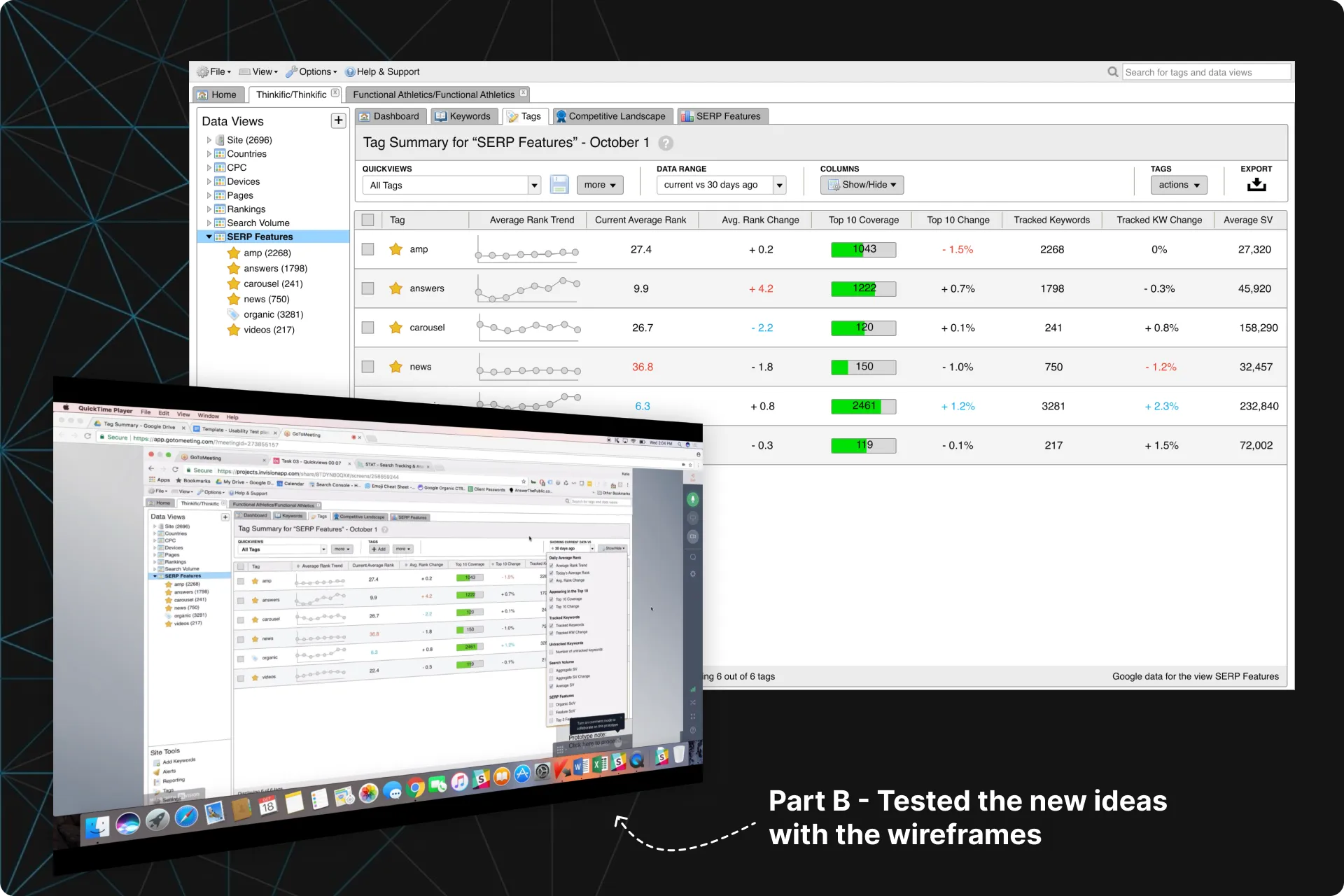
2-in-1 Usability Tests - Part B
In the second half of the Usability Tests, we showed them our plans for the additions.
Clients were very happy as most of the feedback from Part A was already addressed in these wireframes. This was enough support for us to proceed with confidence and get this into Beta.
- More clarity on what filters were active.
- Seeing more trends
- They want the changes in the data to be more obvious when changing the time range
- Being able to specify an exact time range
Step 05
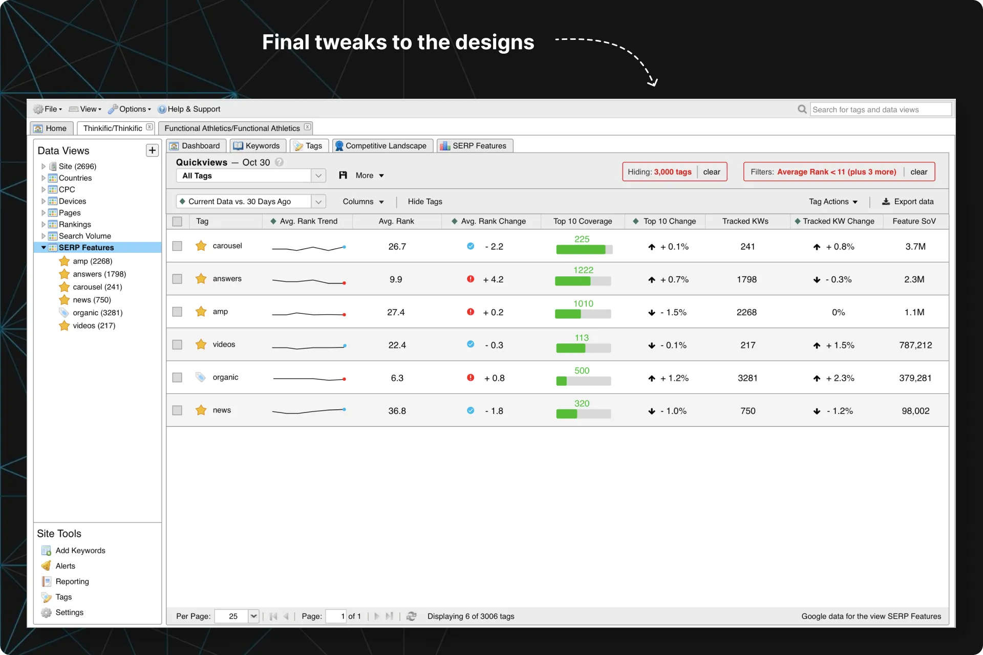
Final mockups
Due to tech constraints, some of the suggestions from our Usability Tests were not feasible for v1, such as adding in more trends and graphs, or specifying exact time ranges.
I did put more emphasis on what filters were active, cleaned up the designs, and passed them off to Dev so they could finish it up and take us into Beta.
Step 06
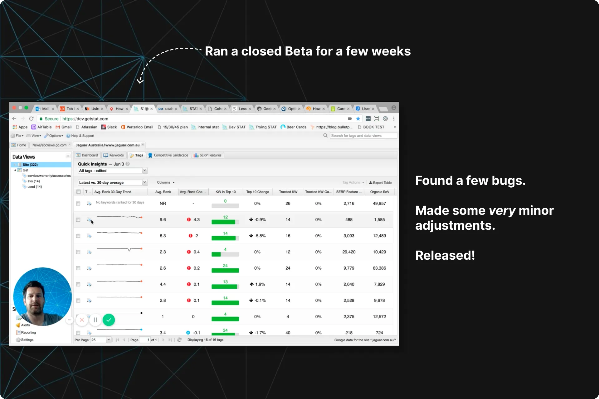
Beta and release
We then ran a Closed Beta for 2 weeks for to:
- Test out the Tag Summary Tab with real clients using real data in an attempt to uncover bugs
- Uncover the smallest of adjustments we can make before going live.
- Collect any feedback for future iterations after we go live
- More information on what some of the columns of data were showing.
- Double click functionality on a specific tag to go to the keywords table and show them what keywords have come in and what ones have left that Tag
- To increase adoption and early satisfaction, users needed to understand the benefits of Data Views, and how grouping their Tags together will allow them to compare them more easily.
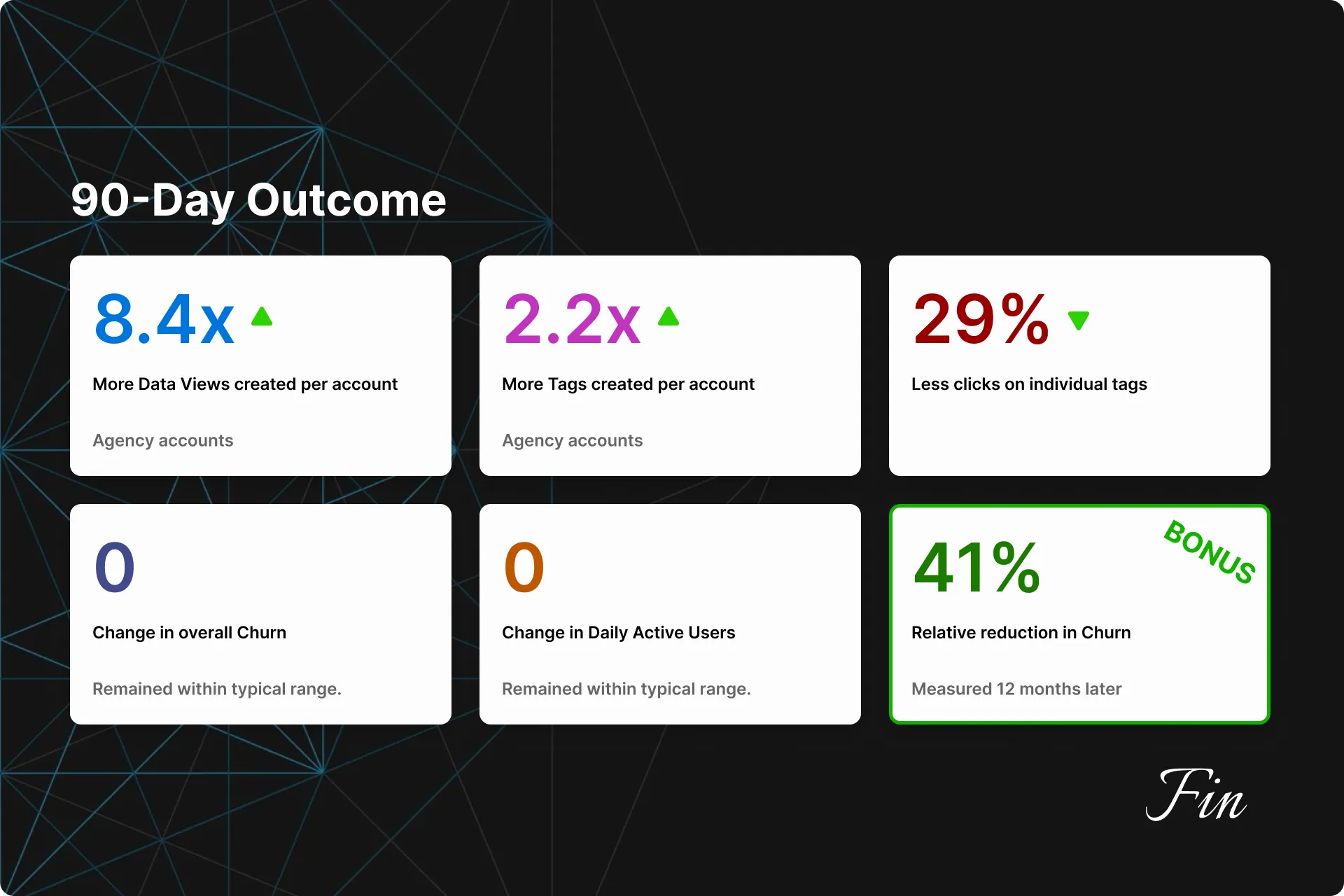
The Outcome
More Tags. Even more Data Views.
3 months later we looked at the usage data from users who truly explored the feature* and found:
- 8.4x more Data Views were created by our Agency users
- 2.2x more Tags created by our Agency users
- 29% less clicks on individual Tags
- Churn and DAU remained within our typical range.
- Bonus (12 months later): We noticed that feature users experienced a 41% relative reduction in churn.
Since release, we have logged several feature requests in our repository, but none worth prioritizing to this day. Once the higher priority requests have been addressed, we have a short list of improvements we can make here.
- 8.4x more Data Views were created by our Agency users
- Enterprise users saw a slight increase (1.8x). We believe this is because Enterprise users spend a lot more time setting up their Tags and Data Views system early on in their journey.
- 2.2x more Tags created by our Agency users
- Enterprise users saw a slight increase (1.2x).
- 29% less clicks on individual Tags
- This was a combined average between Agencies and Enterprise users, as results were similar.
- Churn and DAU remained within our typical range.
- Churn and DAU fluctuate each month, so we measured against a range here.
- Bonus (12 months later): We compared the churn numbers between users who frequented this feature and users who did not, and noticed that feature users experienced a 41% relative reduction in churn. This was a new “Aha! Moment” for us, and we increased education on this Dashboard for new clients.
Bonus
STAT 2.0 Designs
Years later, we finally got around to updating STAT’s design completely.