Sparq Next Gen
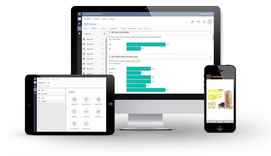
I worked with a UX and design team of seven at Vision Critical to redesign Sparq, their fifteen-year-old customer feedback platform, into a version new users could get started on without losing what existing customers relied on.
Redesigning an outdated platform
You're about to dive into my experience at Vision Critical, now Alida, where my main task was to work with a UX and Design team of 7 to completely redesign their outdated platform.
About the Company
Vision Critical empowers the world’s largest brands to collect real, honest, customer feedback to improve Marketing, Customer Experience and Product Development for their businesses.
Here you can see a video on how the company and platform work through a testimonial from one of their largest customers, Boston Pizza.

Built for a few specific customers
Their original platform was Sparq, which was developed over the last 15 years to meet specific needs of specific companies for very specific tasks, and was never redesigned to include a broader audience.
This led to a tool that was tailored to the needs of their existing customers, which was great for retention, but poor for their adoption metrics.
Keep the core, widen the audience
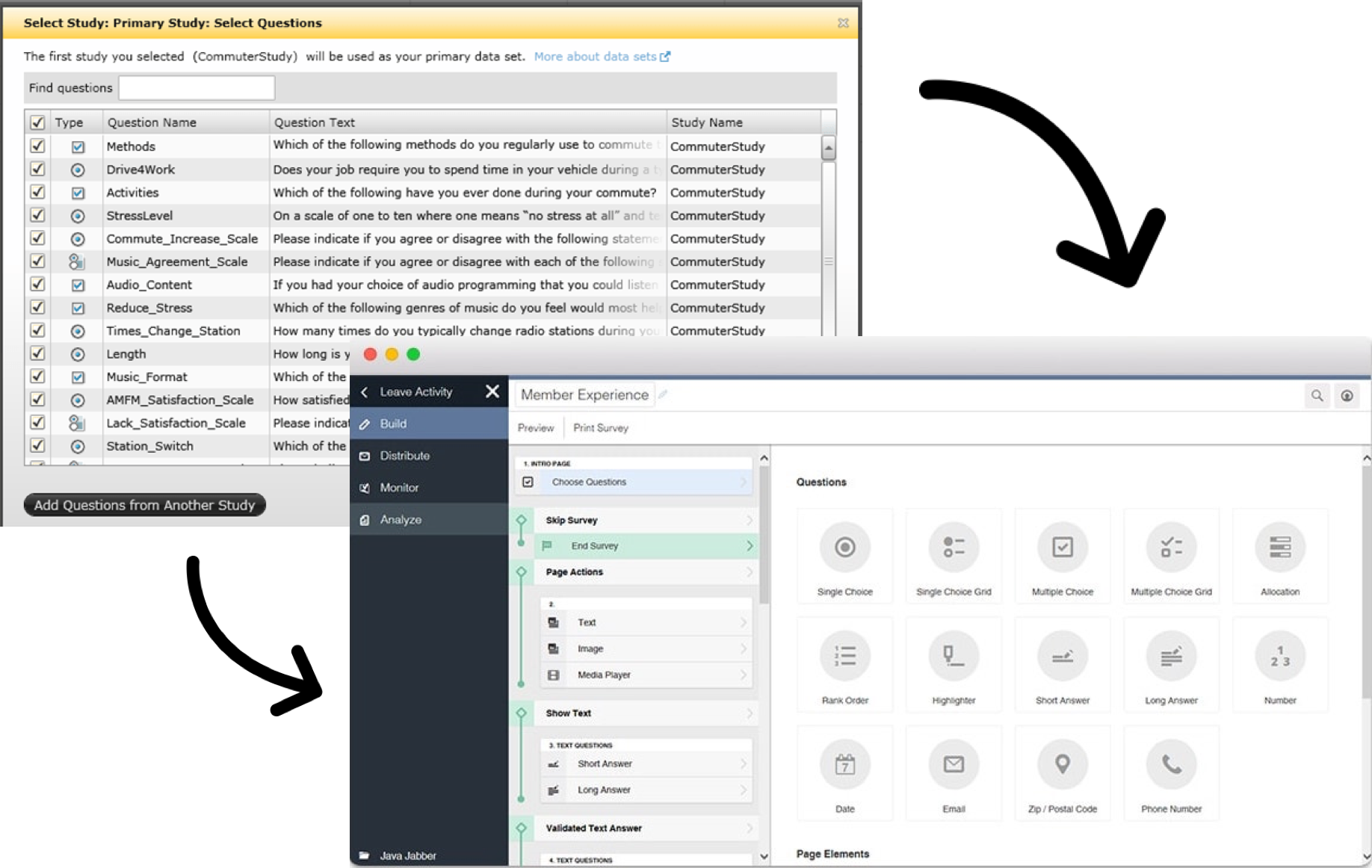
The goal was to create an updated version of the platform that kept the core functionality intact for our current user base, and adapted it enough to make it more accessible and welcoming for new users.
This new platform would be called Sparq Next Gen.
How we worked
On a team of about 7 UX Designers, each one of us worked on a separate area of the product, with a separate product team and manager.
We would reconvene several times a week to update each other on our progress, and coordinate cross-team features. We used a UI library to ensure our finished designs were consistent.
Oftentimes, we had to take extremely complex scenarios and break them down into new, more intuitive interactions and flows, sometimes even cutting features and functionality along the way.
The Condition Builder
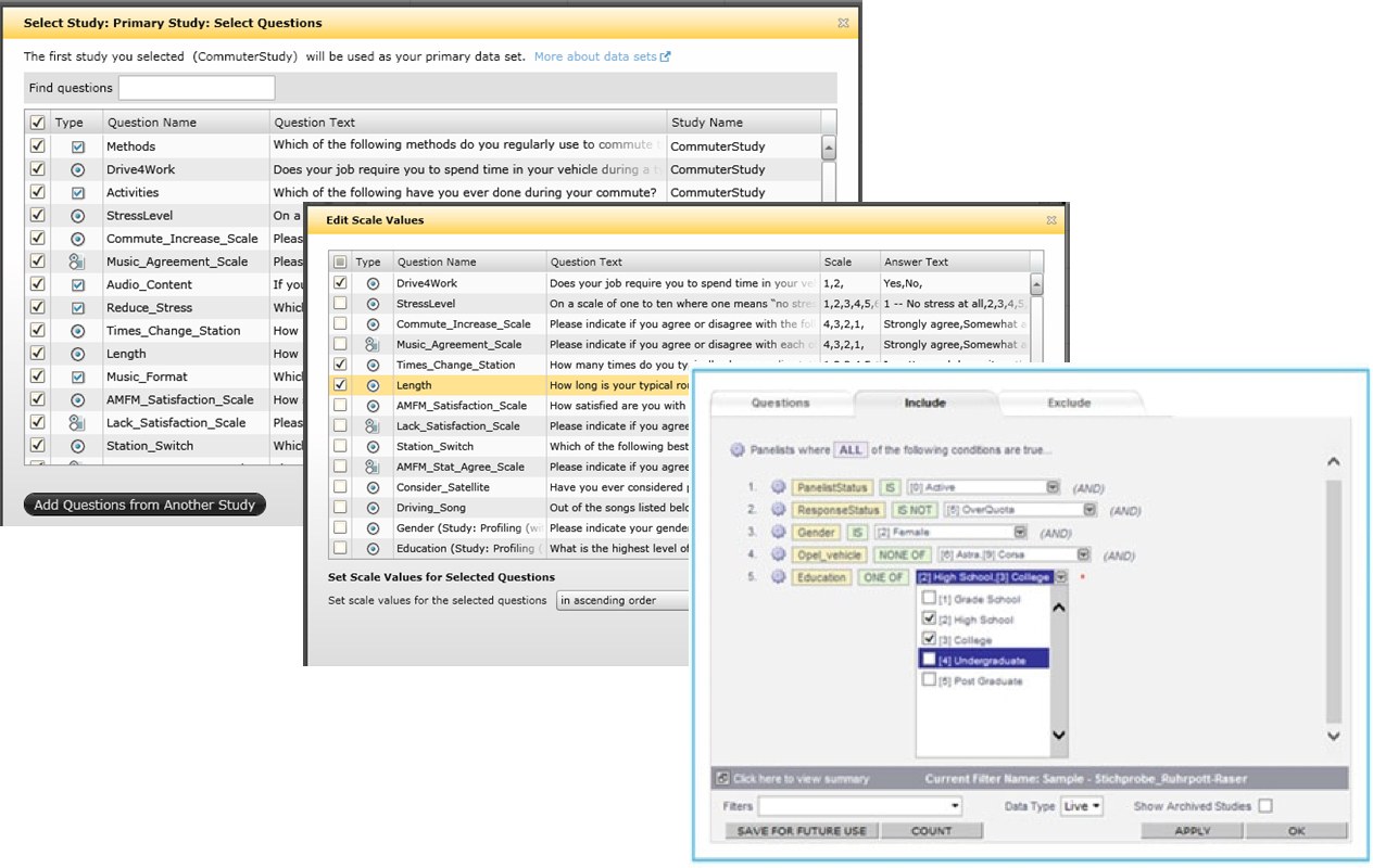
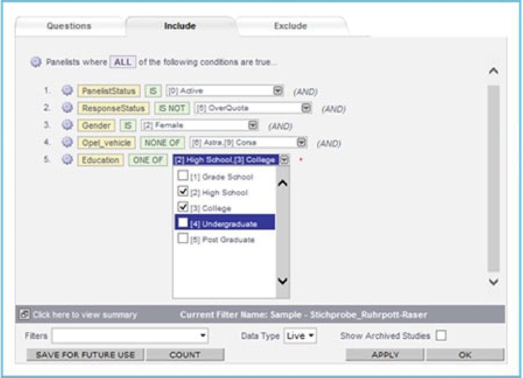
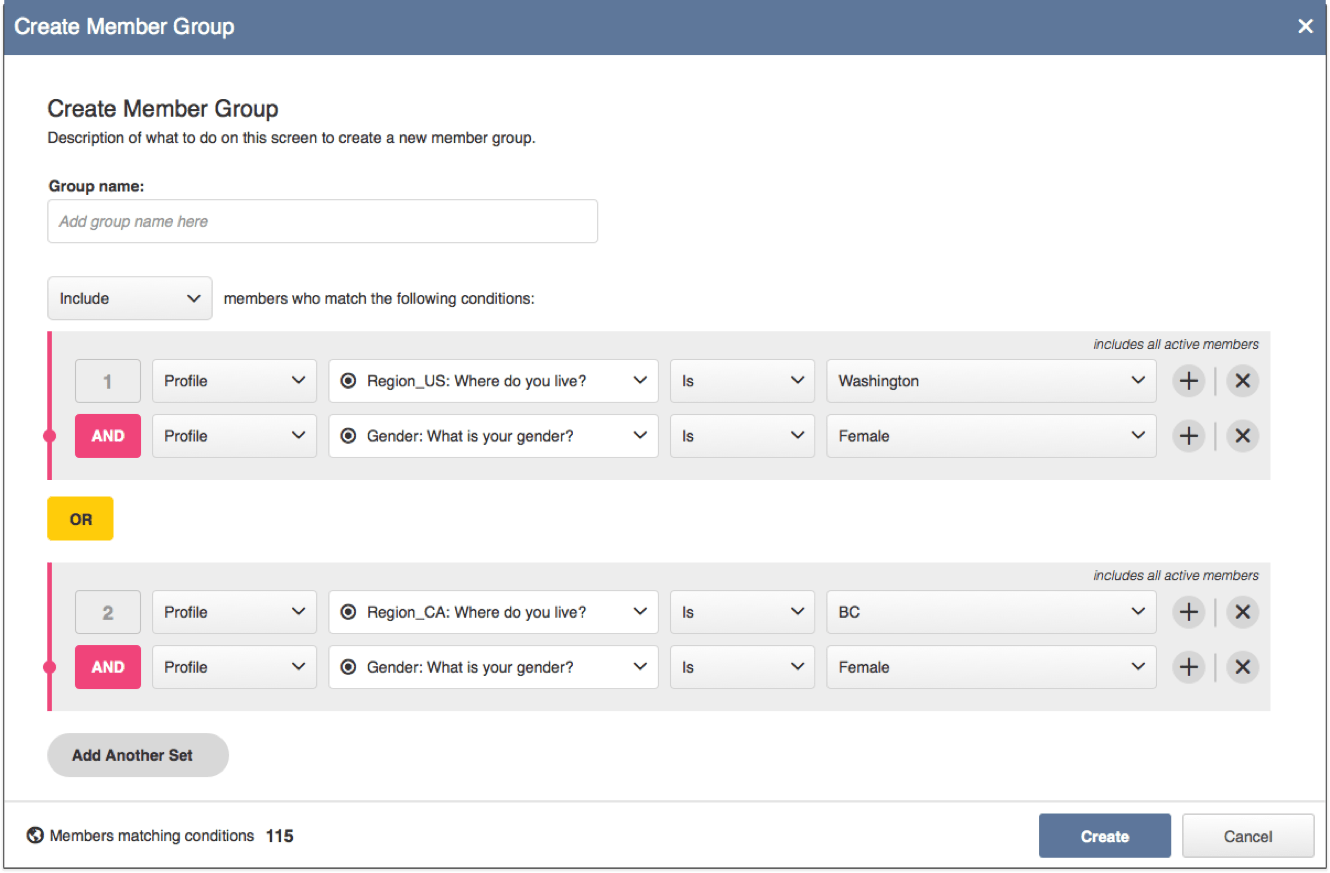
Essentially a complex filtering feature, the condition builder allowed our users to find the perfect customers to target. It was extremely convoluted, as it was designed to the needs of the few, highest paying users. I was in charge of adapting it to the needs of the majority of our userbase.
This wasn't just a facelift. This was understanding what functions and features were most used, and understanding the implications of keeping some, and cutting others.
After analyzing the user data. I optimized it for the most important use cases first, and also cut certain options for it, as they were barely being used, or would take too long to build, and were only adding more confusion to the system.
Here you can see some screenshots of the original and final version of the condition builder, as well as the design document which also includes the responsive designs.
Profile Variables
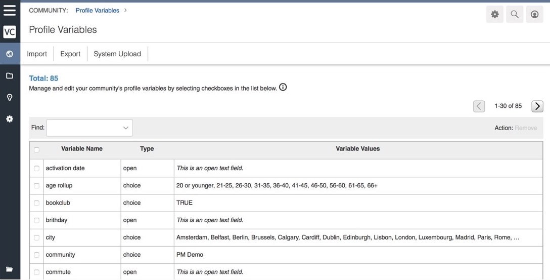
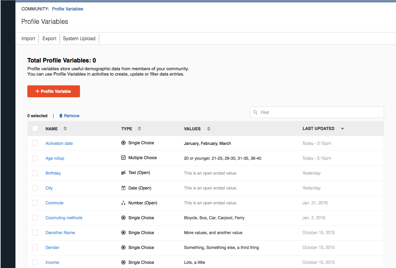
Anytime someone responds to a personal question in a survey sent out by Sparq Next Gen, each response is collected and added to their profile. These bits of customer information are called Profile Variables. They can be later used by the condition builder to target specific people based on their personal information.
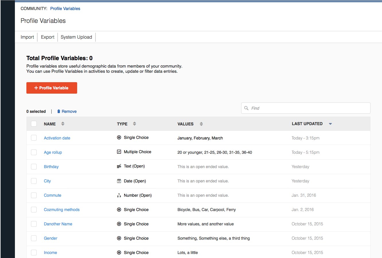
In the original platform, users could only choose from a set list of Profile Variables to collect information. My job was to add functionality to the existing version of this, such as creating a new Profile Variable, editing/sorting/filtering them, removing them, adding empty states in the UI and addressing all of the edge cases that came with these features.
I came up with the requirements from analyzing the results of our user research interviews. I tested all of my designs using prototypes built in sketch and inVision. I also wrote up functionality documents for all major updates to this feature.
Here you can see the early stages of the Profile Variables feature, as well as the design document.
The Main Dashboard
On top of those larger tasks, I was also working on dozens of smaller ones. Resources were often tight at Vision Critical, so I would sometimes redesign features in phases so we could get something in front of our users sooner, without taking up too much dev time.
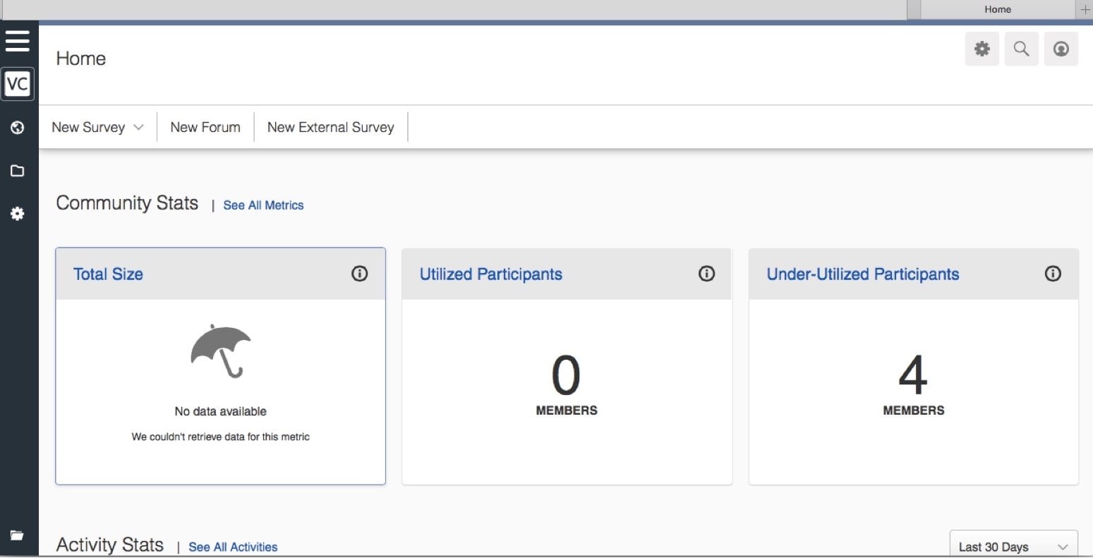
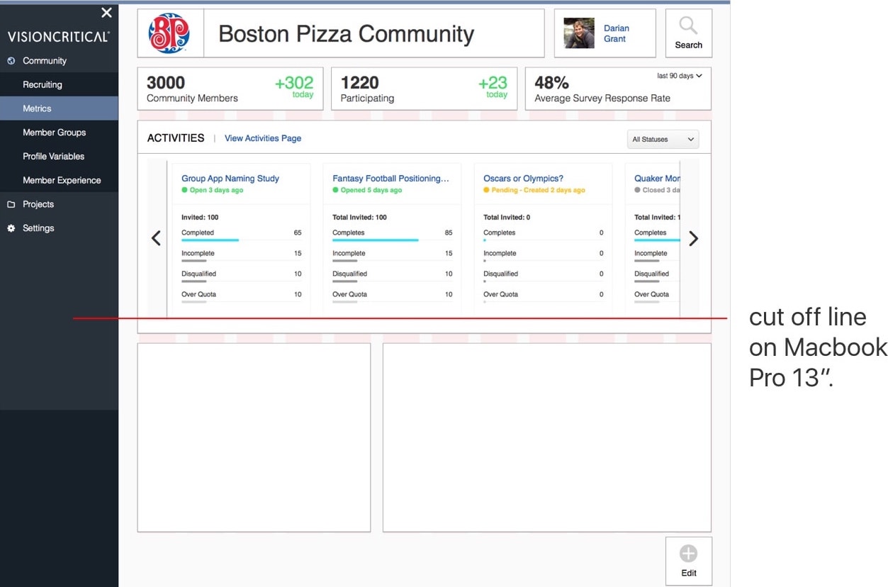
The Dashboard is a good example of that. It was an obnoxious, bare screen at first, but I managed to increase satisfaction on it with a few tweaks pushed out over several iterations.
Here you can see the first version of the dashboard that was launched right before I joined the company. That screenshot was from everything above the fold on a 13" macbook.
Next you can see the proposed wireframed draft. You can also see the proposal for each release here, and you can see the accompanying design documentation here.
Close Date Scheduler
I tackled these smaller tasks with proper documentation and prototype testing whenever possible because, not only does it help communicate them to the dev team, it also helps solve creative arguments.
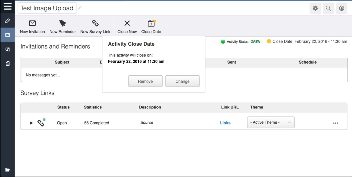
This example is a small update that was required because we found our users were not using the "Close Date" feature, however, there were too many opinions on how it should be addressed, if at all.
I ran the inVision prototype by some users, and presented the feedback to the stakeholders. It was then approved for production and I wrote up the design documentation for the devs.
Hard to measure, but a lot learned
It's hard to define a solid outcome on how my work affected the company's KPIs because it was continuously being updated and reiterated with several other features at once. Release cycles were also extremely long and there was not a lot of communication from the upper management team who got to see the affected numbers. Either way, I learned a lot about working on a large UX team and how to balance a lot of projects at once.
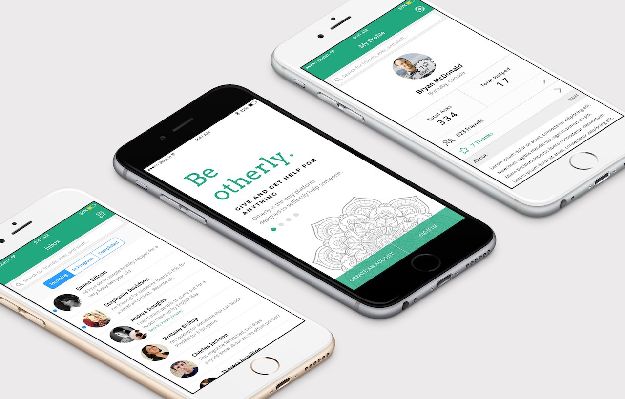 Otherly
A platform for friends and neighbors to give and get help with anything, where I came on as Lead UX Designer to redo an MVP that had been built without a clear vision.
Next
Otherly
A platform for friends and neighbors to give and get help with anything, where I came on as Lead UX Designer to redo an MVP that had been built without a clear vision.
Next
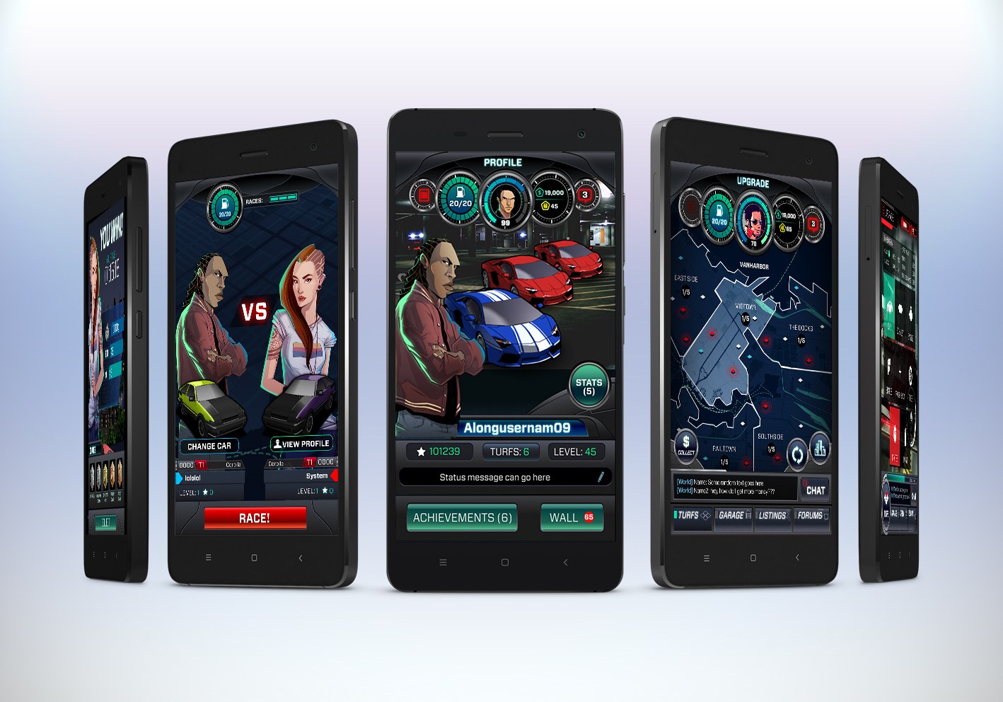 Perfect Drift
 was an Android street-racing game at A Thinking Ape that had lost two Lead Designers and fallen far behind schedule before I was brought in to help get it moving again.
Perfect Drift
Perfect Drift was an Android street-racing game at A Thinking Ape that had lost two Lead Designers and fallen far behind schedule before I was brought in to help get it moving again.


 Email me